Home | Articles | Analog Film
Kodak Film Lightroom Presets – The Full Collection
Richard ♦ April 23, 2026 ♦ 11 min read
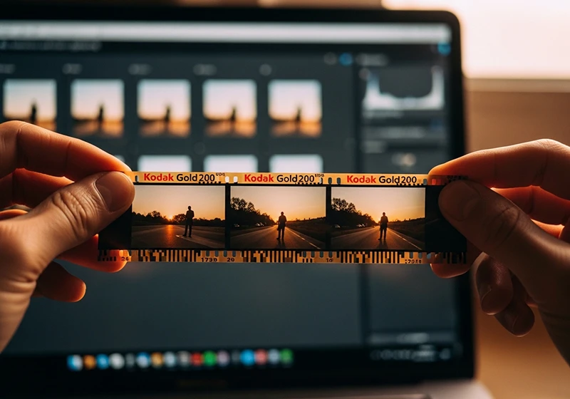
If you’re looking for Film Lightroom presets that actually hold up – warm skin tones, real grain, colors that feel analog rather than filtered – the Kodak range is one of the best places to start. Kodak film presets cover everything from the golden warmth of Gold 200 to the punchy saturation of Ektar, the cinematic contrast of Kodachrome, and the gritty texture of TRI-X 400.
The problem most photographers run into isn’t finding a Kodak preset – it’s picking the right one. This guide walks you through the full collection so you can do exactly that, fast.
Legendary Presets covers every major Kodak emulsion in Lightroom-ready format, compatible with Lightroom Classic, Lightroom CC, and Adobe Camera Raw.
Key Takeaways
- Kodak Gold presets = warm, golden tones; best for outdoor portraits, lifestyle, and travel in natural light
- Kodak Portra presets = neutral, flattering skin; the go-to for professional portrait and wedding work
- Kodak Ektar presets = high saturation, punchy color; built for landscapes, travel, and architecture
- Kodachrome and Ektachrome presets = cinematic slide-film contrast; great for editorial and storytelling
- T-MAX and TRI-X presets = distinct black-and-white looks; not interchangeable – each has its own grain and contrast character
- Picking the right Kodak film preset before you start editing saves time and gives your work a more consistent look across a shoot
01.
Background
What Is a Kodak Film Lightroom Preset?
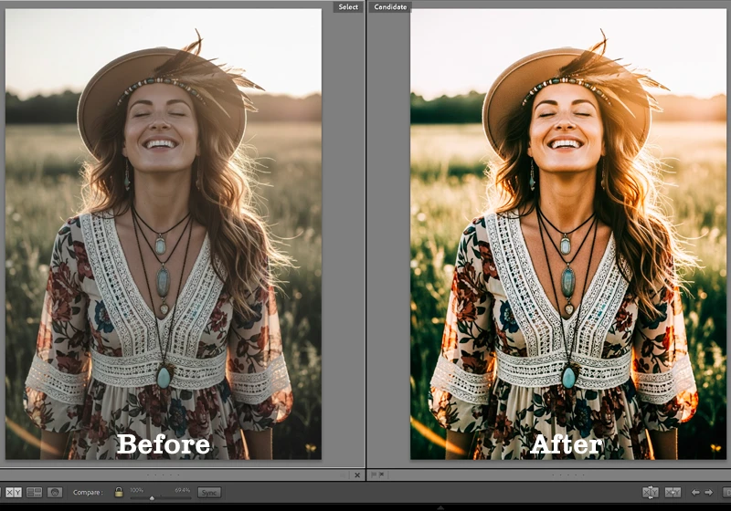
A Kodak film lightroom preset replicates the color rendering, tonal curve, and grain of a specific Kodak film stock. Apply it in one click and your RAW file takes on the shadow lift, highlight rolloff, and color character of that emulsion. Every preset is fully editable – nothing is baked in.

One preset applied – the tonal shift, grain, and color character of Kodak film in a single click. The Kodak range splits into four color families (Gold, Portra, Ektar, Everyday) plus slide films and black-and-white stocks. Each has a distinct look and a specific type of photo it suits best.
02.
Kodak Gold
The Kodak Gold Series – Warm Tones That Never Go Out of Style
The Gold family is what most people picture when they think of that classic warm film look. There are four presets in this group, and the differences between them matter.
This collection covers every major Kodak stock available as a preset. If you want to understand what makes each one distinct before choosing, the Kodak Lightroom presets overview breaks it down film by film.
Kodak Gold 200 is built for exactly this kind of light warm, golden, and effortlessly natural. Kodak Gold 100 is the cleanest of the four – less grain, tighter highlights, warm but composed. Better than Gold 200 for harsh midday light or fashion work where you want warmth without oversaturation.
Kodak Gold 200 is the one most people are searching for when they type “kodak gold lightroom preset.” Golden highlights, creamy lifted shadows, just enough grain to feel tactile. It’s the kodak gold 200 preset for outdoor portraits, lifestyle photography, and travel – and it flatters almost any skin tone in warm or soft natural light. See also: editing photos with sunny Kodak Gold 200 film colors and family photography workflow with Kodak Gold tones.
Kodak Gold 400 is grainier and slightly cooler than Gold 200. Use it for candid shots, indoor natural light, or any image where more texture fits the story.
Kodak Royal Gold 400 is the most underrated preset in the Gold family – richer saturation and deeper shadow detail than standard Gold 400. If Gold 200 is your usual default and you want more body and depth, try this one first.
Film Tone Character Best Use Case Gold 100 Warm, clean Fashion, controlled light Gold 200 Golden, creamy shadows Outdoor portraits, lifestyle, travel Gold 400 Cooler warm, visible grain Candid, indoor natural light Royal Gold 400 Rich, saturated Sunset portraits, moody lifestyle 03.
Kodak Portra
Kodak Portra Presets – The Professional Portrait Film
Where Gold is warm and nostalgic, Portra is precise and professional. These presets are built around one priority: accurate, flattering skin tones with excellent highlight rolloff.
Portra 400’s neutrality is its strength – accurate skin, clean highlights, nothing forced. Kodak Portra 160 is the softest and most neutral preset in the entire Kodak collection. Ultra-fine grain, no color cast, clean highlights. Best for studio portraits, editorial, and commercial work where the color grade should be invisible.
Kodak Portra 400 is the industry standard. Warmer than Portra 160, far less aggressive than Gold 200, with excellent shadow detail and skin tone rendering across a wide range of complexions. If you only use one Kodak preset for client portrait work, this is probably it.
Kodak Portra 800 adds more grain and opens up the shadows. The best Portra preset for low-light wedding receptions, evening events, or indoor sessions where atmosphere matters.
The Kodak Portra Collection includes Portra 160, 166C, 400, 400NC, 400VC, and 800. The NC (Natural Color) and VC (Vivid Color) variants are worth having – 400NC for cooler documentary-style portraits, 400VC when you want warmth with Portra’s highlight control.
04.
Kodak Ektar
Kodak Ektar Presets – When You Want Colors That Pop
Ektar is not for portraits. It’s for subjects where bold, clean color is the point – landscapes, architecture, travel, product photography.
Ektar 100 pushes color to the edge without tipping into artificial – perfect for travel and landscape work. Kodak Ektar 25 gives you ultra-fine grain and extreme sharpness simulation. Works beautifully on product photography, macro work, and architectural detail where you want the image to feel almost tactile.
Kodak Ektar 100 is the travel photographer’s color preset – vivid blues in skies, rich greens in foliage, saturated reds without clipping. For more on getting the most from it, see vivid editing with Kodak Ektar 100 and travel photography with a classic Kodak Ektar 100 aesthetic.
05.
Slide Film
Kodachrome and Ektachrome – Slide Film in Lightroom
Slide film presets behave differently from negative film presets. Expect tighter shadows, more contrast in the midtones, and a color palette that feels cinematic rather than photographic.
Kodachrome 64 turns a street scene into a frame from a story – that contrast and color palette is unmistakable. Kodak Ektachrome E100 is cool and crisp – vivid blues, neutral greens, clean whites. One of the most versatile slide film presets because it defines without oversaturating. See also: Kodak Ektachrome E100 tips and the Ektachrome travel editing guide.
Kodachrome 64 is warm where Ektachrome is cool – rich reds, glowing skin tones, cinematic shadow contrast. Use it for editorial storytelling and street photography where you want the image to feel like it has a past.
Kodachrome 25 adds a near-painterly quality – almost no visible grain, legendary saturation. Not an everyday look, but for the right landscape or architectural image it’s unlike anything else in the collection.
Kodak Ultra Color 100 sits between Ektar and the slide films – elevated saturation, clean grain, solid for nature and travel where you want vivid but controlled color.
06.
Kodak B&W
6 Kodak Black and White Presets – From Fine Grain to Gritty
These are not interchangeable. Each B&W preset has its own grain size, shadow rolloff, and contrast curve. Picking the right one matters as much as picking the right color preset.
TRI-X 400’s grain isn’t noise, it’s texture. That’s what separates it from every digital B&W filter. - Kodak T-MAX 100 – finest grain, smoothest tonal curve. The portrait and product B&W preset. Clean, modern, controlled.
- Kodak T-MAX 400 – the general-purpose workhorse. Slightly more grain than T-MAX 100 but excellent tonal range across highlights and shadows. Good for portraits, street, and architecture.
- Kodak T-MAX 3200 – heavy grain, deep shadow contrast, real drama. Built for low-light – concerts, evening events, moody portraits where the grain is part of the story.
- Kodak TRI-X 400 – larger, more organic grain than T-MAX. Slightly more aggressive contrast. This is the street photography and documentary preset – gritty, human, textural.
- Kodak Panatomic X – almost imperceptible grain, smooth even tonal rendering. A specialty tool for fine art B&W and architectural photography where tonal gradation is everything.
The simple rule: TRI-X for grit, T-MAX for precision.
07.
Tips
How to Pick the Right Kodak Film Preset
Start with the mood, then match the film:
- Warm + outdoor + people → Gold 200, Portra 400
- Punchy + landscape + travel → Ektar 100, Ektachrome E100
- Nostalgic + faded → Color Plus 200, Kodachrome 64
- Documentary + street → TRI-X 400, Gold 400
- Clean B&W portrait → T-MAX 100 or T-MAX 400
- Low-light B&W with drama → T-MAX 3200
Browse the full range at the Kodak film Lightroom presets collection.
Testing the full collection changes how you think about presets, you stop picking by feel and start picking by light. My Take on Lodak Film
After testing the collection, two things stood out. Color Plus 200 performs better than Gold 200 on overcast days – Gold 200 needs warmth in the source image to do its job, and Color Plus 200 doesn’t. And Portra 160 is the most underused preset for client work – it doesn’t impose a mood, it just makes skin look correct, which is exactly what commercial and editorial clients want.
08.
FAQ
Do I need to shoot in RAW to use Kodak film Lightroom presets?
You don’t need to, but RAW gives you significantly better results. A film preset adjusts exposure, tone curve, color grading, and grain all at once. With a RAW file, Lightroom has full latitude to make those adjustments cleanly. With a JPEG, the file has already been compressed and processed in-camera, so the same preset can look flat, over-cooked, or slightly off. If you’re serious about getting a convincing film look, shooting RAW is worth it.
Can I use different Kodak presets across photos from the same shoot?
You can, but it usually works against you. One of the main reasons film photography looks cohesive is that an entire roll was shot on the same stock. If you apply Gold 200 to one frame, Portra 400 to the next, and Ektar 100 to another, the gallery will feel inconsistent even if each individual edit looks good. Pick one preset per shoot, or at most one for indoor frames and one for outdoor – and stick to it.
How much should I adjust a preset after applying it?
Think of a preset as a starting point, not a finished edit. After applying, check three things: exposure (the preset was built on a reference image, yours may be brighter or darker), white balance (if your shot is much warmer or cooler than average daylight, the preset will skew), and grain (you may want more or less depending on output size). Beyond that, leave it alone. Over-adjusting a film preset defeats the point of using one.
Why does the same Kodak preset look different on two photos?
Because presets react to what’s already in the image. A warm preset applied to a photo shot in golden hour will push further warm than the same preset on a photo shot in open shade. The color of your light source, your white balance setting, and your exposure all affect how the preset renders. This is normal – it’s actually how real film behaves too. If a preset looks wrong on a specific image, check your white balance before reaching for a different preset.
Kodak Gold or Kodak Portra – which is better for beginners?
Kodak Gold 200 is more forgiving to start with. It has a strong, recognizable character that reads well even on imperfect exposures – slightly underexposed or overexposed shots still come out looking warm and intentional. Portra is more neutral, which means it rewards good exposure and light but doesn’t add much on its own. If you’re still developing your eye for light, Gold 200 will make your learning curve more enjoyable. Move to Portra when you want more control and less character.
Do Kodak film presets work on photos taken on a smartphone?
Yes, with some caveats. Lightroom Mobile supports presets fully, and the presets themselves apply the same way they do on desktop. The limitation is the phone file, not the preset. Smartphone JPEGs – especially from heavily processed computational photography modes – can fight back against the color grading in a film preset. If your phone allows it, shoot in RAW or a Pro mode that minimizes in-camera processing. The closer your source file is to a neutral, unprocessed image, the better your film preset will look.
09.
Final Thought
I’ve spent years testing film presets across different shooting conditions, from midday travel photography to low-light portrait sessions. The most consistent lesson: the photographers who get the best results from film emulation are the ones who understand what each film stock actually did, not just what it looked like. Once you know that Kodak Portra was designed for skin under mixed light, or that Velvia was built for saturated daylight landscapes, the edits start making a lot more sense.
Richard is a commercial and editorial photographer with over 15 years behind the lens. He’s shot on film and digital across three continents, and still keeps a Nikon F3 loaded with Kodak Portra on his desk. At LegendaryPresets, he leads preset development – studying actual film scans to make sure every stock behaves like the real thing.