Home | Articles | Analog Film
How to Get the Kodak Ektar 100 Look in Lightroom (Full Guide)
Richard ♦ June 14, 2026 ♦ 12 min read

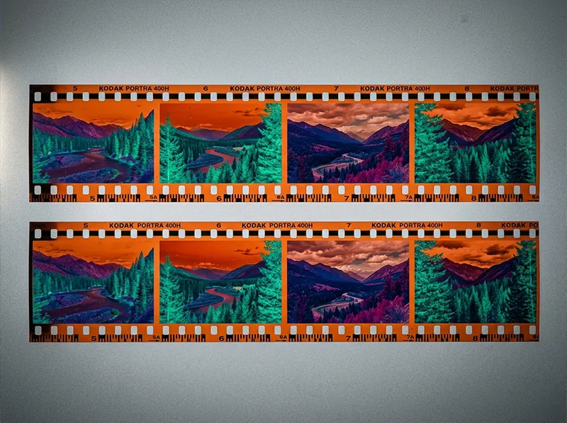
Kodak Ektar 100 gives you the most saturated color of any daylight negative film ever made. On film, it punches reds, deepens blues, and keeps greens crisp without sliding into neon territory. In Lightroom, recreating that look is completely achievable, but you need to understand why Ektar looks the way it does before you start pushing sliders.
This guide covers Ektar’s actual color character, how it compares to Kodak Portra and Kodak Gold, and a complete Lightroom workflow to get the Ektar look from any RAW file. If you want to skip straight to a preset that already nails it, the Kodak Ektar 100 preset from Legendary Presets is built from the film’s real color profile and gets you 90% of the way there in one click.
Key Takeaways
- Ektar 100 is a daylight film with extreme red saturation and fine grain, designed for commercial and landscape work, not portraits
- Its blues run cooler and deeper than Portra or Gold; its reds are noticeably more aggressive
- In Lightroom, the Ektar look lives in the HSL panel: Red Saturation +15 to +25, Blue Luminance -10 to -15, Orange Saturation -5 (skin protection)
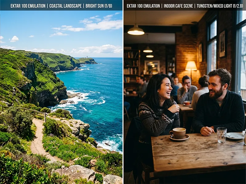
- Ektar rewards outdoor shooting in direct sun, it falls apart fast in mixed or artificial light
- It shares DNA with Kodak’s E-6 slide films in contrast behavior, but on C-41 chemistry
01.
What Ektar 100 Actually Is (and Why It Looks the Way It Does)
Kodak launched Ektar 100 in 2008 as their sharpest, finest-grain C-41 color negative film. The design goal was simple: maximum color saturation with minimum grain. Kodak achieved it by using ultra-fine T-GRAIN emulsion technology, the same grain technology in their T-MAX black-and-white films, applied to a color negative.

Ektar 100 uses T-GRAIN emulsion technology, the same fine-grain platform as Kodak’s T-MAX B&W films, applied to a color negative. The result is a film that behaves differently from every other color negative in the Kodak range. Where Kodak Portra 400 is designed for skin tones, with a warm, slightly muted base that flatters faces, Ektar goes the opposite direction. It saturates primaries hard, especially reds, and it doesn’t care what that does to skin. That’s not a flaw, it’s a deliberate design for landscape, product, and editorial work where punchy color matters more than flattering people.
The contrast behavior is also unusual for a negative film. Most C-41 films have a low-contrast base with a wide exposure latitude. Ektar’s latitude is narrower, closer to slide film (E-6) territory. Overexpose it by two stops and you lose highlight detail fast. It rewards careful metering in a way that Portra simply doesn’t.
If you shoot portraits, landscapes, or travel, there is a Kodak stock built for it, browse the full Kodak film presets range and see which one clicks.
02.
Ektar vs. Portra vs. Kodak Gold: Which One Do You Need?
This is the question I get asked most often when photographers are choosing between Kodak’s color films for Lightroom emulation. Here’s a direct comparison:
Ektar 100 Portra 400 Kodak Gold 200 Best for Landscapes, travel, product Portraits, weddings, fashion Casual, lifestyle, everyday Color character Vivid primaries, cool shadows Warm, skin-flattering Warm, slightly golden cast Grain Ultra-fine Fine Visible at 400+ Latitude Narrow (slide-like) Wide Medium Red handling Aggressive saturation Neutral-warm Warm, not punchy Portra is forgiving. Gold is warm. Ektar is neither, it’s precise and demanding. If you’re editing outdoor travel photography, landscapes, or architectural work, Ektar is the obvious choice. If there are faces in the frame as the main subject, Portra will serve you better. If you want something between the two with a nostalgic feel, look at Kodak Gold 200.
I shot a roll of Ektar 100 alongside Portra 160 at the same location, a sunlit Tuscany hillside in August, and the difference was stark. Portra rendered the ochre walls as warm terracotta. Ektar made them brick-red. Neither is wrong, but they’re completely different editorial choices.
03.
The Lightroom Workflow for the Ektar 100 Look
This is the step-by-step process I use when building an Ektar emulation from a RAW file. You can apply this to any photo, it doesn’t require an actual Ektar scan to start from.
Step 1: Set Your White Balance First
Ektar 100 was designed for direct sunlight (5,500K). In Lightroom, set your white balance to 5,200–5,500K with a slight negative tint (around -5 to -8). This gives you the slightly neutral-to-cool base that Ektar has in shade and mixed light. Don’t go warmer than 5,600K or you’ll start sliding into Gold territory.
Step 2: Adjust Tone Curve for Slight Contrast Lift
Ektar has more contrast than other C-41 films. In the Tone Curve panel, lift your shadows just slightly (bring the bottom-left point up about 10 units) and add a gentle S-curve. Nothing dramatic, you’re not going for slide film contrast. You want the shadow end slightly lifted with clean, defined highlights. Avoid crushed blacks.
Step 3: HSL Panel, This Is Where Ektar Lives
This is the most important step. Ektar’s color signature is almost entirely controlled through the HSL panel.
- Reds: Saturation +18 to +25. This is the defining move. Ektar’s reds are genuinely aggressive on film and this is how you get there digitally.
- Oranges: Saturation -5 to -8. Skin protection. Without this, portraits taken on Ektar emulation will look sunburned.
- Blues: Saturation +10 to +12, Luminance -12 to -15. Ektar’s blues are deep and slightly dark, this is what gives it that punchy sky look.
- Greens: Hue -5 (shifts toward yellow-green), Saturation +5. Ektar renders foliage with a slightly warmer, more saturated green than you’d expect.
- Aqua: Luminance -8. Deepens ocean and sky gradients.
Step 4: Add Grain After Your Tone Curve
Here’s something most tutorials miss: add grain after you’ve set your tone curve, not before. Grain applied before your tone adjustments gets affected by the curve, it compresses in shadows and stretches in highlights in a way that doesn’t match film grain behavior. Add it last. For Ektar 100, use Amount 18–22, Size 25–30, Roughness 50. Ektar’s grain is very fine and should barely be visible at normal viewing size.
Step 5: Check Your Highlights
Because Ektar has narrower latitude than Portra, your Lightroom emulation should reflect that. In the Basic panel, pull Highlights down -20 to -30. You’re not recovering blown highlights, you’re keeping the rendition accurate to how Ektar behaves when slightly pushed. If your original exposure has clipped highlights, they’ll stay clipped. Ektar doesn’t rescue overexposure.
04.
When Ektar Works Best (and When to Leave It Alone)
Ektar’s strengths are specific. It’s not a versatile, all-purpose film emulation. Here’s a realistic breakdown:
Ektar is excellent for:
- Landscape photography in direct sun, the saturation boost on blue skies and green foliage is exactly what the film was built for
- Architecture and urban photography, hard edges, primary colors, and clean shadows all benefit from Ektar’s contrast and saturation
- Travel photography where color vibrancy matters more than skin accuracy
- Still life and product photography with strong primary colors
Ektar was designed for direct sun and high-contrast light. It earns every bit of its saturation outdoors, but mixed indoor light makes those same settings feel heavy and muddy. Ektar struggles with:
- Indoor or mixed light – the narrow latitude and high saturation create muddy, heavy shadows indoors
- Portraits as the primary subject, the red/orange saturation push is genuinely unflattering on most skin tones without significant Orange Luminance compensation
- Overcast or flat light, Ektar’s punch comes from contrast; low-contrast light produces dull, heavy results
For architecture and high-saturation travel work, pair this workflow with the step-by-step high-saturation film workflow guide for additional technique on protecting highlights while keeping colors vivid.
05.
Ektar 100 vs. Kodak Ektar 25: The Less-Known Sibling
Most photographers don’t know that Ektar had a predecessor: Kodak Ektar 25, one of the finest-grained color negative films ever produced. Ektar 25 was discontinued in 1995. Where Ektar 100 is saturated and punchy, Ektar 25 was actually more neutral, it was designed for commercial studio work where color accuracy mattered more than saturation.
If you’ve seen the Ektar 25 look and wondered why it’s so different from Ektar 100, that’s why. They share a name but were built for different purposes. You can explore the Kodak Ektar 25 preset if you want the quieter, more neutral sibling.
06.
A Contrarian View on Ektar for Digital Photographers
Most tutorials treat Ektar as a simple “boost everything” preset. I think that’s backwards. The reason Ektar looks so good on film isn’t just saturation, it’s selectivity. The film saturates reds and blues hard, but it holds greens relatively neutral and keeps fine detail in shadows.
When photographers just push overall vibrance or saturation in Lightroom trying to get “the Ektar look,” they get a heavy, oversaturated image that shares nothing with actual Ektar negatives.
The real Ektar workflow is about targeted HSL adjustments, not global saturation. The orange desaturation step I mentioned above is actually the move that separates a real Ektar emulation from a generic “film look.” Ektar kills orange. That’s counterintuitive when you think of it as a saturated film, but it’s exactly what makes outdoor and landscape shots look right.
This is also why Ektar presets vary so much in quality. A preset that lifts global Vibrance by +30 and calls it Ektar is not Ektar. The real behavior is channel-specific.
The analog look is not one thing, it is dozens of distinct emulsions each with its own character, see the full film presets range and find the one that fits your vision.
07.
Using the Kodak Ektar 100 Preset as a Starting Point
If you want to get to the Ektar look faster, the Kodak Ektar 100 preset at Legendary Presets gives you a calibrated starting point built from the film’s actual color profile rather than a generic “vivid” adjustment. Apply it, then use the HSL workflow above to fine-tune for your specific image.
For outdoor travel editing, you can compare Ektar’s approach to the Fuji vs. Kodak color science breakdown, Ektar and Fujichrome Velvia are actually the closest competing film stocks in the saturation range, which surprises most photographers.
If you’re building a complete Kodak film preset collection, the Kodak Lightroom presets range covers Ektar 100, Ektar 25, the full Portra range, and Gold through UltraMax.
08.
Quick Reference: Ektar 100 Lightroom Settings
Here are the core values as a starting reference. Every image will need adjustment, but these get you close:
Panel Setting Value Basic White Balance 5,200–5,500K Basic Tint -5 to -8 Basic Highlights -20 to -30 Tone Curve Shadows lift +10 (bottom-left point) HSL Red Saturation +18 to +25 HSL Orange Saturation -5 to -8 HSL Blue Saturation +10 to +12 HSL Blue Luminance -12 to -15 HSL Green Hue -5 HSL Aqua Luminance -8 Detail Grain Amount 18–22 Detail Grain Size 25–30 09.
Frequently Asked Questions
What is Kodak Ektar 100 known for?
Ektar 100 is the finest-grain, most color-saturated C-41 (color negative) film Kodak has ever produced. It’s primarily used for landscape, travel, and architectural photography where vivid color and sharp detail matter. It’s not recommended for portraits because its red and orange saturation is unflattering on skin.
How is Ektar 100 different from Portra 400?
Portra 400 is designed around skin tones, it renders oranges and warm colors neutrally, with a wide exposure latitude. Ektar 100 is designed for primary color saturation, it pushes reds and blues hard, has a narrower exposure latitude (closer to slide film), and is less forgiving with overexposure.
Can I use Ektar 100 presets on portrait photos?
You can, but you need to compensate in the HSL panel. Lower Orange Saturation by -5 to -10 and raise Orange Luminance by +5 to avoid the skin-burning effect that Ektar’s red/orange push creates. For true portrait work, Kodak Portra 160 or Portra 400 will serve you better.
What’s the difference between Ektar 100 and Ektachrome E100?
They’re completely different film types. Ektar 100 is a C-41 color negative film, it produces negatives, has more latitude, and is printed or scanned. Ektachrome E100 is an E-6 slide film, it produces positive transparencies, has higher contrast, and the colors are more “what you see is what you get.” Ektachrome has cooler, more neutral color compared to Ektar’s aggressive saturation. See the Kodak Ektachrome E100 preset for comparison.
Does Ektar 100 work in low light?
No. Ektar 100 is a daylight-balanced, ISO 100 film. It’s not designed for low light, and the Lightroom emulation reflects that, the preset is calibrated for well-lit outdoor conditions. For low-light work, Kodak UltraMax 400 or Kodak Gold 400 are better options.
Richard is a commercial and editorial photographer with over 15 years behind the lens. He’s shot on film and digital across three continents, and still keeps a Nikon F3 loaded with Kodak Portra on his desk. At LegendaryPresets, he leads preset development – studying actual film scans to make sure every stock behaves like the real thing.