


Home | Articles | Adobe Lightroom
What Are Lightroom Film Presets? The Complete Guide
Richard ♦ May 18, 2026 ♦ 18 min read

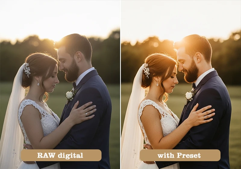
If you’ve ever wondered what lightroom film presets actually are – not just what they look like, but what they do – you’re in the right place. In short: a film preset is a saved collection of Lightroom settings that replicates the color, tone, and grain of a real analog film stock. One click, and your digital photo starts to look like it came out of a darkroom instead of a memory card.
That’s the quick answer. But there’s a lot more to it, and understanding what’s actually happening inside a preset will change how you use them.
I’ve been shooting and editing for over a decade, and film presets are still part of almost every professional edit I do. Not because they’re a shortcut, but because they work – when you know how to use them properly. Sites like Legendary Presets have built entire libraries around specific film stocks, from Kodak Portra 400 to Fujichrome Velvia 100 to Agfa Vista 800.
Let’s get into it.
01.
Background
What Are Lightroom Film Presets?
A Lightroom film preset is a one-click set of saved adjustments that mimics the color, contrast, grain, and tone of a real analog film stock – applied non-destructively to any photo in Adobe Lightroom.

That definition matters because it separates film presets from two things people often confuse them with:
- Filters (like Instagram or in-camera JPEG styles): These bake the effect into the file permanently and usually work on a flat, simplified color model. You can’t undo them or fine-tune individual channels after the fact.
- Generic Lightroom presets: These are just saved settings too, but they’re not tied to any real film stock. They might look nice, but they’re not built around the actual color science of Kodak or Fujifilm.
A proper film preset adjusts multiple panels in Lightroom simultaneously. When you click apply, you’re changing:
- Tone Curve – the most important element. Film curves lift the shadows slightly (that “faded” base), compress highlights gently, and create an S-shape that feels organic rather than punchy.
- White Balance – Kodak stocks typically shift warmer (toward 5500–5800K); Fuji stocks tend toward cooler, more neutral tones.
- HSL Panel (Hue/Saturation/Luminance) – this is where Fuji’s famous green-teal shift lives, where Kodak’s warm skin reds come from, and where Agfa’s punchy cyans get their character.
- Color Grading – shadows are often pushed toward warm amber or cool teal depending on the stock; highlights get a complementary shift.
- Grain – size, roughness, and amount. Good presets use larger, rougher grain in lower ISOs (like TRI-X 400) and finer grain in emulsions like T-MAX 100 or Neopan Acros 100.
- Camera Calibration Panel – often overlooked, but this shifts the primary color channels at a deeper level than HSL, which is how the best presets feel different from the rest.
The file format is either .xmp (current standard for Lightroom Classic and Adobe Camera Raw) or the older .lrtemplate format. In Lightroom CC and mobile, presets sync through the cloud and work exactly the same way.
Once you know what film presets are, the next step is seeing the full range of what’s possible. Our Lightroom film presets guide covers every major film stock and how to use them in your editing workflow.
02.
Reasons
Why Do Photographers Use Film Presets?
The obvious answer is nostalgia. Film has a warmth and imperfection to it that digital – no matter how good the sensor gets – hasn’t fully replicated on its own. But that’s not the whole story.
- Speed. A good preset gets you 80% of the way there on a well-exposed image. You tweak the remaining 20% – exposure, maybe white balance – and you’re done. That’s the difference between spending 3 minutes per image and 25 minutes per image.
- Consistency. When you shoot a 400-photo wedding or a 3-day travel assignment, batch-applying one preset keeps the gallery cohesive. Every image looks like it came from the same roll of film.
- Skin tones. Kodak stocks were chemically engineered for flattering human skin. That color science carries over into well-built presets. Portra 400, for example, is still the reference point for natural skin rendition in portrait photography.
- Storytelling. A high-contrast Kodak TRI-X look on a street photo changes how you read the image. It adds weight. Velvia on a mountain landscape makes it feel like a travel magazine from 1994. These associations are real and they work.
I’ll be direct about something here: presets don’t rescue bad photos. I spent a long time reaching for a film preset when an image wasn’t working – hoping the warm tones would fix a flat, underexposed frame. They never did. The shift that actually changed my results was using film presets only on properly exposed images with good light. The difference was immediate and obvious. A preset adds character to a strong image; it can’t inject character into a weak one.
03.
Tools Inside
What’s Actually Inside a Film Preset?
This is the part most guides skip, and it’s worth slowing down on. If you know what each element does, you can adjust any preset to fit your image instead of wondering why it “doesn’t quite work.”
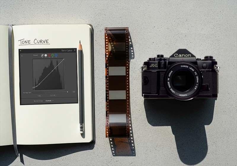
The Tone Curve
This is the backbone of any film preset. Real film doesn’t clip highlights abruptly the way digital sensors do – it rolls off gradually. And real film doesn’t have pure black shadows; there’s always a slight density in the darkest areas from the film base itself.
In Lightroom terms:
- The black point is lifted – instead of RGB (0, 0, 0) pure black, the shadows sit at around 10–20 on the curve. That’s the “faded” look you see in a lot of film emulations.
- The highlights are compressed – they roll off softly instead of clipping.
- The overall curve is an S-shape, but gentler than the aggressive contrast S you’d apply to a commercial product shot.
White Balance and Color Temperature
Different film stocks respond to light differently because of their chemical dye layers. Kodak emulsions tend to render tungsten and golden-hour light with a pleasing warmth; Fuji emulsions are more neutral and handle cooler daylight naturally. A well-built preset shifts the color temperature to match that character – usually a few hundred Kelvin in either direction.
HSL: Where the Film Personality Lives
The Hue/Saturation/Luminance panel is where presets get specific. Here’s what you’ll typically see:
- Fuji presets: Greens are shifted toward teal or aqua (famous in Velvia and Provia); reds and oranges are slightly desaturated to prevent skin from going too orange.
- Kodak presets: Reds and oranges are warmed and slightly lifted in luminance; greens are often muted or shifted yellow-green; yellows are warm and saturated.
- Agfa presets: Oranges and reds are punchy and saturated; blues shift toward cyan; overall saturation sits higher than Kodak or Fuji equivalents.
Grain
This is where a lot of budget presets fall apart. Real film grain is not uniform – it’s denser in shadows and mid-tones, finer in highlights. Lightroom’s built-in grain tool applies it somewhat uniformly, which can look artificial at high resolutions.
The best presets compensate for this by calibrating grain size and roughness to match the actual grain structure of the film being emulated:
- TRI-X 400: large, chunky, irregular grain – especially visible in shadows
- Kodak T-MAX 100: very fine, tight grain – almost imperceptible at normal print sizes
- Fujifilm Natura 1600: aggressive grain throughout, which is part of the aesthetic at that ISO
The Camera Calibration Panel
Most photographers never touch this. It lets you shift the primary red, green, and blue channels independently at a very low level – below the HSL panel, closer to the raw demosaic process. This is where the best preset builders embed the fundamental color character of a film stock, and it’s why two presets with identical HSL settings can look completely different.
04.
Presets
Film Preset Categories: Which Type Do You Need?
Color Film Presets
Fuji-based presets give you cooler, cleaner tones with that signature green-teal shift and pastel softness. They work exceptionally well for outdoor portraits, travel photography, and any scene with a lot of green foliage. Key stocks to know:
- Fujichrome Velvia 100 – extremely saturated, punchy, made for landscapes
- Fujichrome Provia 100F – balanced and natural, the all-purpose Fuji slide film
- Fujifilm Pro 400H – soft, slightly cool, outstanding for outdoor wedding photography
- Fujifilm Superia X-Tra 400 – affordable consumer film with a warm-neutral balance and moderate grain
- Fujifilm Natura 1600 – high-ISO, available-light specialist with heavy grain
See the full Fuji Lightroom preset collection.
Kodak-based presets run warmer, with more flattering skin tones and a richness in mid-tones that digital rarely produces naturally. They suit portraits, weddings, family sessions, and any warm-light scenario:
- Kodak Portra 400 – the gold standard for portrait and wedding film. Creamy, warm, forgiving.
- Kodak Ektar 100 – ultra-fine grain and bold color. Best for landscapes and architecture.
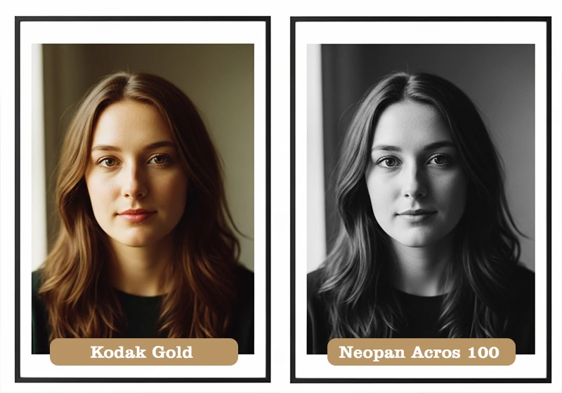
- Kodak Gold 200 – warm yellowish cast, slight grain. Great for casual, nostalgic lifestyle shots.
- Kodachrome 64 – rich reds, deep blacks, cinematic. No longer manufactured, but iconic.
- Kodak UltraMax 400 – punchy, slightly oversaturated consumer film with a lot of personality
See the full Kodak Lightroom preset collection.
Agfa-based presets are the most underrated category. Agfa film stocks have a distinct warmth in the shadows, bold reds and oranges, and a slight color cross-processing quality that makes them stand out:
- Agfa Vista 400 – bold colors, slightly warm, excellent for street photography and travel
- Agfa RSX II 100 – punchy slide film with vibrant, slightly shifted colors
- Agfa Portrait XPS 160 – softer, designed for skin, with beautiful warm mid-tones
See the full Agfa Lightroom preset collection.
Black & White Film Presets
B&W film presets are a separate category entirely. The variables aren’t hue or saturation – they’re contrast, grain structure, tonal range, and how specific colors are translated into grayscale. Here’s a quick breakdown of the main stocks:
| Film Stock | Grain | Contrast | Best For |
| Kodak TRI-X 400 | Heavy, gritty | High | Street, documentary, reportage |
| Kodak T-MAX 100 | Ultra-fine | Medium | Studio portraits, architecture |
| Kodak T-MAX 400 | Fine | Medium-high | Versatile, general purpose |
| Fujifilm Neopan Acros 100 | Very fine | Medium-low | Portraits, smooth tonality |
| Fujifilm Neopan 400 | Moderate | Medium | Street, available light |
| Agfa Scala 200X | Fine | Unique reversal | Fine art, B&W slide work |
Agfa Scala 200X deserves a special mention. It was the only black and white slide film ever made commercially – meaning it was processed as a reversal (positive) rather than a negative. The tonal structure is unlike any other B&W stock and gives preset emulations a distinctive quality that’s hard to fake with standard curve adjustments.
See the full Black & White Lightroom preset collection.
05.
Application
How to Apply a Film Preset in Lightroom
Lightroom Classic (Desktop)
- Open your image in the Develop module
- Find the Presets panel on the left sidebar
- Hover over any preset to preview it on the image in real time
- Click to apply
- Adjust Exposure first (usually ±0.5 stops is all you need)
- Tweak White Balance if skin tones feel off
- Lower Grain Amount slightly if you’re working with a high-resolution file (40+ megapixels)

Lightroom CC / Mobile
- Open your photo and tap Edit
- Tap the Presets icon at the bottom
- Browse by category and tap to apply
- Use the Opacity slider (tap the preset name again) to blend the effect if needed
A few things worth knowing:
- RAW files always work better than JPEGs. With a RAW file, you have full tonal latitude to push and pull after the preset is applied. A JPEG has already had its highlights and shadows baked in, so a preset that lifts shadows will often look muddy.
- Apply the preset before exposure corrections, not after. The preset’s tone curve was built around a “normal” exposure base. If you’ve heavily corrected exposure first, the curve will behave differently.
- Grain stacks. If you shot at ISO 1600 or higher, your digital file already has noise in it. Applying a heavy-grain preset on top creates a look that’s more “corrupted JPEG” than “analog film.” Either lower the preset grain or choose a finer-grain stock emulation for high-ISO shots.
06.
Genres
Film Presets by Photography Genre
Not every preset works for every type of photography. Real film stocks were designed with specific uses in mind – and the presets that emulate them carry those strengths and weaknesses over.

Portraits & Weddings Your best options here are stocks that were specifically formulated for skin tones and natural light: Kodak Portra 160, Kodak Portra 400, Fujifilm Pro 160NS, Fujifilm Pro 400H, and Fujichrome Astia 100F. These give you creamy mid-tones, gentle highlight rolloff, and warm-to-neutral colors that don’t fight with skin.
Travel & Landscape This is where the bold stocks shine. Fujichrome Velvia 100 for vivid greens and skies, Kodak Ektar 100 for saturated color with ultra-fine grain, and Fujichrome Fortia SP50 for maximum color saturation if you’re shooting wide landscapes in flat midday light.
Street Photography Kodak TRI-X 400 is the classic choice here – high contrast, gritty grain, the look of every photojournalist from the 1960s onward. For color street work, Kodak Gold 200, Agfa Vista 400, and Fujifilm Superia X-Tra 400 all give you a “found photo” quality that suits candid urban scenes.
Family & Lifestyle Keep it warm and simple. Kodak Gold 200, Kodak Color Plus 200, and Fujifilm Superia 100 are all low-contrast consumer films that feel approachable and nostalgic without being dramatic. They’re the preset equivalent of a disposable camera – and that’s exactly the right vibe for family sessions.
Fashion & Editorial Look at Fujichrome Astia 100F (soft and cool), Agfa RSX II 100 (vibrant and punchy), or Fujifilm Pro 800Z if you’re shooting in lower light. These stocks have a more deliberate, stylized color character that suits styled shoots and editorial work.
07.
Tips
How to Choose the Right Film Preset
There are a few practical rules that will save you a lot of time:
Match the stock’s original purpose to your subject. Velvia was made for landscapes, not people. If you apply it to a portrait, you’ll spend the next 20 minutes trying to bring back skin tones. Portra was made for skin – use it for skin.
Think about your light first. Warm presets (Kodak family) work beautifully in golden hour and tungsten light. Cooler presets (Fuji family) handle midday sun and overcast conditions without going muddy. The wrong preset in the wrong light creates color casts that are annoying to correct.
Match grain to your resolution. A heavy-grain preset like TRI-X looks natural on a 12-megapixel file but overwhelming on a 60-megapixel medium-format image. Fine-grain stocks (T-MAX 100, Neopan Acros 100) are more flexible across sensor sizes.
Use the ISO as a guide. If you shot at ISO 100–200, pair it with a box-speed preset – Portra 160, Ektar 100, T-MAX 100. If you shot at ISO 800–3200, use a faster stock preset – Portra 800, Fujifilm Natura 1600, T-MAX 3200. This keeps the grain character proportional to the actual amount of digital noise in the file.
Start at full strength, then back off. Apply the preset at 100%, then reduce grain and adjust white balance. Don’t immediately start moving every slider. Give the preset a chance to do its job before you start second-guessing it.
08.
Key Takeaways
- A Lightroom film preset is a saved set of adjustments – tone curve, HSL, color grading, grain, and camera calibration – all applied at once. It’s not a filter; it’s a full editing recipe built on real film science.
- The tone curve is the most important element. Film curves lift the shadow base and compress highlights gently – that’s what creates the “faded” analog look.
- Match the film stock to your subject: Kodak for warm portraits and skin tones, Fuji for cool outdoor scenes and landscapes, Agfa for bold street and lifestyle work.
- Apply presets to properly exposed RAW files. A preset can add character to a good image; it won’t fix a bad one.
- Watch for grain stacking on high-ISO files. Reduce grain in the preset settings or choose a finer-grain emulsion when working with noisy files.
- Legendary Presets offers individual stock presets and full brand collections – Fuji, Kodak, Agfa, and Black & White – each built to match the actual characteristics of the original film.
09.
Final Thought
Film presets aren’t about pretending you shot on film. They’re about borrowing the color science, grain structure, and tonal character that analog photographers spent decades perfecting – and applying it to the sharp, clean, high-dynamic-range images that digital cameras produce today. The best results come from knowing your stocks, respecting the light, and letting a well-built preset do what it was designed to do.
Start with one stock from each family – something like Kodak Portra 400, Fujichrome Provia 100F, and Kodak TRI-X 400 – and shoot with those three for a month before expanding. You’ll start to see exactly where each one works, and where it doesn’t. That’s how you build an editing style that actually feels like yours.
Richard is a commercial and editorial photographer with over 15 years behind the lens. He’s shot on film and digital across three continents, and still keeps a Nikon F3 loaded with Kodak Portra on his desk. At LegendaryPresets, he leads preset development – studying actual film scans to make sure every stock behaves like the real thing.