Home | Articles | Analog Film
The Iconic Fuji Film Looks: A Stock-by-Stock Guide to Getting Them in Lightroom
Richard ♦ updated June 15, 2026 ♦ 13 min read
Fuji’s film range isn’t one look, it’s a whole family of them, and they’re genuinely different from each other. Velvia and Pro 400H are almost opposites. Provia and Superia serve different audiences entirely. Fortia SP50 exists in a category of its own.
If you’ve been treating “the Fuji look” as a single thing to chase in Lightroom, that’s probably why your edits don’t feel quite right. The character of each Fuji stock comes from specific engineering choices Fuji made for specific subjects and conditions. Once you understand what each film was actually built for, recreating it in Lightroom becomes a lot more direct.
This guide covers the ten most important Fuji film stocks, what made each one distinct, what it looks like in a Lightroom edit, and the fastest way to get there.
If Fuji color science is your thing, the Fujifilm Lightroom presets collection gives you every stock in one place, ready to drop into your workflow.
Key Takeaways
- Fuji’s film range spans from ultra-saturated slide films (Velvia, Fortia) to ultra-soft portrait films (Pro 400H, Astia), they require completely different Lightroom approaches
- The Calibration panel’s Blue Primary Hue setting is the single most important control for getting authentic Fuji greens in Lightroom
- Slide films (Velvia, Provia, Astia, Fortia, Sensia) and color negative films (Superia, Pro 400H, Natura, Reala, Press 800) behave differently, slide films have higher contrast and less latitude, negatives are more forgiving
- Fuji’s color negative films are consistently underrated for Lightroom work, they have a subtlety that slide film presets don’t replicate
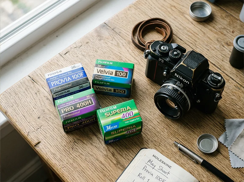
- Each stock below links directly to its Legendary Presets product page, built from actual film scan analysis, not slider approximations
01.
The Quick Reference Table
Film Stock Format Best For Key Character Fujichrome Provia 100F Slide Travel, street, general Neutral, balanced, fine grain Fujichrome Velvia 100 Slide Landscapes, nature Hyper-saturated, deep greens, bold contrast Fujichrome Astia 100F Slide Portraits, fashion Soft contrast, skin-flattering, pastel Fujichrome Fortia SP50 Slide Landscapes, saturated scenes More saturated than Velvia, extremely fine grain Fujichrome Sensia 200 Slide Travel, vintage feel Warm, slightly faded, vintage slide character Fujifilm Superia 100/400/800 Color negative Everyday, street, travel Versatile, slightly cool, fine to medium grain Fujifilm Pro 400H Color negative Portraits, weddings Soft, pastel highlights, exceptional skin latitude Fujifilm Natura 1600 Color negative Low light, nightlife Warm shadows, visible grain, high-speed character Fujifilm Reala 100 Color negative Daylight accuracy Most neutral of all Fuji color negatives Fujifilm Press 800 Color negative Photojournalism, events Gritty, contrasty, high-speed color negative Why Fuji Film Still Matters
Fuji’s color science is loved by photographers from New York street shooters to Tokyo wedding pros. The company’s classic emulsions – Provia 100F, Velvia 50, and Astia 100F – deliver crisp contrast, rich greens, and lifelike skin tones. Even in the age of mirrorless giants like Canon and Sony, many digital shooters try to match the tones that made Fuji film famous. Fujifilm’s unique approach to dyes and development created a palette that digital sensors still struggle to match.
Quick Takeaway: Provia gives you balanced color for everyday scenes. Velvia packs punch for landscapes. Astia stays soft for portraits.
These Fuji stocks are some of the most iconic in analog photography, but they’re part of a much wider world of film emulation. For a full overview of analog film looks you can recreate in Lightroom, check out Legendary Presets breakdown on Analog Film Looks.
02.
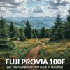
Fujichrome Provia 100F
What it was: Provia 100F was Fuji’s workhorse slide film, the professional all-rounder in a world full of specialists. It sat between Velvia’s punch and Astia’s softness, designed to deliver accurate color across a huge range of subjects without bias toward any particular palette.

Provia 100F: balanced color, accurate rendering, works anywhere. The all-rounder in Fuji’s slide film lineup. What it looks like: Neutral whites, accurate color rendering across the spectrum, medium contrast without the crunch of Velvia. Greens read as true greens, not teal or yellow-olive. Grain is extremely fine, at 100 ISO, you essentially don’t see it in well-exposed frames.
Who shoots it: Travel photographers who need a versatile film for unpredictable conditions. Documentary shooters who don’t want the film to editorialize the scene. Portrait photographers who want a clean base without Astia’s softening effect.
Getting it in Lightroom:
- White balance: keep cool-to-neutral (5,000–5,400K)
- Tone curve: gentle S-curve, not aggressive, the contrast is present but not deep
- HSL Green Hue: +8 toward Aqua, Provia greens are clean, not warm
- HSL Yellow Saturation: reduce slightly (-8 to -12), less golden than Kodak films
- Calibration Blue Primary Hue: +12 to +15, this is what keeps the greens authentic
- Grain: very fine, Amount 15–20 at most
→ Fujichrome Provia 100F Presets
03.
Fujichrome Velvia 100
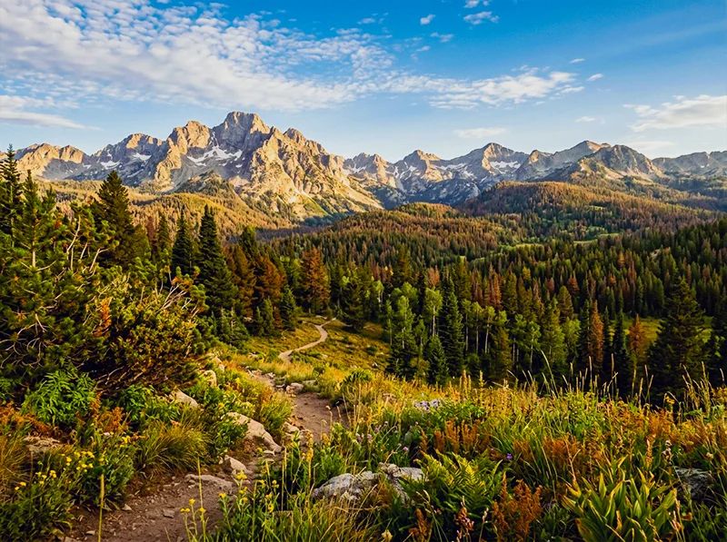
What it was: Velvia was the film you reached for when you wanted nature to look more like itself than it actually did. Fuji engineered it specifically for landscape and nature photographers who needed maximum saturation and color separation. At 100 ISO it was already vivid, at 50 ISO (the original Velvia) it was almost hallucinatory in its richness.
Velvia 100 was built for exactly this: landscape color that goes beyond accuracy into something more dramatic. The green hue shift toward cyan is the defining characteristic. What it looks like: Deep, saturated greens that shift toward cyan. Blues that are genuinely blue. Reds that hold their intensity without clipping. Contrast is high, the darkest shadows go dark and stay dark. Skin tones are not Velvia’s strength; faces can take on an orange warmth that needs correction.
Who shoots it: Landscape and nature photographers, primarily. Wildlife work. Dramatic skies, autumn foliage, tropical color. It’s almost never the right choice for people-focused work unless you want the stylized look deliberately.
Getting it in Lightroom:
- Increase overall saturation (+15 to +20), but do it in HSL, not the global Saturation slider
- HSL Green Hue: +15 to +20 toward Aqua (the Velvia green is distinctly cyan-tinted)
- HSL Green Saturation: +20 to +25, Velvia greens are more saturated than almost any other film
- HSL Blue Hue: -10 toward Aqua, makes sky blues richer and deeper
- HSL Blue Saturation: +15 to +20
- Tone curve: proper S-curve with deeper shadows, Velvia blacks are real blacks
- Calibration Blue Primary Hue: +20, this is the most important control for the Velvia green shift
- Avoid applying Velvia settings to portraits without checking skin tones first
Information gain note: One thing I’ve found in testing Velvia against actual scanned frames: the Velvia green is often imitated by simply pushing Green Saturation high, which results in a flat, oversaturated look. The actual character comes from the hue shift first, pushing greens toward Aqua, and then the saturation boost on top of that. The order matters. If you saturate before you shift the hue, you end up boosting the wrong green.
→ Fujichrome Velvia 100 Presets
04.
Fujichrome Astia 100F
What it was: Astia 100F was Fuji’s answer to a specific professional need: slide film for fashion and portrait photography that didn’t make skin look over-processed. Compared to Velvia, it was a completely different philosophy. The goal was accuracy with flattery, keeping color vivid enough for editorial work while keeping skin transitions smooth and natural.
What it looks like: Soft contrast with more detail held in the highlights than Velvia allows. Colors are present but not aggressive, they describe the scene rather than dramatize it. Skin tones show more detail and less saturation than Provia, making it genuinely the best slide film for portraiture.
Who shoots it: Fashion photographers, editorial portrait work, wedding photographers who want slide film character without the skin-tone risk of Velvia.
Getting it in Lightroom:
- White balance: slightly cooler than daylight (5,000–5,200K), Astia is not a warm film
- Highlight compression: reduce Whites and pull the top of the tone curve down gently, Astia holds highlight detail that Velvia clips
- HSL Red Saturation: reduce slightly (-8 to -12), this is what keeps skin from going orange
- HSL Orange Luminance: increase slightly (+8 to +10), adds skin luminosity without saturation
- Clarity: reduce slightly (-8 to -12), Astia is smooth, not sharp
- Grain: fine grain, Amount 18–22
- Contrast: lower overall than Provia, Astia is the gentlest of the Fuji slide films
→ Fujichrome Astia 100F Presets
05.
Fujichrome Fortia SP50
What it was: Fortia SP50 was Fuji’s limited-release slide film, produced for a short window and discontinued, which has given it an almost mythological status among Fuji enthusiasts. At ISO 50, it was the slowest color film in Fuji’s lineup and the most saturated. Even more so than Velvia.
What it looks like: Color saturation beyond what most digital photographers expect from film. Reds are deep and warm. Greens are vivid with a slight warm bias (unlike Velvia’s cooler green). Blues are strong. The extremely fine grain at ISO 50 gives images an almost medium-format smoothness at 35mm.
Who shoots it: Landscape work primarily, but also still life and product photography where maximum color depth matters. It’s a deliberate, considered choice, you don’t reach for Fortia when you need speed.
Getting it in Lightroom:
- Push saturation higher than Velvia, this is a more extreme look
- HSL Green Hue: +10 toward Aqua, but less shift than Velvia, Fortia greens read warmer
- HSL Red Saturation: +20 to +25, the red richness is one of Fortia’s signatures
- HSL Blue Saturation: +20
- Tone curve: deep S-curve, proper black point
- Grain: minimal, at ISO 50 Fortia had almost no visible grain
- This is not a subtle preset; it’s a deliberate stylistic statement
→ Fujichrome Fortia SP50 Presets
06.
Fujichrome Sensia 200
What it was: Sensia 200 was Fuji’s consumer slide film, positioned below Provia in the professional range and designed for the photographer who wanted slide film quality at a slightly lower cost. At ISO 200 it offered more flexibility in mixed light than the ISO 100 slide films, with a slightly warmer rendering that gave it a vintage travel photo quality.
What it looks like: Slightly warmer than Provia, with a faint golden cast in the highlights and a tendency toward slightly faded shadows, not Kodak-warm, but less neutral than Provia. The vintage travel aesthetic people associate with slide film from the 1990s is closer to Sensia than to Velvia.
Who shoots it: Travel photography with a nostalgic angle. Street work where you want warmth without the intensity of Kodak. Film collectors who appreciate the “found roll” aesthetic that Sensia produces in slightly expired condition.
Getting it in Lightroom:
- White balance: slightly warmer than Provia (5,400–5,600K)
- Lift the shadows very slightly, Sensia doesn’t go as deep as Velvia
- HSL Yellow Hue: -5 toward Green, keeps warmth from going orange
- HSL Green Hue: +5 toward Aqua, less aggressive than Velvia
- Add slight warm split tone to shadows (orange-amber, Saturation 8–12)
- Grain: medium fine, Amount 20–28, more visible than Provia at ISO 200
→ Fujichrome Sensia 200 Presets
07.
Fujifilm Superia 100 / 400 / 800
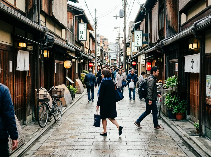
What it was: The Superia range was Fuji’s consumer color negative lineup, the film in the yellow boxes at every camera shop. What made it interesting for serious photographers was its consistency and its Fuji-characteristic neutrality. Unlike Kodak Gold, which pushed warmth, Superia stayed relatively cool and accurate, making it versatile across almost any light condition.
What it looks like: The cooler, cleaner side of color negative film. Less warm than Kodak Gold or Ultramax. Greens read as neutral-cool rather than yellow-olive. Skin tones are accurate without heavy flattery. At ISO 400 and 800, grain becomes more visible and adds a gritty texture to street and travel work.
Who shoots it: Street photographers. Travel shooters who want film character without heavy stylization. Photographers who use film for documentary accuracy rather than aesthetic warmth.
Getting it in Lightroom:
- White balance: cool-neutral (5,000–5,200K)
- Shadows: slight lift, color negatives don’t clip blacks as hard as slide films
- HSL Green Hue: +10 toward Aqua, Superia greens lean cool
- HSL Yellow Saturation: reduce (-10 to -15), less golden than Kodak consumer films
- Grain: Amount 25–30 at ISO 400, 35–45 at ISO 800, visible but not coarse
- Color negative films have more exposure latitude, don’t add aggressive tone curve contrast
→ Fujifilm Superia 100 Presets · Superia X-Tra 400 Presets · Superia X-Tra 800 Presets
08.
Fujifilm Pro 400H
What it was: Pro 400H was the film that wedding and portrait photographers reached for when they needed to shoot all day in unpredictable light and have the negatives look beautiful at every exposure. Fuji designed it with exceptional skin tone latitude, meaning skin looked good whether you shot at box speed or pushed it two stops in bright outdoor conditions. It was discontinued in 2021, which hit the portrait photography world harder than almost any other discontinuation.
Pro 400H: the portrait photographer’s color negative. Soft highlight compression and exceptional skin latitude made it the most-missed discontinued Fuji film. What it looks like: Soft, pastel highlights that compress beautifully rather than clipping. Skin tones that read clean and natural under almost any light. A slight coolness in the shadows that keeps images from going muddy. The overall character is refined, not dramatic, not aggressive, just beautifully controlled.
Who shoots it: Wedding photographers. Natural light portrait photographers. Lifestyle and editorial work where the subject is people and the light is outdoors or window-lit.
Getting it in Lightroom:
- White balance: neutral to slightly cool (5,200–5,500K), Pro 400H was not a warm film
- Highlights: compress them, reduce Whites and pull the top of the tone curve down. The soft highlight roll-off is Pro 400H’s most distinctive trait
- Shadows: slight lift (+15 to +20 on the Blacks slider or tone curve toe), Pro 400H never went truly dark
- HSL Red Saturation: -8 to -12, keeps skin from oversaturating
- HSL Orange Luminance: +8 to +10, adds skin luminosity
- HSL Green Hue: +8 toward Aqua
- Clarity: -10 to -15, softness is part of this film’s character
- Grain: fine, Amount 18–22 at ISO 400
Personal note: Pro 400H was the first film I genuinely missed after its discontinuation. I’ve shot more portrait sessions on Pro 400H than any other film. The thing that presets can capture is the highlight compression and the skin tone character, but what they can’t replicate is how it felt to actually shoot at f/2.8 in window light knowing the negatives would forgive almost any small exposure mistake. That kind of latitude is a confidence thing, and presets give you a version of it.
09.
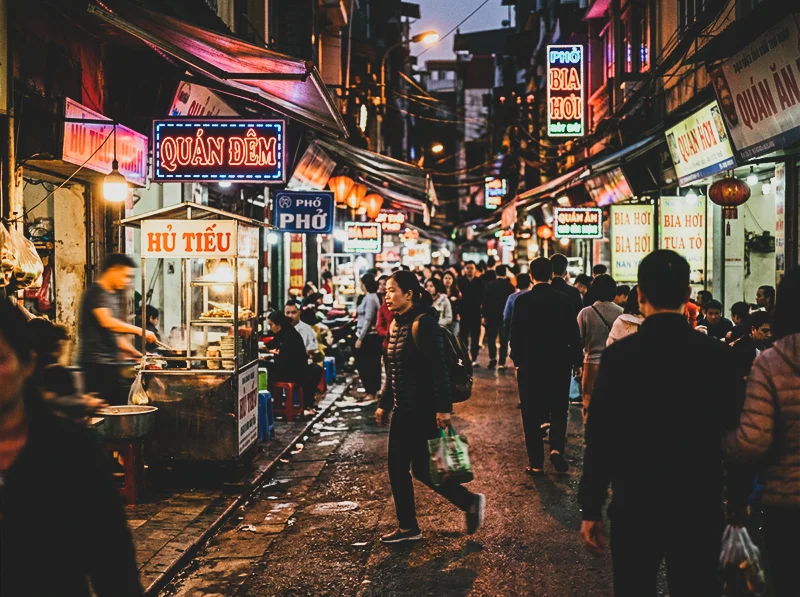
Fujifilm Natura 1600
What it was: Natura 1600 was Fuji’s high-speed consumer film, designed specifically for low-light and indoor photography without flash. It was sold primarily in Japan and was unusual in that it used a four-layer emulsion (adding a fourth color layer to improve color fidelity at high ISO), a technology Fuji called Super Fujicolor.
Natura 1600 was designed for conditions like this: mixed artificial light, high speed, and grain that adds atmosphere rather than noise. What it looks like: Warm shadows with visible grain that feels atmospheric rather than harsh. The grain structure at ISO 1600 is coarser than anything else in Fuji’s lineup but has a quality that high-ISO digital grain doesn’t replicate. Highlights can be slightly warm. Colors are not as clean as Superia, there’s a slight haziness to the rendering that works perfectly for nightlife, concerts, and indoor candid work.
Who shoots it: Nightlife and event photographers. Street photographers who shoot after dark. Anyone wanting the feel of pushed film without the exposure headaches of actually pushing.
Getting it in Lightroom:
- Warm the shadows in split toning (orange-amber, Saturation 12–18)
- Add significant grain, Amount 45–55, Roughness 55–65
- Allow slight highlight warmth, don’t correct it
- Reduce overall clarity (-12 to -18), Natura had a slight softness from the grain
- Lower Blacks slightly to keep the high-ISO gritty feel
- This film doesn’t suit clean, bright scenes, it’s built for low light
→ Fujifilm Natura 1600 Presets
10.
Fujifilm Reala 100
What it was: Reala 100 was Fuji’s attempt at the most color-accurate negative film they could produce. It used a fourth color layer (before Natura 1600 adopted the same technology) specifically designed to improve the rendering of greens and avoid the metamerism problems that caused other films to struggle in mixed artificial light. The result was the most neutral, accurate color negative film Fuji ever made.
What it looks like: Extremely neutral color rendering, less warm than Superia, less cool than Pro 400H. Greens are accurate without the cyan shift of other Fuji films. Skin tones read very true to life. It’s a film that gets out of the way of the scene and just records it, which is either its strength or its weakness depending on what you want from film photography.
Who shoots it: Documentary and photojournalism work where accuracy matters over aesthetic. Portrait photographers working in mixed artificial light, where other films tend to go green or magenta. Architectural photographers who need color fidelity.
Getting it in Lightroom:
- White balance: accurate to the scene, don’t compensate
- HSL Green Hue: minimal shift (+5 at most), Reala’s greens are already accurate
- HSL Green Saturation: keep moderate, don’t add Velvia-style boost
- Tone curve: gentle S-curve only, Reala had medium contrast, not dramatic
- Grain: very fine, Amount 15–18, Reala at ISO 100 was exceptionally clean
- The goal is accuracy, not stylization, resist the urge to push sliders
11.
Fujifilm Press 800
What it was: Press 800 was designed for photojournalists. Speed, reliability, and the ability to handle fluorescent and mixed artificial light without going green, those were the requirements. It wasn’t designed to be beautiful in a conventional sense. It was designed to work, fast, in any light.
What it looks like: Grittier than Superia. More contrast. Grain that has presence rather than delicacy. Colors are punchy rather than refined, this film has an edge to it. In good light it produces vivid, saturated images; in difficult light it holds color better than you’d expect for an ISO 800 film.
Who shoots it: Documentary photographers. Event photographers shooting in mixed light. Street photographers who want the gritty aesthetic of a fast film without pushing a slower stock.
Getting it in Lightroom:
- Add contrast, Press 800 had more midtone punch than Superia
- Grain: Amount 35–45, Roughness 50–60, visible and characteristic
- Boost overall saturation slightly (+8 to +12), this film was punchy
- HSL Green Saturation: +10 to +12, Press 800 greens were slightly warmer than Superia
- Shadows: keep them deep, don’t lift too much
- This is a grittier, more editorial character than the Pro film range
12.
How to Choose the Right Fuji Stock for Your Work
If you’re shooting… Start with… Why Landscapes, nature, dramatic color Velvia 100 or Fortia SP50 Maximum saturation and color depth Travel with a vintage feel Sensia 200 or Superia 400 Warm character and versatile speed Portraits in natural light Pro 400H or Astia 100F Skin latitude and soft highlights Weddings, all-day shooting Pro 400H Exposure latitude and consistent skin tones Street photography Superia 400 or Press 800 Speed and gritty character General all-round work Provia 100F Neutral, accurate, works everywhere Low light and night scenes Natura 1600 Built for exactly this condition Documentary accuracy Reala 100 Most color-accurate film Fuji made 13.
One Technical Thing Most Guides Miss
Every guide to Fuji film looks in Lightroom will tell you to use the HSL panel. That’s true but incomplete.
The HSL panel adjusts how existing colors appear in your image. The Calibration panel adjusts how your camera’s RAW file interprets color at a more fundamental level, before HSL has any input.
For Fuji-style greens specifically, the most reliable approach is:
- Open the Calibration panel (at the bottom of the Develop panel list)
- Set Blue Primary Hue between +10 and +25 depending on the stock
- Then adjust Green Hue in HSL on top of that
This two-stage approach produces the clean, slightly cyan-shifted Fuji green that a single HSL adjustment never quite nails. The difference is especially visible in foliage and grass, it shifts from a yellow-olive cast to the cooler, more separated Fuji green character.
For a full breakdown of this technique, see How to Get Fuji Film Greens in Lightroom.
14.
FAQ
What’s the difference between Fujichrome slide films and Fujifilm color negative films?
Slide films (Provia, Velvia, Astia, Fortia, Sensia) produce a direct positive image, they’re scanned or projected as-is and have higher contrast and less exposure latitude. Color negative films (Superia, Pro 400H, Natura, Reala, Press 800) produce a negative that gets printed or scanned with more flexibility. In Lightroom terms, slide film presets need more contrast and less shadow lift; color negative presets should have gentler contrast curves and more lifted blacks.
Can I use Fuji film presets on non-Fuji cameras?
Yes, and this is the most common use case. The HSL and Calibration panel adjustments in any Fuji preset work on RAW files from Sony, Nikon, Canon, or any other camera. The starting color response is different because sensors vary, but the same principles apply. If you’re on a Fuji X-Trans camera, you may need slightly different calibration settings because Lightroom interprets X-Trans files differently from Bayer sensors.
Which Fuji film is best for portraits?
Pro 400H and Astia 100F are the two strongest choices, for different reasons. Pro 400H (color negative) is the most forgiving and produces the softest, most flattering skin tones. Astia 100F (slide film) is the portrait slide film, it keeps color accuracy but softens contrast more than Provia or Velvia. For most natural light portrait work, Pro 400H is the better choice. For editorial work where you need more color presence, Astia is the right slide film.
Is Velvia too saturated to use for everyday photography?
For most everyday subjects, yes. Velvia was designed for landscape and nature work where maximum color depth is an asset. On people, urban scenes with mixed colors, or any subject where color accuracy matters, Velvia’s aggressive saturation creates problems. Use Provia or Superia for everyday work and keep Velvia for scenes where you specifically want that heightened, dramatic color response.
Where do I start if I’ve never used Fuji film presets before?
Provia 100F is the safest entry point, it’s neutral, balanced, and works across a huge range of subjects and conditions. Apply it to a variety of images first to understand how the Fuji color character differs from your default editing style, then move into the more specialized stocks from there.
Film photography produced some of the most distinctive color palettes in the history of the medium, explore our Lightroom film presets and bring those palettes back to your digital shots.
Related Reading
- Fuji vs Kodak Color Science in Lightroom, How the two color systems differ technically and which one suits your shooting style
- How to Get Fuji Film Greens in Lightroom, Deep dive on the Calibration panel technique for authentic Fuji green rendering
- Fuji Lightroom Presets for Portrait Photographers, Portrait-specific guidance across the Fuji range
- How to Recreate Fuji Velvia-Style for Travel Photography, Velvia technique for landscape and travel work
- Realistic Film Grain Without Losing Detail in Lightroom, Getting grain right for each film stock
Richard is a commercial and editorial photographer with over 15 years behind the lens. He’s shot on film and digital across three continents, and still keeps a Nikon F3 loaded with Kodak Portra on his desk. At LegendaryPresets, he leads preset development – studying actual film scans to make sure every stock behaves like the real thing.