Home | Articles | Analog Film
Fuji vs Kodak Color Science in Lightroom: Which Look Should You Be Using?
Richard ♦ updated June 15, 2026 ♦ 13 min read

The short answer: Fuji runs cooler, cleaner, and more controlled. Kodak runs warmer, punchier, and more emotionally driven. Which one you need depends almost entirely on your subject and your lighting, not on brand loyalty or gear.
That said, the difference between these two color palettes goes a lot deeper than “cool vs. warm.” After years spent studying actual film scans to build the preset range at Legendary Presets, I’ve learned that the real distinction shows up in three very specific places: how greens shift, how skin handles midtone transitions, and how highlights roll off into white. Get those three things right and the rest of the look falls into place.
This guide breaks down both color systems the way they actually matter in Lightroom, with practical slider values, real use cases, and a clear recommendation for each shooting scenario. No vague generalities, just what you actually need to choose the right look.
Key Takeaways
- Fuji color science = cooler neutrals, cleaner greens, smooth highlight roll-off, skin that reads pink-neutral
- Kodak color science = warm midtones, amber-gold skin, richer reds and yellows, shadows with more body
- The biggest technical difference between the two is in the Calibration panel, specifically Blue Primary Hue and Red Primary Saturation
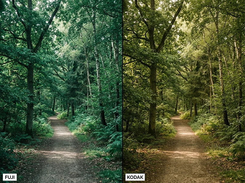
- Fuji-style greens shift toward teal/cyan; Kodak-style greens shift toward yellow-olive
- For portraits: Kodak is more flattering under warm light; Fuji is more accurate under daylight
- For landscapes and street: Fuji wins on separation; Kodak wins on mood
- A preset built on actual film scans (not just slider guesswork) will handle the hard work, the Legendary Presets Fuji collection and Kodak collection are built from real stock analysis, not imitation
01.
What “Color Science” Actually Means (And Why It Matters Here)
Color science is not a marketing term. It refers to how a film or sensor handles the relationship between hue, saturation, and luminance across the tonal range. Fuji and Kodak built their emulsions with very different priorities, and those decisions translate directly into how Lightroom edits look when you’re chasing either aesthetic.

The Calibration panel is where Fuji and Kodak color science differ most in Lightroom, and it’s the one most editors skip. Fuji designed its color negative films, Superia, Pro 400H, Natura 1600,around daylight accuracy and neutral color reproduction. The goal was to record scenes as they actually were. That engineering choice shows up as:
- Cooler whites that don’t take on a yellow cast in highlights
- Less aggressive saturation in yellows and reds
- Shadows that stay cool and clean rather than warm and heavy
Kodak designed its consumer and professional films, Gold 200, Portra, Ektar, around emotional warmth and skin tone flattery. The goal was to make subjects look good, not just accurate. Portra 400 became the world’s best-selling professional film largely because it made skin look beautiful in almost any light. That engineering bias shows up as:light
- Richer reds and deeper yellows throughout the tonal ran
- Warmer midtones that lean golden even under neutral dayge
- Highlight roll-off that feels amber before it clips to white
When you’re editing in Lightroom and trying to achieve either look, you’re not just applying “warmth” or “coolness.” You’re trying to recreate specific relationships between color channels that took both companies decades to refine. That’s why a single Temperature slider never gets you there, and why the Calibration panel matters more than most tutorials admit.
02.
The Three Technical Differences That Matter Most
Most articles about Fuji vs Kodak color science stay at the surface, “Fuji is cool, Kodak is warm.” That’s accurate but not useful. Here’s where the difference actually lives in Lightroom.
Green hue is the most visible difference between Fuji and Kodak color systems. Fuji shifts greens toward teal; Kodak lets them go warm and yellow-olive. 1. The Calibration Panel (the one most editors skip)
This is the most underused panel in Lightroom and the most important one for film emulation. The Calibration panel controls how your camera’s raw file interprets color at a fundamental level, before HSL even touches it.
For a Fuji-style look:
- Blue Primary Hue: push toward +15 to +25 (shifts greens cooler, away from yellow)
- Red Primary Saturation: pull back slightly (-5 to -10), softens skin warmth
- Green Primary Hue: slight nudge toward +5 to +10 (keeps foliage clean)
For a Kodak-style look:
- Red Primary Hue: push slightly toward orange (+5 to +10)
- Red Primary Saturation: increase slightly (+10 to +15), deepens skin warmth
- Blue Primary Hue: pull toward neutral or slight negative (allows greens to read warmer)
I’ve found that most preset builders skip the Calibration panel entirely and try to compensate in HSL. The problem is that HSL adjustments apply globally, they don’t respect how adjacent hues interact the way the Calibration panel does. A Fuji green that’s built from Calibration panel adjustments looks cleaner than one built from HSL alone. You can see the difference immediately in foliage and clothing.
2. The Tone Curve Shape
Fuji’s tone curve tends to be gentler in the shadows, with a slight lift at the toe, this is why Fuji-style images never feel truly black in the shadows, they stay a little airy. Kodak’s curve typically has more contrast in the midtones, with shadows that feel heavier and more grounded.
In Lightroom’s tone curve, approximate it this way:
Fuji-style curve:
- Lift the black point slightly (drag the bottom-left corner in about 5 units)
- Keep the midtone anchor at or slightly below center
- Let highlights compress gently toward the top
Kodak-style curve:
- Keep blacks deeper (don’t lift the black point)
- Raise midtones slightly (+5 to +10 from center)
- The contrast should feel present but not harsh
3. HSL Panel: Greens and Yellows
This is where the visible difference is most obvious to viewers.
HSL Slider Fuji Look Kodak Look Green Hue Push toward Aqua (+10 to +20) Leave neutral or push toward Yellow (+5) Green Saturation Slight reduction (-5 to -10) Slight boost (+5 to +10) Yellow Hue Pull toward Green (-10 to -15) Leave neutral or push toward Orange (+5) Yellow Saturation Reduce noticeably (-15 to -20) Boost lightly (+5) Red Saturation Keep moderate (0 to -5) Boost (+10 to +15) The Yellow Saturation reduction is specifically a Fuji signature. Real Fuji films show less aggressive yellow, it’s part of why Fuji landscapes look cleaner and less “golden” than Kodak ones.
03.
Fuji Color Science: What It Looks Like in Practice
The mood: Controlled, accurate, modern. A Fuji-style image feels like you were there, it doesn’t editorialize.
Where it shines:
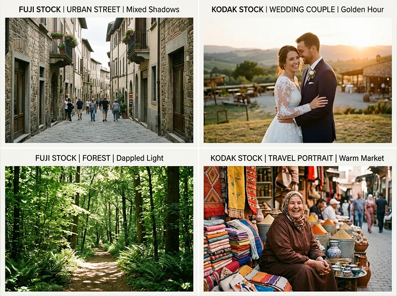
- Street photography in mixed light (Fuji handles the unpredictable color temperature of city scenes without turning everything orange)
- Forest and woodland landscapes (the cooler greens separate beautifully from shadows)
- Daylight portraits where accuracy matters more than flattery
- Editorial and fashion work where skin needs to stay neutral
The stocks it draws from: Fujifilm Pro 400H for portraits, Velvia 100 for saturated landscapes, Superia 100 for clean everyday shooting, Reala 100 for the most neutral daylight response of any color negative film Fuji made.
What people get wrong: Over-brightening. A Fuji-style image should feel light without feeling washed. The highlights stay controlled, that’s intentional. If you’re lifting exposure too aggressively, you’re fighting the look.
For a deep dive into the green-handling specifically, see How to Get Fuji Film Greens in Lightroom, it covers the specific HSL and Calibration moves that separate real Fuji greens from imitations.
04.
Skin Tones: The Real-World Comparison
This is the question portrait photographers care about most.
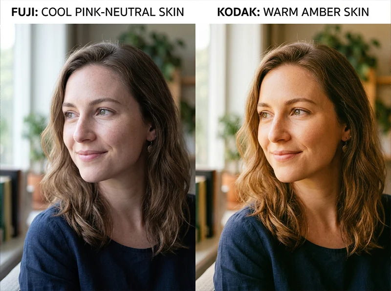
Fuji keeps skin neutral and accurate. Kodak adds warmth that most portrait clients read as flattering. Neither is wrong, they serve different purposes. Fuji skin under daylight: Reads pink-to-neutral. Accurate to the actual skin tone. Doesn’t add warmth that isn’t there. Works beautifully for fair to medium skin in clean light.
Kodak skin under daylight: Reads amber-warm. Slightly flattering. The warmth feels natural because it mimics what golden-hour light does to skin, even when the light is actually neutral.
Fuji skin under warm light: Can feel slightly cool, which some photographers correct with a white balance nudge toward warmth. This is intentional to the film, Fuji wasn’t trying to compensate for light color, it was trying to record it accurately.
Kodak skin under warm light: This is where Kodak was engineered to thrive. Portra 400 in warm light produces skin that looks almost impossibly good without much intervention. It’s why wedding photographers reach for Kodak by default.
The practical rule I use: if the light is doing the warmth for you, use Fuji, it won’t fight the scene. If the light is flat or cool and you need the image to feel warm, Kodak will do that heavy lifting.
05.
Highlights and Shadows: The Differences That Decide the Vibe
Fuji highlights: Compress gently into white without taking on a yellow or orange cast. You get clean, soft blown highlights that don’t feel harsh. This is the “airy” quality people associate with Fuji, it’s not about exposure, it’s about how the highlights roll off.
Kodak highlights: Retain warmth longer before blowing. This is why sunset shots with Kodak color look golden even in the blown areas, the highlights have a slight amber bias before they clip. It’s beautiful in the right scene and problematic in harsh midday light.
Fuji shadows: Stay cool and lean toward blue-gray. This creates good separation from the warmer midtones and makes Fuji-style images feel “clean” rather than moody.
Kodak shadows: Carry warmth further down the tonal range. Shadows lean brown-gray rather than blue-gray. This is what gives Kodak-style images their cinematic depth, but it can also muddy the blacks if you push it too far in Lightroom.
For managing highlights without clipping in either style, the Whites slider and highlight-specific tone curve adjustments matter more than the Highlights slider, the Highlights slider often introduces unwanted hue shifts in the recovery zone.
Fuji handles clean scenes better. Kodak handles emotional ones. The light in your scene usually tells you which to reach for first. 06.
Which One Should You Use? (Practical Scenarios)
Shooting Scenario Better Choice Why Street photography, urban scenes Fuji Handles mixed light and urban greens without going orange Weddings and couples Kodak Warm skin tones read as romantic; flatters in almost any light Forest and woodland landscapes Fuji Cleaner green separation from shadows Golden hour portraits Kodak Warm highlight bias is already in the right direction Fashion and editorial Fuji Neutral skin keeps color story in the clothes, not the face Travel in warm climates Kodak Warmth matches the environmental color palette Documentary and lifestyle Fuji Accuracy over emotionality Architectural interiors Fuji Clean neutrals, no false warmth on walls The one scenario where this framework breaks down: low light and high ISO work. In those conditions, both systems face grain and color noise challenges that override the underlying color science. That’s a different problem than which film palette to choose.
07.
A Personal Note on Switching Between the Two
I shot a commercial job last spring, half of it was an outdoor portrait series under flat overcast light, the other half was a golden-hour lifestyle sequence at the same location. I used the same RAW files for both.
Same location, same day, two color systems. The light tells you which one to reach for. For the overcast portraits, a Fuji Pro 400H-based preset kept the skin tones from going gray (overcast light tends to desaturate skin fast) while keeping the background foliage accurate and clean. The images looked natural and editorial.
For the golden-hour sequence, I switched to Kodak Portra 400 as the starting point. The warm highlight bias meant I barely touched the temperature slider, the light was already doing the Kodak thing and the preset just reinforced it.
Same location, same day, two completely different color approaches, and both worked because I was matching the color system to the light, not picking a favorite and sticking to it.
That’s the shift in thinking that makes the difference between photographers who use film presets and photographers who really understand them.
Whether you shoot portraits, travel, street, or landscape, there is a film stock in our film preset library built for your subject and your light.
08.
What is the difference between Fuji and Kodak color science?
Fuji color science produces cooler whites, cleaner greens that shift toward teal, and softer highlight roll-off with neutral-pink skin tones. Kodak color science produces warmer midtones, richer reds and yellows, amber-warm skin tones, and highlights with a slight golden bias.
In Lightroom, the most important controls for recreating either look are the Calibration panel (Blue Primary Hue and Red Primary Saturation), the HSL panel (Green Hue, Yellow Saturation), and the tone curve shape. Fuji suits street, editorial, and daylight portrait work. Kodak suits weddings, golden-hour portraits, and cinematic travel editing.
09.
FAQ
Can I recreate Fuji and Kodak color science on a non-Fuji, non-Kodak camera?
Yes, and this is the most common use case. The Calibration panel adjustments and HSL moves work on RAW files from any camera because they modify how Lightroom interprets the raw data, not the data itself. The camera model affects the starting point (different sensors render color differently), but the principles apply universally.
If you’re using presets built on camera-specific profiles, check whether the preset includes a camera profile setting, that affects the starting color response before any slider values apply.
Is one style better for social media?
Kodak-warm images tend to perform better on platforms like Instagram where warmth is the dominant aesthetic. Fuji-clean images work better for portfolio and editorial contexts where clients want to see accurate color. Neither is objectively better, it depends on what your audience expects to see.
Why do some Fuji presets look completely different from each other?
Because “Fuji” covers wildly different film stocks. Velvia 100 is one of the most saturated color films ever made, it’s nothing like the soft, desaturated look of Fuji Pro 400H. If a Fuji preset looks nothing like what you expected, you’re probably comparing the wrong stock. The guide to iconic Fuji film looks breaks down which Fuji stock does what.
What’s the fastest way to build a Kodak look from scratch in Lightroom?
Start with white balance around 5,500K, lift midtones slightly on the tone curve, increase Red Saturation in HSL by +10 to +15, pull Yellow Hue toward orange by +5, and add a very slight warm tint in the shadows via split toning. That’s the skeleton of a Kodak-style edit. From there, the Calibration panel refinements are what separate a rough approximation from a convincing one.
Do these techniques work in Lightroom Mobile?
Yes. Lightroom Mobile has the same HSL and tone curve panels, and the Calibration panel is available in the mobile version as well (under Color Mixer and then camera calibration). The experience is less precise on a small screen, but the same slider logic applies.
10.
Where to Start With Presets
If you want a fast starting point for either look rather than building from scratch, the Fuji presets collection covers the full range of Fuji stocks, from Velvia 100 for saturated landscapes to Pro 400H for soft portrait work. The Kodak presets collection covers everything from Portra 160 through Gold 200 and Ektar 100, each built from actual film scan analysis.
Both are useful as a starting point for understanding how each color system behaves on your specific camera, you apply the preset, see how it responds to your RAW files, and use that as a baseline for the manual adjustments above.
Related reading:
- How to Get Fuji Film Greens in Lightroom
- Guide to Iconic Fuji Film Looks: Provia, Velvia and Beyond
- Fuji vs Kodak Lightroom Presets: Which Look is Right for You
- Realistic Film Grain Without Losing Detail in Lightroom
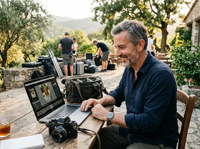
Richard is a commercial and editorial photographer with over 15 years behind the lens. He’s shot on film and digital across three continents, and still keeps a Nikon F3 loaded with Kodak Portra on his desk. At LegendaryPresets, he leads preset development – studying actual film scans to make sure every stock behaves like the real thing.