Home | Articles | Analog Film
Step-by-Step Lightroom Workflow for High-Saturation Film Looks
Richard ♦ updated June 14, 2026 ♦ 14 min read
High-saturation film looks are not about pushing sliders until the colors scream. The films that defined this aesthetic achieve their punch through selective color behavior, targeted by channel, never global.
The difference between a great film edit and a bad Instagram filter is the order of operations. At Legendary Presets, every profile is built from actual film scans, and the sequence below is what makes them work. The Kodak Ektar 100 preset is a good reference point, apply it alongside a real Ektar scan and you can see exactly what each channel is doing.
The six steps, in order:
- Nail exposure before you touch color
- Shape contrast with the tone curve
- Drop Red/Orange Luminance to protect highlights before saturation
- Adjust color with HSL, not the global Saturation slider
- Check highlights again after saturation and pull back if needed
- Add grain last
Key Takeaways
- Shape contrast with the tone curve before you touch any color slider, this is the most commonly skipped step
- Use HSL for color, not the global Saturation slider, film never treats all hues equally
- Protect highlights before boosting saturation, or you’ll clip before you’ve finished
- Clipped highlights cannot be recovered after export, catch them in the histogram first
- Add grain after your tone and color work is done, not before, it changes behavior when placed before the curve
- Vibrance (+10 to +20) is safer than Saturation for broad color lifts; keep global Saturation at 0 or negative
01.
What High-Saturation Film Stocks Actually Do
Before touching Lightroom, understand what these films actually do to color, because “high saturation” is not one thing:
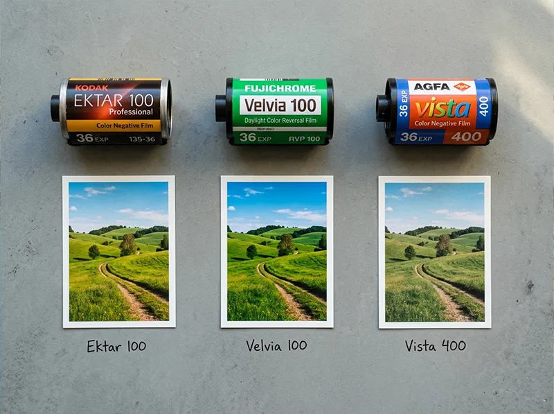
- Kodak Ektar 100 (C-41 negative): Pushes reds and blues hard, holds orange back deliberately. Fine grain, narrower latitude than Portra. Built for landscapes and travel, not skin.
- Fujichrome Velvia 100 (E-6 slide): Extreme greens and yellows, high contrast, tighter color layers than any negative film. Clips faster, latitude is genuinely narrow.
- Agfa Vista 400 (C-41 negative): Looser, grainier structure. Shifts magenta into shadows, lifts greens. The grain is part of the look.

Three film stocks, three approaches to saturation. Ektar pushes reds and blues. Velvia goes heavy on greens and yellows. Vista adds grain and a magenta shadow cast. Each film achieves saturation through a different mechanism. Applying the same HSL values to all three produces generic results. The workflow below models each film’s specific behavior.
For a full breakdown of Ektar’s color science and how it compares to Portra or Gold, see the Kodak Ektar 100 Lightroom preset guide.
02.
The Workflow: Six Steps in the Right Order
Step 1: Nail Your Exposure Before You Touch Color
This is the step most photographers skip because they plan to fix it in Lightroom. But with high-saturation editing, overexposure creates a problem you genuinely cannot fix later: clipped highlights.
When bright colors, especially reds and yellows, clip, they lose all luminance detail. Once those values max out, no amount of Highlights recovery brings them back, because there’s no data left to recover. This is true of any file after export, and it’s true in-camera above a certain point even with RAW.
Check your histogram before you edit. You want the rightmost peaks sitting just below the right wall, not kissing it, and not spilling over. If your original file has blown highlights, pull Exposure down first, then bring Shadows up to compensate. This sets you up for everything that follows.
Practical check: In Lightroom, press
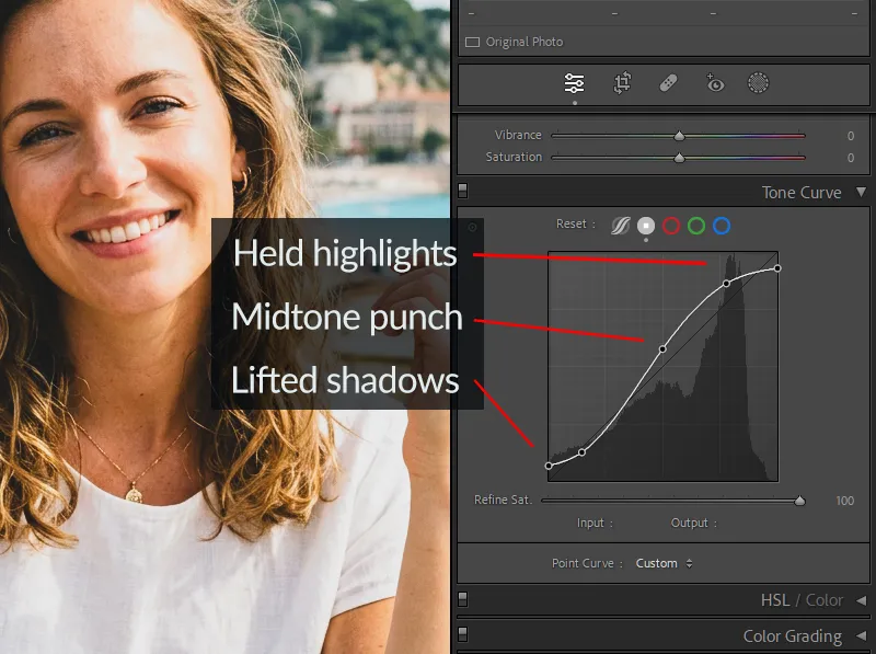
Jto toggle the highlight clipping overlay. Any red areas in your image are already lost. Fix them before moving forward, or accept that the blown areas will look worse once saturation goes up.Skip the Contrast slider. The Point Curve gives you control over where contrast sits, which matters once you start pushing color in the HSL panel. Step 2: Shape the Tone Curve Before Saturation
Skip the Contrast slider. Use the Point Curve instead, it gives you real control over where the contrast sits.
For a film-accurate high-saturation look, you want:
- Lift the black point by raising the bottom-left anchor point 8–12 units. This opens shadows slightly, the way negative film handles underexposed areas, you don’t get crushed black, you get dark grey with detail.
- Gentle S-curve in the midtones – a small pull up on the upper-left midtone area and a slight pull down on the lower-right midtone. This is a subtle contrast lift, not a dramatic swing.
- Keep highlights from clipping – the top-right anchor point should stay put or be pulled inward very slightly. Film compresses highlights gradually; digital clips suddenly. You’re trying to mimic the film behavior.
Why do this before color? Because the tone curve changes the relationship between luminance and saturation. A color that reads as a vivid red at normal contrast becomes over-saturated and heavy once you increase contrast. Tone first means your color adjustments are accurate to the final tonal range.
Step 3: Protect Highlights – HSL Luminance Before Saturation
Before you add any saturation, spend 60 seconds in the HSL panel checking your brightest colors. This is the highlight-protection step that most tutorials fold into saturation work, which is the wrong order.
The most common clipping problem in high-saturation editing is red and orange luminance. When you boost Red Saturation, the bright areas of red subjects, flowers, clothing, brick walls, sunsets, can push luminance over the ceiling and clip visibly.
Pre-saturation HSL moves:
- Red Luminance: Drop by -5 to -10 if you have any bright red subjects. This pulls the channel below clipping before you boost its saturation.
- Orange Luminance: Drop by -5 if you have skin in the frame. Same principle, you’re creating headroom before the saturation push.
- Yellow Luminance: Drop by -5 to -8 if you have bright foliage or clothing in yellow-green territory.
Think of this as making space. You’re not changing the color yet, you’re lowering the ceiling on the channels most likely to blow.
Step 4: HSL Color Adjustments by Film Stock
Now you add color, but not globally. The Saturation slider in the Basic panel treats every hue identically. Film never does that. Here’s how to approach it by target look:
For the Kodak Ektar 100 look (punchy reds, deep blues, sharp greens):
Channel Hue Saturation Luminance Red 0 +18 to +25 -8 to -10 (already adjusted above) Orange 0 -5 to -8 -5 (skin protection) Yellow -5 +5 -5 Green -5 +5 0 Aqua 0 +8 -8 Blue 0 +10 to +12 -12 to -15 For the Fujichrome Velvia 100 look (extreme greens and yellows, vivid sky):
Channel Hue Saturation Luminance Yellow -8 +20 to +28 0 Green -8 +20 to +25 -5 Aqua +5 +15 -10 Blue 0 +15 to +20 -15 Red 0 +10 -5 For the Agfa Vista 400 look (lifted grain, warm-magenta shadows, vivid but slightly faded):
Channel Hue Saturation Luminance Red +5 +10 0 Orange +5 +5 +5 Green +8 +8 +5 Blue -5 +8 -8 For the Vista 400 approach, you’ll also want to add a slight magenta-to-shadow Color Grade (Shadows: Magenta +8–12) to match the film’s characteristic shadow shift. See the Agfa Vista 400 preset for a calibrated reference.
Global panel: With the targeted HSL work done, you can safely add Vibrance +10 to +20 in the Basic panel. Keep Saturation at 0 or -3. The Vibrance slider lifts less-saturated colors while protecting already-saturated ones, closer to how film selectively boosts color than the blunt Saturation slider.
Step 5: Check Highlights Again – Then Lock Them
After saturation, check your histogram one more time. Boosting Red and Blue Saturation in the HSL panel can push channels that were clean before over the edge. If you see new clipping:
- Pull Highlights down -15 to -30 in the Basic panel
- Pull Whites down -5 to -15
- Use a Luminance masking brush on specific blown areas if the global controls are affecting too much of the image
The Highlights and Whites sliders in Lightroom recover data in bright areas without touching midtones. For a high-saturation edit where you’ve done real work in the midtones and shadows, these sliders are surgical, use them to catch clipping without undoing the contrast and color lift you’ve built.
For bright outdoor scenes with complex highlights, clouds, water, glass, the Masking panel’s Luminance Range tool (Range > 200+) lets you create a mask that targets only the brightest areas. Lower exposure locally on that mask by -0.3 to -0.5. It’s more precise than a global Highlights pull and won’t dull your midtones.
Step 6: Add Grain Last
Grain belongs at the end of the process. This is not just convention, there’s a functional reason.
Grain added before your tone curve gets modified by that curve when it renders. The shadow-to-midtone grain gets compressed; the highlight grain gets stretched. The result doesn’t match how film grain actually distributes across a frame. Add grain after all your tonal and color work is done and it applies over the finished image, which is closer to how a film emulsion layers silver halide grain over the developed image.
Film-accurate grain settings by stock:
Film Stock Amount Size Roughness Kodak Ektar 100 18–22 25–30 50 Fujichrome Velvia 100 12–16 20–25 45 Agfa Vista 400 28–35 35–40 60 Kodak Gold 200 22–28 30–35 55 Velvia is an E-6 slide film, it actually has less grain than most negative films at similar ISO. Ektar 100 is ultra-fine-grain by design. Vista 400 at ISO 400 has the most visible grain of these four. The numbers above reflect those real differences.
Film stocks were tested in real shooting conditions by working photographers over decades, browse our film simulation presets and use that same proven color science in your own edits.
03.
The Most Common High-Saturation Mistakes (and How to Fix Them)
Mistake 1: Global Saturation first, curve second. The Saturation slider at +30 before you’ve shaped your tone curve creates color that gets deformed by whatever contrast you add later. Always curve, then color.
Mistake 2: Ignoring the histogram until the edit is done. By then, your clipped areas have been further distorted by the saturation and contrast work you’ve layered on top. The highlight check at Steps 1 and 5 prevents this from compounding.
Mistake 3: Boosting Vibrance and Saturation together. These are not additive tools, they overlap. Using both at medium values often produces worse results than using one well. For film looks, Vibrance is the right primary tool. Keep Saturation neutral.
Mistake 4: Heavy grain at the start. Grain applied before your tone curve changes how the grain reads at different luminance levels in the final image. It’s subtle but visible in highlights, the grain looks too large in bright areas.
Mistake 5: Treating all high-saturation looks the same. Ektar, Velvia, and Vista all produce vivid color through completely different mechanisms. Using the same HSL values for all three produces a generic “vivid” look with none of the film specificity. The channel differences in the table above reflect real film behavior.
04.
A Note From My Own Workflow
I used to boost saturation globally and assume the result was close enough to Ektar. Then I put a Lightroom edit side by side against an actual Ektar scan of the same subject. The differences were immediate:
- My version had warm shadows – Ektar’s were cool and neutral
- My greens were heavy – Ektar holds mid-greens back
- My reds were fine, but the orange was too rich – Ektar deliberately pulls orange down
That orange desaturation move was the biggest surprise. You’d expect a “saturated” film to push orange, but Ektar doesn’t, which is exactly why it works so well on sunlit buildings and landscapes rather than skin.
If you want a calibrated starting point rather than building from scratch, the Kodak Lightroom presets collection and Fuji Lightroom presets collection are built from real film scans. Apply either as a base, then use the HSL workflow above to fine-tune.
05.
Quick Reference Settings
Step Panel Setting Value 1 Basic Exposure Set before editing; clip check with J 2 Tone Curve Black point lift +10 (bottom-left anchor) 2 Tone Curve Shape Gentle S, highlights held back 3 HSL Red/Orange/Yellow Luminance -5 to -10 pre-saturation 4 HSL Red Saturation (Ektar) +18 to +25 4 HSL Blue Luminance (Ektar) -12 to -15 4 Basic Vibrance +10 to +20 4 Basic Saturation 0 to -3 5 Basic Highlights -15 to -30 post-saturation 5 Basic Whites -5 to -15 6 Detail Grain Amount 18–35 (stock-dependent) 6 Detail Grain Size 20–40 (stock-dependent) 06.
Frequently Asked Questions
What makes film saturation look different from digital saturation?
Film saturates by separating specific color channels based on the emulsion’s spectral sensitivity. It never boosts all hues equally. Digital saturation, the Lightroom Saturation slider, pushes all channels uniformly, which is why it produces a different, often heavier look. The HSL panel is the tool that gets you to film-accurate color because it lets you treat each channel independently.
Can I do this workflow without starting from a preset?
Completely. The steps above work on any RAW file in Lightroom. Presets save time and give you a calibrated starting point, but they’re not required. Start with a neutral white balance and work through the six steps.
Why does the order matter so much?
Because each step affects how the next one reads. Saturation added before the tone curve produces different results than saturation added after, the curve modifies how color values are rendered at each luminance level. Grain added before the curve reads differently in highlights than grain added at the end. The order is functional, not stylistic.
How do I stop highlights from clipping when I add saturation?
The two-stage highlight check (Step 1 and Step 5) is the answer. Drop Red and Orange Luminance before boosting their Saturation, this creates headroom. Then pull Highlights and Whites down after saturation to catch anything that’s moved since. The
Jkey in Lightroom shows you clipping in real time.Which is better for high-saturation looks: Ektar or Velvia?
Different use cases. Ektar is a C-41 negative film, more latitude, softer contrast, and the saturation comes from red and blue channels specifically. Velvia is an E-6 slide film, higher contrast, green and yellow saturation are its signature, and it clips faster because of the narrower latitude. For landscapes with green foliage and golden light, Velvia. For travel and architectural work with primary colors, Ektar. For a direct comparison of Fuji and Kodak color science, see the Fuji vs. Kodak color science guide.
Every major Kodak emulsion is available as a Lightroom preset, take a look at the complete Kodak film preset collection and find your match.
Richard is a commercial and editorial photographer with over 15 years behind the lens. He’s shot on film and digital across three continents, and still keeps a Nikon F3 loaded with Kodak Portra on his desk. At LegendaryPresets, he leads preset development – studying actual film scans to make sure every stock behaves like the real thing.