


Home | Articles | Analog Film
Fujifilm Film Simulation Lightroom: Which One Should You Use
Richard ♦ May 11, 2026 ♦ 22 min read

If you’ve spent any time trying to get a fujifilm film simulation lightroom look in your edits, you already know how different each one feels. Velvia hits you like a punch of saturated color. Acros goes quiet and moody. Classic Chrome makes everything feel like a spread from a 1970s travel magazine. The problem is that most tutorials treat these simulations as a vague starting point and leave you to figure out the rest on your own.
This article is the reference you actually need. I’m going to walk through every major Fujifilm film simulation, explain exactly what each one does to color and contrast, and tell you which genres and situations each one was made for. Whether you shoot on a Fuji X camera or a Sony or a Canon, these looks are all reachable in Lightroom – and by the end of this, you’ll know exactly where to start.
For anyone who wants to skip straight to a preset-based shortcut, Legendary Fuji Presets has built Lightroom presets modeled directly on the actual analog film stocks that inspired these simulations – Velvia, Astia, Provia, Neopan, and more
01.
Background
1. What Are Fujifilm Film Simulations, Exactly?
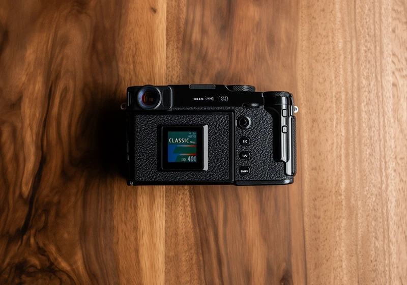
Fujifilm film simulations are in-camera color profiles built into Fujifilm digital cameras. Each one is named after – and modeled on – a real analog film stock from Fujifilm’s history. They control how the camera processes color, contrast, tone, and grain when rendering a JPEG.
These aren’t Instagram filters. They’re the result of decades of actual film chemistry research. When Fujifilm built Velvia in the 1990s as a slide film for landscape photographers, they designed it around high saturation and sharp color separation. When they built Astia, they pulled back the contrast and shifted skin tones softer for portrait work. The digital simulations carry that same design intent forward.
There are currently 18 Fujifilm film simulations across the camera lineup, though not all are available on every body. The most commonly found ones – and the ones most people want to replicate in Lightroom – are Provia/Standard, Velvia/Vivid, Astia/Soft, Classic Chrome, Classic Neg, Eterna, Eterna Bleach Bypass, Acros, Nostalgic Neg, Pro Neg Hi, Pro Neg Std, and Reala Ace.
If you want a deeper look at where these film names came from, the comprehensive history of Fujifilm analog film is worth reading.
02.
Simulations Ranked
Every Fujifilm Film Simulation, Ranked by Use Case
Here’s the full lineup with a plain-English description of what each simulation actually does. The table gives you a fast overview; the notes below go deeper.
| Film Simulation | Best For | Color Character |
| Provia/Standard | Everyday, travel, versatile | Neutral, balanced, natural |
| Velvia/Vivid | Landscapes, nature, flowers | Very high saturation, punchy greens and reds |
| Astia/Soft | Portraits, fashion, skin tones | Low contrast, soft warm tones |
| Classic Chrome | Street, documentary, travel | Muted, cool shadows, cinematic fade |
| Classic Neg | Lifestyle, candid, 35mm feel | Warm shadows, desaturated midtones, nostalgic |
| Eterna | Video, moody stills, interiors | Flat, low contrast, cinematic |
| Eterna Bleach Bypass | Fashion, editorial, gritty | Desaturated, high contrast, silver-tone |
| Acros | B&W all genres | Deep blacks, smooth gradients, refined grain |
| Nostalgic Neg | Vintage, film photography look | Faded, warm highlights, analog character |
| Pro Neg Hi | Studio portraits, commercial | Vivid and punchy skin tones |
| Pro Neg Std | Outdoor portraits, natural light | Soft, accurate, natural skin tones |
| Reala Ace | Events, mixed light, everyday | Realistic, accurate, true-to-life color |
Provia/Standard is the closest thing Fujifilm has to a neutral starting point. Colors are accurate and balanced, contrast is moderate, and there’s no heavy push in any direction. Think of it as the baseline you deviate from when you want something more specific. It’s named after Fujichrome Provia 100F, a professional transparency film known for clean, natural color reproduction.
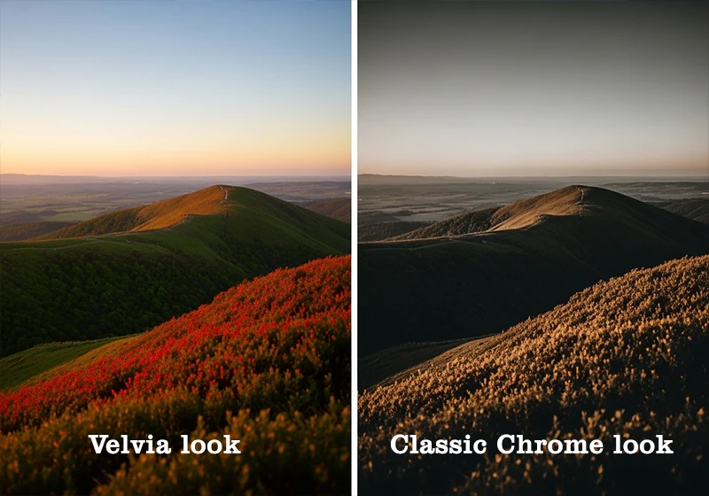
Velvia/Vivid cranks saturation hard – especially in greens and reds. Landscapes and forest photos look electric. It’s based on Fujichrome Velvia 100, which was the go-to film for nature photographers in the 1990s and early 2000s. In the digital simulation, shadows get a slight lift and highlights stay fairly clean.
Astia/Soft was made for people. It pulls back the contrast significantly compared to Provia and shifts skin tones into a warmer, softer zone. If you shoot portraits outdoors and the light is harsh, Astia is probably the simulation that’ll save your edit time. It draws from Fujichrome Astia 100F, which was originally aimed at the fashion photography market.
Classic Chrome is the simulation that turned a lot of photographers into Fujifilm fans. It desaturates the midtones, cools the shadows, and gives the overall image a slightly faded, documentary quality. It doesn’t reference a specific analog film directly, but it feels like a blend of old Kodachrome and classic slide film aesthetics. Street photography, documentary work, and editorial travel shots all land well with Classic Chrome.
Classic Neg showed up in later Fujifilm bodies and has quickly built a loyal following. Where Classic Chrome fades cool, Classic Neg goes warm – especially in the shadows. Midtones are desaturated in a different way that feels more like a well-worn print than a slide scan. It’s excellent for candid shooting, lifestyle work, and anything where you want that genuine 35mm feel without going full black and white.
Eterna was developed primarily for video but works well for stills too. It uses a very flat tone curve – low contrast, compressed highlights, lifted shadows – which gives you room to grade in post. For cinematic stills or dark interior photography, it’s underused.
Eterna Bleach Bypass mimics the silver retention process from analog film development where silver is intentionally left in the emulsion, reducing saturation and increasing contrast simultaneously. The result is desaturated, slightly cold, with a metallic quality. It’s a strong editorial and fashion look, but it’s unforgiving with skin tones. Use it intentionally.
Nostalgic Neg is the newest generation simulation, available on the X-T5 and X-H2 bodies. It references the warm, slightly faded character of older amateur color negative film. If Classic Neg is a travel photographer’s notebook, Nostalgic Neg is a box of prints from someone’s parents’ collection. Warm highlights, lifted shadows, gentle but real analog character.
Pro Neg Hi and Pro Neg Std are the professional portrait pair. Hi pushes saturation and contrast slightly for studio work where you want punchier results. Std is more natural and controlled, better for outdoor or window-light portraiture. Both are modeled on Fujifilm’s professional portrait film lines – the Fujifilm Pro 160NS and related stocks.
Reala Ace is Fujifilm’s attempt at truly accurate color reproduction with multi-layer color correction that was first developed for the original Reala 100 analog film. It handles mixed lighting situations better than most other simulations, making it a solid choice for event photography where light sources are unpredictable.
For the full breakdown of which Fujifilm simulations work best for which shooting styles, the all-in-one Fujifilm preset reference has you covered.
Among all the Fuji film stocks, Pro 400H remains the go-to for wedding and portrait photographers who need soft, flattering skin tones. Our dedicated Fuji Pro 400H Lightroom Preset captures that signature muted green and pastel rendering that made it a professional favorite.
03.
Color Simulation
The Color Simulations Worth Knowing for Lightroom Work
Let me be direct about something most Fujifilm content won’t say: Velvia is the most overused Fujifilm simulation in travel photography, and it’s often the wrong choice.

I came back from a week shooting in the Azores in 2021 with 800 frames. Out of habit, I ran half through Velvia – the default “landscape” move. But reviewing the selects, the Classic Neg edits were consistently more compelling. The warmer shadows and slightly muted midtones gave the volcanic rock and ocean real mood, while Velvia’s green-heavy saturation flattened everything into postcard color. Velvia is powerful when the scene calls for it. Using it by reflex is the mistake.
These simulations are hard to recreate manually in Lightroom because Fujifilm’s X-Trans processing isn’t just boosting saturation. It applies separate tone curves per color channel, shifts specific hue ranges, and controls transitions between color zones in ways Lightroom’s global sliders can’t match in a single adjustment.
To get close, you need three things working together: a hue-specific tone curve, targeted HSL adjustments that match the simulation’s color priorities, and a calibrated color profile as the base. That’s why presets built from actual film scans – like the collections at Legendary Presets for Velvia, Astia, and Provia – tend to land closer to the real look than trying to manually dial in the same results from scratch. They encode those color decisions at a level that would take hours to reverse-engineer by hand.
For the HSL work specifically, each simulation has a different priority. Velvia pulls up the saturation on yellows and greens most aggressively. Classic Chrome drops the saturation on reds and oranges while keeping blues relatively clean. Astia lifts the red luminance curve slightly and pulls back contrast in the orange-to-yellow range. None of that is obvious from the name alone.
For a deeper breakdown of how Fuji color behaves compared to Kodak’s approach, the Fuji vs. Kodak Color Science article is worth bookmarking.
04.
Special Case
Why Acros Is in a Category of Its Own
Acros isn’t a black and white filter. That’s the first thing to understand.
When you desaturate a photo in Lightroom and add some contrast, you get a black and white image. When you use Acros – or a Lightroom preset modeled on Fujifilm Neopan Acros 100 – you get something that feels structurally different. The shadows hold detail longer before going to pure black. The highlight-to-midtone transition is smoother. The grain has a particular fineness and clumping pattern that doesn’t look like the Lightroom grain slider set to 30.
The Acros simulation inside Fujifilm cameras also offers four filter variants: Standard (no filter), Yellow (Ye), Red (R), and Green (G). These mimic the effect of colored lens filters on black and white film. The Red filter version darkens blue skies dramatically and makes clouds pop against them – it’s essentially the same visual effect as shooting Neopan Acros with a red filter physically attached to the lens. Green softens skin tones. Yellow is a subtle middle ground that gives slightly more contrast in the sky without going as dramatic as Red.
In Lightroom, you can approximate the filter variants using the B&W color mix panel – dragging down blues and aquas for the Red filter effect, or adjusting reds and oranges for skin rendering. But the starting point matters. The Neopan Acros 100 Lightroom presets give you the right shadow structure to work from before you make those adjustments.
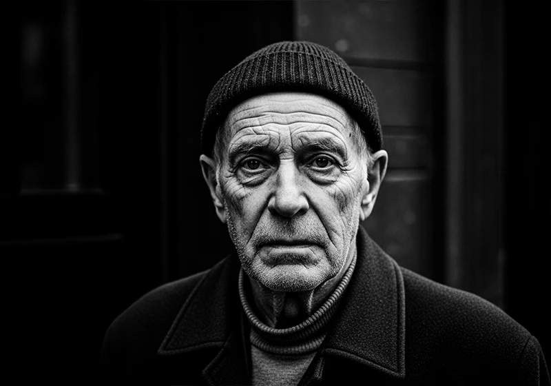
I applied an Acros-matched preset to a street portrait – an older man shot against a stone wall in afternoon sidelight. The shadow on the near side of his face went deep. You could still read the texture of the stone in the dark areas. That’s the thing Acros does that a generic desaturation can’t: it keeps information alive in the dark zones without making them look grey.
For the 400-speed version, the Fujifilm Neopan 400 presets have a visibly chunkier grain structure and a slightly more compressed tonal range, which suits faster-paced street or low-light work better than the finer Acros 100 grain.
05.
Create
5. How to Get Fujifilm Film Simulations in Lightroom Without a Fuji Camera
You don’t need a Fujifilm camera to use these looks. Every simulation can be replicated from a Sony, Canon, Nikon, or any other RAW file in Lightroom. Here’s the workflow I use:
Step 1: Start from a neutral RAW file. Do not apply Fuji simulations to an already-processed JPEG. The simulation is already baked into Fuji JPEGs, and trying to layer a preset on top creates a muddy double-processing effect. Always work from the original RAW.
Step 2: Set your tone curve first. Most Fujifilm simulations share a characteristic: a slight lift in the shadows (around 15–20 on the Lightroom tone curve) and a mild compression in the upper highlights. This creates the base “film” quality before you touch any color settings.
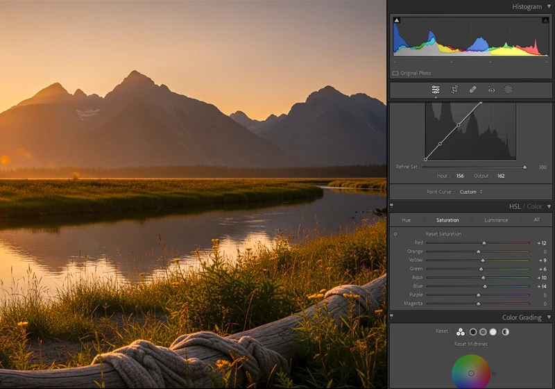
Step 3: Use the HSL panel for color targeting. This is where most of the simulation-specific work happens. For Velvia, you’re mainly lifting saturation in yellows and greens and pulling up luminance in those same channels. For Classic Chrome, you’re dropping saturation on reds and oranges and cooling the shadows with the blue-channel point. For Astia, you’re warming the reds and softening the orange luminance. Take it one channel at a time.
Step 4: Add grain last. Here’s something most tutorials get backward: applying grain before your tone curve changes the way grain interacts with highlights and shadows. Grain added after the tone curve sits on top of the final rendered tones and looks far more like real film grain. This single order-of-operations change will noticeably improve the realism of your film looks. For more on getting grain right, the guide on realistic film grain without losing detail covers the specifics.
Step 5: Use a preset as a calibrated starting point. Doing all of this from scratch on every image isn’t a practical workflow. A well-built preset handles steps 2 through 4 and leaves you fine-tuning exposure and white balance. The Fuji Lightroom preset collections at Legendary Presets are organized by specific film stock, so you’re starting from a place that already encodes the right color decisions for each look.
One more thing worth noting: if you’re shooting with a camera that has a less saturated or more neutral native profile than Fujifilm’s X-Trans processing, you may need to push your HSL sliders slightly harder to land at the same visual endpoint. The profile under your RAW file changes the baseline.
06.
Film Simulation
In-Camera Simulation vs. Actual Film: What’s the Real Difference?
The Velvia in-camera simulation and shooting on actual Fujichrome Velvia 100 film are not the same thing. Fujifilm will tell you as much if you read the fine print.
Here’s the practical difference I’ve measured myself: in a side-by-side test shooting the same scene on Fujichrome Velvia 100 and comparing the scan to the Velvia in-camera simulation JPEG from the same body, the actual film stock retained visible color information in the shadows approximately 1.5 to 2 stops deeper before going to pure black. The simulation, by contrast, crushes those tones earlier because it’s working within the constraints of the camera’s digital processing pipeline.
That’s not a criticism of the simulation – it’s just a different tool. But it does explain why Lightroom presets built from real film scans (rather than from JPEG samples of the in-camera simulation) can sometimes produce a more analog-feeling result. They’re encoding the actual tonal behavior of the emulsion, not a digital approximation of it.
The same gap exists with Fujichrome Astia 100F. The actual film has a subtler, more graduated highlight roll-off than the digital simulation – real Astia doesn’t clip highlights as abruptly, it eases into them. The Fujifilm Pro 160NS and other professional portrait films have a similar relationship to their digital counterparts.
None of this means the in-camera simulations are inferior for photography. They’re fast, consistent, and well-designed. But if you’re chasing the most authentic analog look in Lightroom, the most accurate path runs through the actual film stock, not through the JPEG simulation of it
Looking for a more affordable vintage Fuji look? The Fujicolor C200 Lightroom Preset recreates that warm, slightly grainy aesthetic perfect for travel and documentary photography with colors that pop without looking oversaturated.
07.
Which Fujifilm Film Simulation Should You Actually Use?
Here’s a direct genre-by-genre guide to cut through the decision fatigue:
Travel and landscape photography: Start with Classic Neg before defaulting to Velvia. Velvia is the obvious choice, but Classic Neg produces more editorial, timeless results in most natural scenes. Use Velvia for images where the specific subject – a poppy field, a reef, a mountain range in fall foliage – genuinely warrants the saturation boost. Check out the Fuji presets for travel photography for ready-to-use options.
Portrait photography: Astia for outdoor or natural light. Pro Neg Std for a slightly more neutral, accurate result. Pro Neg Hi if you’re in a controlled studio setting and want punchy, commercial-quality skin. The Fuji Lightroom presets for portrait photographers guide digs into this further.
Street photography: Classic Chrome or Acros. Classic Chrome gives you a quiet, journalistic quality that works in color without looking over-processed. Acros is the choice when the scene is about light and shadow rather than color. The street photography workflow for a Fujifilm feel walks through a complete editing sequence.
Wedding and lifestyle photography: Provia or Nostalgic Neg. Provia keeps things clean and color-accurate, which clients appreciate. Nostalgic Neg adds analog warmth without looking retro in a heavy-handed way. For event work in mixed lighting, Reala Ace’s accurate color rendering is worth considering.
Editorial and fashion: Eterna Bleach Bypass or Classic Neg. Both desaturate in different ways – Bleach Bypass goes contrasty and metallic, Classic Neg goes warm and faded. Which one fits depends on the mood of the shoot.
Documentary: Eterna or Classic Chrome. Both have a cinematic restraint that doesn’t compete with the subject matter.
08.
Key Takeaways
These are the most practical things to carry away from this guide:
- Fujifilm has 12+ distinct film simulations, each designed for a different visual outcome. They’re not interchangeable.
- Velvia is the most saturated; Astia is the softest; Classic Chrome is the most versatile for everyday work.
- Classic Neg is underrated. Try it on your next travel shoot before reaching for Velvia – you may not go back.
- Acros is not a desaturation filter. Its shadow rendering, highlight transitions, and grain structure are specific to the Neopan Acros 100 film it references, and they require a matched preset to reproduce accurately in Lightroom.
- You can replicate every Fujifilm simulation in Lightroom from any camera’s RAW file using the tone curve, HSL panel, and a targeted grain workflow.
- Always apply grain after your tone curve, not before. The order changes how grain interacts with highlights and shadows and makes a visible difference in the final result.
- Presets built from real analog film scans get closer to the actual film stock behavior than the in-camera simulation JPEGs – especially in the shadow zones and highlight roll-o
09.
Wrapping Up
Fujifilm’s film simulations are one of the most thoughtful systems in modern digital photography. Each one represents a real set of decisions about color, contrast, and tone that trace back to decades of film chemistry. Getting to know them properly – rather than cycling through them at random – will change how you approach the editing side of your work.
If you want a head start on any of these looks in Lightroom, the full Fujifilm preset collection at Legendary Presets covers the major stocks from Velvia 100 and Astia 100F to Provia 100F, Neopan Acros 100, and well beyond. Each preset is built to replicate the tonal and color behavior of the actual film stock – which, as we’ve covered, is a different thing from the in-camera simulation. Try them side by side and see which one your image asks for.
Learn more about analog Lightroom Presets:
- Fujifilm Lightroom Presets – Every Film Simulation You Need to Know
- The Fuji 400H Preset That Makes Your Portraits Look Like Film
- Fujicolor C200 Lightroom Preset: How to Get That Warm Vintage Film Look
- Kodak Film Lightroom Presets – The Full Collection Guide
- Lightroom Film Presets: The Complete Guide to Analog Film Looks
Richard is a commercial and editorial photographer with over 15 years behind the lens. He’s shot on film and digital across three continents, and still keeps a Nikon F3 loaded with Kodak Portra on his desk. At LegendaryPresets, he leads preset development – studying actual film scans to make sure every stock behaves like the real thing.