


Home | Articles | Analog Film
Fujicolor C200 Lightroom Preset: How to Get That Warm Vintage Film Look
Richard ♦ May 11, 2026 ♦ 16 min read

If you’ve been searching for a Fujicolor C200 Lightroom preset that actually looks like the real film, you already know the struggle. Most warm presets just push the orange slider and call it a day. The C200 look is something different – softer, more golden, with a natural lift in the shadows that makes every shot feel like it was taken on a lazy summer afternoon. We break down exactly what that look is, where it comes from, and how to get it right in Lightroom.
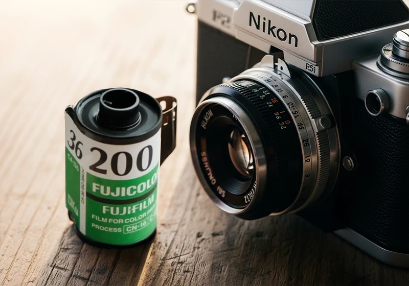
Fujicolor C200 was a budget 200 ISO color negative film made by Fujifilm, sold mainly in Asia and Europe. It was quiet, affordable, not glamorous. No photographer in 2005 was bragging about using the C200. But the way it rendered warm afternoon light – amber highlights, peachy skin, slightly milky shadows – turned out to be exactly what a generation of digital photographers has been chasing ever since. The film was discontinued around 2013, which made it a cult classic almost overnight.
If you want a ready-made starting point, Legendary Presets has a full range of fuji original lightroom desktop presets built from actual film references. Their Fuji collection covers everything from Fujichrome Velvia 100 to Fujifilm Pro 400H, and the presets are designed to behave the way real film does – not just look warm on the surface.
01.
Background
What Was Fujicolor C200 Film?
Fujicolor C200 was a consumer-grade color negative film with a 200 ISO rating. It wasn’t built for professionals. It was designed to be cheap, widely available, and forgiving enough for everyday point-and-shoot use. And because of that, it had a color rendering that was genuinely different from Fujifilm’s pro lineup.
Where Fujifilm Pro 160NS gave you cool, accurate tones suited to studio portraits, and Fujichrome Provia 100F delivered faithful, neutral slide film colors, C200 leaned warm. Greens picked up a slight olive-yellow cast. Blues softened. Highlights rolled off gently without harsh clipping. And shadows lifted just enough to give images an airy, open feel – even in low-contrast situations.
The film also had a wider exposure latitude than most people gave it credit for. You could overexpose by a full stop and the highlights would hold. That behavior is part of what makes the C200 aesthetic so appealing to recreate in Lightroom today.
The C200 is an underrated pick – but it makes even more sense when you see it next to the rest of the Fujifilm analog preset collection.
Here’s a quick comparison to put it in context:
| Film | ISO | Color Character | Best Use |
| Fujicolor C200 | 200 | Warm amber, lifted shadows, soft contrast | Travel, lifestyle, casual portraits |
| Fujifilm Superia 100 | 100 | Vivid, neutral-cool, sharp | Outdoor daylight, travel |
| Fujifilm Pro 160NS | 160 | Cool, clean, accurate skin tones | Studio and wedding portraits |
The contrarian take here is worth saying out loud: C200 was never a professional film, and that is precisely why it looks so good today. Pro films were made to be accurate. C200 was made to look pleasant – and pleasant, it turns out, ages extremely well.
02.
Look
What Does the Fujicolor C200 Look Like in Lightroom?
This section answers the most common question directly.
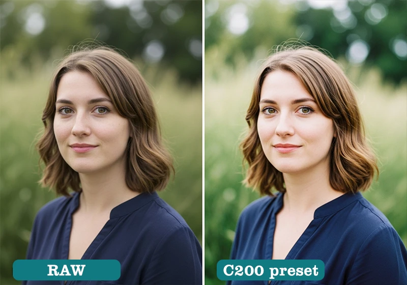
The Fujicolor C200 look in Lightroom is defined by warm amber midtones, slightly lifted and milky shadows, reduced blue saturation, and peachy skin rendering. It gives images a nostalgic, late-afternoon quality without heavy processing.
Breaking that down into specific Lightroom terms:
Highlights: Warm, leaning amber-orange. Not harsh yellow, not pure gold – somewhere in between. The rolloff is gradual, which is what separates a well-built C200 preset from a blunt warm filter.
Shadows: Lifted, slightly desaturated, leaning toward a warm gray. This is the “milky” quality you see in consumer negative film. Pure black shadows are almost absent. If your shadows are hitting -100 on the blacks slider, you’re not looking at C200 – you’re looking at something else.
Greens: Shifted toward yellow-olive. Not dramatic, but noticeable. Forest greens become warmer. Grass picks up a golden tint in sunlight.
Blues: Pulled back in saturation. Sky blues become softer and slightly muted. This is one of the reasons C200-edited photos feel so calm – the sky doesn’t compete with everything else.
Skin tones: Peachy-warm. Not orange, not red – genuinely flattering on a wide range of complexions because the amber sits in the mid-frequency of the orange hue range rather than pushing all the way toward red.
Grain: Fine and organic. The original film had a fairly tight grain structure for a consumer stock. In Lightroom terms: Amount 20–28, Size 20–28, Roughness 45–55.
This is different from Fujichrome Velvia 100, which punches saturation hard and deepens blues dramatically. It’s also different from Kodak Gold 200, which leans more toward a yellow warmth. C200 sits in its own space: amber rather than yellow, open rather than contrasty, gentle rather than vivid.
03.
Genres
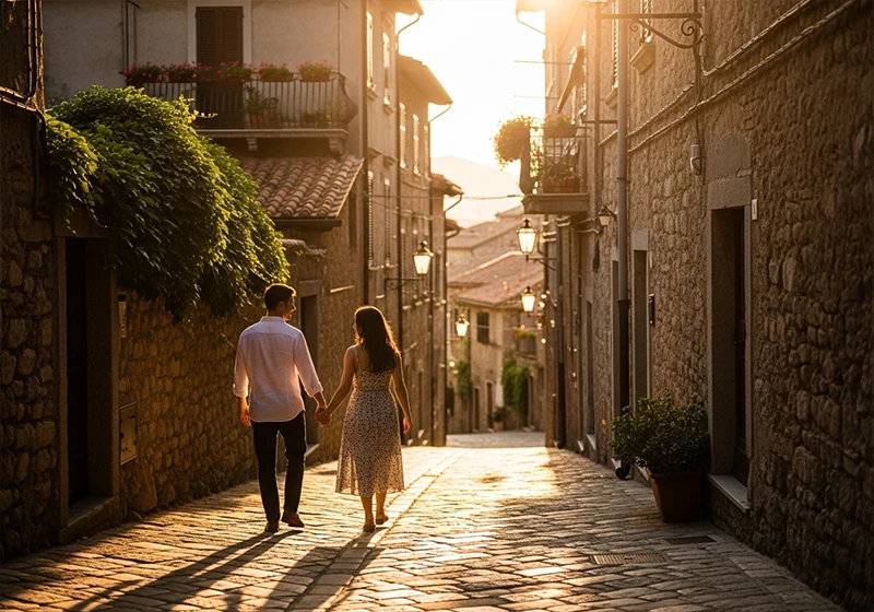
Best Photography Genres for the Fujicolor C200 Preset
The C200 look isn’t universal – and it shouldn’t be. Here’s where it works best, and where it doesn’t.
Breaking that down into specific Lightroom terms:
Highlights: Warm, leaning amber-orange. Not harsh yellow, not pure gold – somewhere in between. The rolloff is gradual, which is what separates a well-built C200 preset from a blunt warm filter.
Shadows: Lifted, slightly desaturated, leaning toward a warm gray. This is the “milky” quality you see in consumer negative film. Pure black shadows are almost absent. If your shadows are hitting -100 on the blacks slider, you’re not looking at C200 – you’re looking at something else.
Greens: Shifted toward yellow-olive. Not dramatic, but noticeable. Forest greens become warmer. Grass picks up a golden tint in sunlight.
Blues: Pulled back in saturation. Sky blues become softer and slightly muted. This is one of the reasons C200-edited photos feel so calm – the sky doesn’t compete with everything else.
Skin tones: Peachy-warm. Not orange, not red – genuinely flattering on a wide range of complexions because the amber sits in the mid-frequency of the orange hue range rather than pushing all the way toward red.
Grain: Fine and organic. The original film had a fairly tight grain structure for a consumer stock. In Lightroom terms: Amount 20–28, Size 20–28, Roughness 45–55.
This is different from Fujichrome Velvia 100, which punches saturation hard and deepens blues dramatically. It’s also different from Kodak Gold 200, which leans more toward a yellow warmth. C200 sits in its own space: amber rather than yellow, open rather than contrasty, gentle rather than vivid.
04.
Create
How to Apply and Fine-Tune a Fujicolor C200 Preset in Lightroom
Once you have the preset installed, the process is straightforward – but a few specific adjustments will make the difference between a good result and a great one.
Step 1: Start with a well-exposed RAW file.
The C200 look depends on gentle highlight rolloff. If your RAW is underexposed by more than a stop, the preset will fight the image rather than work with it. Expose to the right where possible.
Step 2: Apply the preset.
One click from the Presets panel in Lightroom Classic or Lightroom CC. The base look should already give you the warm amber cast and lifted shadows characteristic of C200.
Step 3: Set your white balance.
The preset works best when your source white balance is in the 5500–6200K range. If your shot was taken in shade or on an overcast day, you may need to pull the temperature slider slightly warmer to compensate.
Step 4: Adjust exposure.
Most shots need a +/- 0.3 nudge after applying a film preset, depending on your original exposure. Don’t skip this step – it keeps the highlights from looking blown or the shadows from going too milky.
Step 5: Fine-tune skin tones using the HSL panel.
Go to HSL > Saturation and check the Orange slider. If skin tones are reading too warm, pull it back by 5–10 points. For the Hue panel, shift Orange slightly toward yellow if you’re seeing any red in the skin.
Step 6: Adjust grain to taste.
If the preset includes grain, check the Detail panel. For a true C200 feel, keep Amount between 20–30, Size between 22–28, and Roughness around 50. Going higher on Size makes the grain look more like Fujifilm Natura 1600 – beautiful, but not C200.
Step 7: Recreate the highlight rolloff.
This is the step most people miss. Open the Tone Curve panel and gently lower the top-right anchor point by about 5–8 points. This softens the brightest highlights and mimics the wide exposure latitude the original film had. It’s a small move that makes a real difference – especially in outdoor shots with bright skies.
05.
Comparsion
Fujicolor C200 vs Other Fuji Presets: Which One Do You Need?
If you’re building out your Lightroom preset collection, it helps to know exactly where C200 sits relative to the other Fuji film looks.
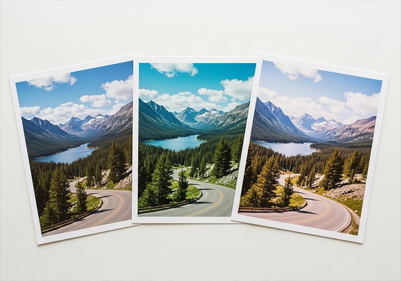
C200 vs Fujifilm Superia X-Tra 400: Superia 400 has more contrast and cooler greens. It’s a sharper, more modern-looking edit. C200 is warmer and softer – better for lifestyle and travel, while Superia 400 handles bright daylight and street photography with more punch.
C200 vs Fujifilm Pro 400H: Pro 400H is the go-to for wedding photographers chasing that cool, airy pastel look. Skin tones lean toward soft pink rather than warm peach. C200 is the warmer, more casual sibling – great for outdoor lifestyle but less suited to the refined editorial look Pro 400H delivers.
C200 vs Fujichrome Velvia 100: These are almost opposite aesthetics. Velvia is saturated, punchy, with deep blues and vivid greens. C200 is understated, warm, and soft. If Velvia is a bold poster, C200 is a faded photograph you found in a drawer.
C200 vs Kodak Gold 200: Both are warm consumer-film stocks, but they land differently. Kodak Gold 200 pushes more into yellow territory – you’ll see it in the greens and the highlights. C200’s warmth is amber-peach and sits mainly in the midtones. Gold 200 also tends to have more shadow contrast, while C200 stays open and airy in the darker areas.
Knowing these differences will save you time when you’re editing a batch of photos and trying to match the right mood to the right stock.
06.
Opinion
A Personal Note on the C200 Look
I first came across the C200 aesthetic on a trip through southern France – late September, low sun, everything bathed in that particular amber-orange light you only get in southern Europe in autumn. I’d tried half a dozen warm presets on those shots and none of them felt right.
They all looked processed. Then I applied a C200-based grade and something clicked. The lifted shadows kept the detail in the shaded alleyways. The muted blues stopped the sky from looking like it had been painted on. The skin tones on the people I photographed looked real.

What I noticed is that the C200 look actually holds up better on overcast days than most warm presets do. Most warm grades fall apart when the light is flat. C200’s lifted shadows and softened contrast mean the edit still works even when the natural light isn’t doing you any favors. That was surprising to me, and it’s the main reason this film stock keeps coming up in my editing from time-to.time.
07.
Key Takeaways
- Fujicolor C200 was a discontinued 200 ISO consumer color negative film known for warm amber midtones, lifted shadows, and wide exposure latitude – qualities that translate directly into a flattering Lightroom preset.
- The three defining qualities of the C200 look are: amber-warm midtones (not yellow), lifted and slightly milky shadows, and reduced blue saturation. If your preset doesn’t have all three, it’s not really C200.
- The C200 preset works best for travel photography, casual portraits, lifestyle shoots, and natural-light family photography. It works less well for high-contrast moody edits or blue-hour cityscapes.
- The one workflow move that separates a good C200 preset from a great one is the highlight rolloff – gently lowering the top-right anchor on the Tone Curve to mimic the film’s wide exposure latitude.
- The C200 look holds up better in flat, overcast light than most warm presets do, making it a more versatile choice than its reputation suggests.
- For ready-to-use fuji original lightroom desktop presets built from real film references, browse the Fuji Lightroom Presets collection at Legendary Presets.
The Fujicolor C200 preset is one of those film looks that rewards photographers who take the time to understand it. It’s not flashy, but it makes images feel warm, lived-in, and real in a way that’s hard to fake with a generic warm filter. Load it up on your next travel or portrait shoot, dial in the highlight rolloff, and let the film do the talking.
Learn more about analog Lightroom Presets:
- Fujifilm Lightroom Presets – Every Film Simulation You Need to Know
- The Fuji 400H Preset That Makes Your Portraits Look Like Film
- Fujifilm Film Simulation Lightroom: Which One Should You Use
- Kodak Film Lightroom Presets – The Full Collection Guide
- Lightroom Film Presets: The Complete Guide to Analog Film Looks
Richard is a commercial and editorial photographer with over 15 years behind the lens. He’s shot on film and digital across three continents, and still keeps a Nikon F3 loaded with Kodak Portra on his desk. At LegendaryPresets, he leads preset development – studying actual film scans to make sure every stock behaves like the real thing.