Home | Articles | Analog Film
VSCO Portra Presets for Lightroom: What They Were and What Replaces Them
Richard ♦ June 12, 2026 ♦ 14 min read

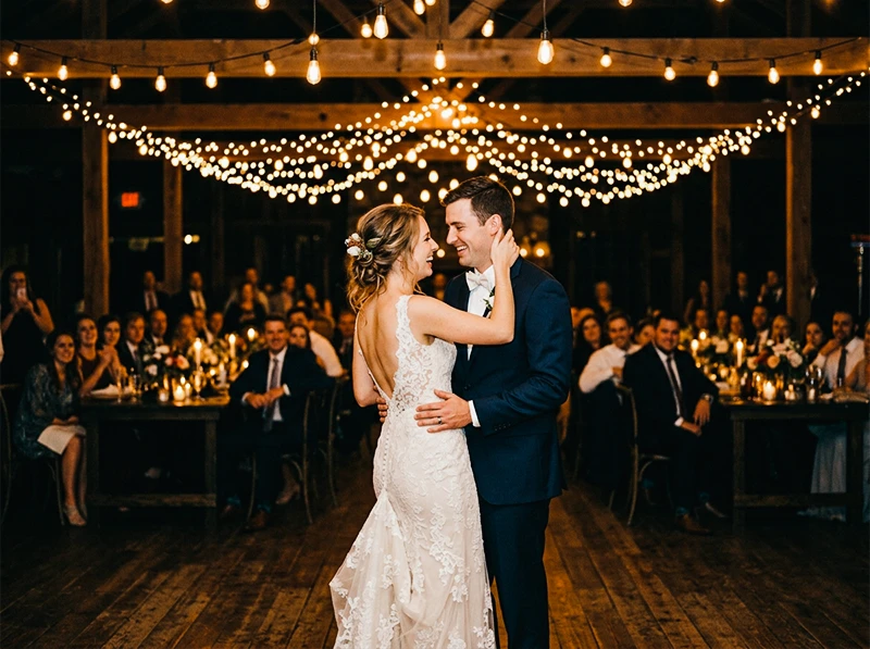
If VSCO had a signature look, it was Portra. Kodak Portra 400 NC was the preset wedding photographers, portrait shooters, and lifestyle photographers applied by default, neutral skintones, soft shadows, that particular flattering quality that made digital files look like they came off a well-exposed roll of 35mm.
VSCO’s Kodak presets are gone now. All VSCO Film packs for Lightroom were permanently discontinued on March 31, 2026. The full background on what happened and why is on the main VSCO alternatives page if you need it.
This article covers the Kodak side specifically: what VSCO’s Portra presets actually did, how the NC/UC/VC variations differed, what the Kodachrome filters were about, and exactly where to get replacements for each one. The comparisons below come from years of using both on client portrait and wedding work, not from reading documentation.
Legendary Presets covers the full Kodak catalog individually. For everything at once, the Kodak Portra Collection bundles Portra 160, 400, and 800 with all their variations in a single purchase.
Key Takeaways
- VSCO’s Kodak filters covered Portra 160 NC/VC, Portra 400 NC/UC/VC, Portra 800, and Kodachrome-inspired looks, all permanently discontinued as of March 31, 2026.
- NC (Normal Contrast), UC (Ultra Color), and VC (Vivid Color) are processing interpretations of the same film stock, not different films. Choosing the right replacement means matching the interpretation, not just the brand name.
- Portra 400 NC was the most-used Kodak preset across portrait and wedding photography. It maps directly to the standard Kodak Portra 400 preset.
- VSCO’s Kodachrome filters were aesthetic approximations, not emulations of scanned Kodachrome negatives. Purpose-built Kodachrome presets produce a more accurate result.
- Portra 800 runs warm, unlike the cooler Portra 160 and 400. If you switch replacements without accounting for this, indoor reception edits will look wrong.
01.

What VSCO’s Kodak Filters Actually Covered
VSCO Film’s Kodak presets were spread across Film 01, 02, and 04. Photographers mixed across packs without necessarily knowing which preset came from which pack number. Here’s the full list in one place:
VSCO Preset Pack Character Kodak Portra 160 NC Film 01 Cool-neutral, very fine grain, clean highlights Kodak Portra 160 VC Film 01 Slightly warm, fine grain, gentle contrast lift Kodak Portra 400 NC Film 02 Neutral, flattering skintones, low contrast Kodak Portra 400 UC Film 02 Mild saturation boost, neutral skintones Kodak Portra 400 VC Film 02 Warm midtones, punchier contrast Kodak Portra 800 Film 01/06 Warm base, lifted shadows, visible grain Kodachrome 64 Film 04 Red-orange-blue contrast, high saturation Kodachrome 25 Film 04 Cooler version of the Kodachrome look If you used a Kodak filter in VSCO and can’t remember the exact name, the table above covers everything that was available. Each one has a direct replacement.
02.
Understanding NC, UC, and VC
This is where most replacement guides stop short. The NC/UC/VC labels weren’t film stocks, they were VSCO’s processing variations of the same Kodak Portra 400 negative. Knowing what each one did helps you pick the right replacement without guessing.
NC, Normal Contrast The base version. Low contrast, neutral skintones trending slightly cool, fine grain, lifted shadows that hold detail. This is what Portra 400 actually looks like when shot and scanned without lab push or pull. It was the default for most portrait photographers because it’s the most forgiving in mixed light, window plus tungsten, shade plus direct sun, without any channel going too hot.
UC, Ultra Color Added a mild saturation boost across all channels without shifting skintone warmth. Greens and blues got a little more presence. Useful when you wanted the environment around your subject to breathe, lifestyle editorial, outdoor portraits, family sessions in green settings, without skin reading orange.
VC, Vivid Color Pushed contrast and saturation, with a warm shift in the midtone orange-yellow range. The most stylized of the three. Some photographers used it as-is for editorial and fashion work. Others used it as a starting point and pulled back the contrast manually. It’s the version furthest from the actual film stock behavior, closer to a warm-toned creative grade than a straight emulation.
When choosing a replacement, you’re matching the interpretation, not just the film brand. A generic “Portra 400 preset” could be any of these three depending on who built it and what reference they used.
03.
The Full VSCO Portra → Legendary Presets Replacement Map
Portra 800 was the wedding photographer’s indoor preset. Kodak Portra 160 NC → Kodak Portra 160 Lower ISO, finer grain, cooler base than Portra 400. Best for carefully lit portraits in controlled or consistent light, studio setups, window light only, golden hour without harsh shadows. The cooler highlight rolloff of 160 is distinctive and worth using specifically when you have the light to expose it correctly.
Kodak Portra 160 VC → Kodak Portra 160 (Vivid variation) Adds a gentle warmth and contrast lift to the 160 base. Still fine-grain and clean, the difference from NC is subtle, mostly noticeable in midtone warmth and slightly punchier blues. Better for outdoor portraits in mixed light where NC felt slightly flat.
Kodak Portra 400 NC → Kodak Portra 400 The straight replacement for the most-used VSCO Kodak preset. Neutral-cool base, flattering skintones, low contrast, fine grain. If NC was your default for portrait and wedding work, this is your new default. Nothing needs to change in your workflow, apply, make a minor Temp adjustment for your specific camera, sync across the shoot.
Kodak Portra 400 UC → Kodak Portra 400 (Balanced variation) Mild saturation lift without touching skintone warmth. Right for outdoor environmental portraits and lifestyle work where you want a bit more color presence in the background without skin going hot.
Kodak Portra 400 VC → Kodak Portra 400 (Vivid variation) Warm midtones, contrast punch, orange-yellow shift. Best for editorial work, harsh midday light, or anywhere NC felt too quiet. Stays truer to the actual film stock than VSCO’s VC did, the warmth is there without the occasional cross-process edge.
Kodak Portra 800 → Kodak Portra 800 The one Portra stock that runs warm instead of neutral. Lifted shadows, more visible grain, a distinctly pushed look even at box speed. The go-to for indoor receptions, dim venues, and any portrait work where you needed speed and wanted the grain to read as intentional rather than incidental. If you used this at weddings for the first dance and reception candids, the Kodak Portra 800 preset is the direct replacement, warm base intact.
The Kodak Portra Collection bundles all three ISOs together. For a deeper look at how each Portra stock behaves across different shooting situations, the guide to Kodak Portra Lightroom presets covers film characteristics, ISO selection, and editing adjustments by subject type.
Get the Classic Films Collection
Don’t waste hours obsessing over grain sliders. Get authentic film texture across 14 classic stocks – Portra, Ektar, Fuji Pro, TRI-X and more – with presets, profiles and LUTs included.
04.
VSCO’s Kodachrome Filters: What They Were and What Replaces Them
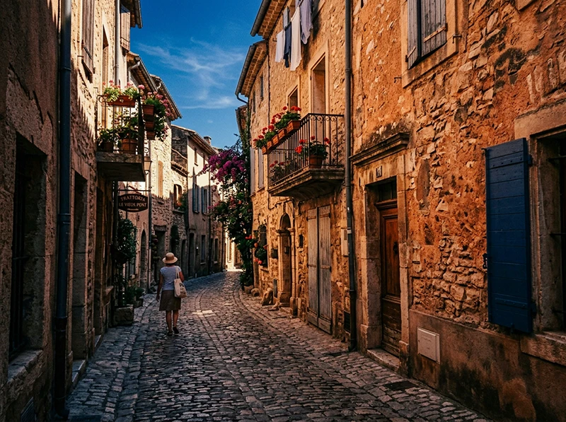
Kodachrome was a different animal from Portra. Where Portra was a negative film designed for latitude and skin flattery, Kodachrome was a slide film, high saturation, rich reds and oranges, deep blues, very specific color contrast between the warm and cool channels. The Kodachrome 64 look is immediately recognizable: that warm-red-orange-blue opposition that defined documentary and travel photography from the 1950s through the 1980s.
European street travel photo edited with Kodachrome 64 Lightroom preset showing warm orange tones and deep blue sky VSCO’s Kodachrome presets in Film 04 were aesthetic approximations built by hand to suggest the Kodachrome look. They weren’t built from scanned Kodachrome negatives, and they didn’t replicate the dye-layer behavior of the actual film. For many photographers that was fine, the approximate look was what they wanted. But the approximation had some characteristic artifacts: a tendency to go slightly magenta in the shadows and to push the red channel harder than actual Kodachrome does.
Kodachrome 64 → Kodachrome 64 Built from scanned reference material rather than hand-approximated, this gives you the warm red-orange-blue contrast signature of the film more accurately than VSCO’s version. The red channel behavior is more controlled, you get the richness without the magenta shadow cast. Best for travel, architecture, and documentary work where the Kodachrome color opposition is the point.
Kodachrome 25 → Kodachrome 25 Cooler and more restrained than 64, with tighter grain. The ISO 25 rating meant it was used in controlled conditions, bright daylight, tripod work, and the look reflects that: precise, clean, less warm than 64. Good for architecture and landscape where you want the Kodachrome color structure without the orange push.
For a comparison of how Kodak and Fuji color science differ in Lightroom and when to reach for each, the Fuji vs. Kodak color science guide covers the key rendering differences in detail.
05.
Why VSCO Film 02’s Portra Presets Ran Slightly Cool for Sony Shooters
Why VSCO’s Portra Presets Ran Cool on Sony BodiesVSCO’s Portra presets included Camera Calibration values tuned to Canon and Nikon sensors, specifically a negative Red Primary Hue shift and boosted Blue Primary Saturation. On Sony A7-series or Fujifilm mirrorless bodies, those values produced a blue-green shadow cast that wasn’t in the original film look. Most photographers blamed their camera’s color science and added a warm offset manually without finding the real cause.
Fix for existing VSCO archives: Open the Camera Calibration panel. If Red Primary Hue sits around -10 to -15, pull it back toward zero and reduce Blue Primary Saturation to match. That single correction shifts the edit to where the preset was supposed to land.
For new work: this doesn’t apply. Replacement presets built on Adobe Standard normalize color across all camera profiles – Canon, Sony, Nikon, Fujifilm – consistently.
06.
Which Portra ISO Is Right for Your Work
This question comes up constantly and the answer depends on light, not preference.
Portra 400 NC in open shade is one of the most forgiving combinations in portrait photography. Shooting Situation Recommended Portra ISO Controlled studio or window light Portra 160 Outdoor portraits, mixed light, overcast Portra 400 NC Outdoor lifestyle, environmental portraits Portra 400 UC or VC Indoor available light, dim venues Portra 800 Weddings, ceremony (good light) Portra 400 NC Weddings, reception (low light) Portra 800 Portra 160 and 400 run neutral to cool. Portra 800 runs warm. If you’re mixing ISOs across a shoot, ceremony in Portra 400 NC and reception in Portra 800, expect a warmth shift between the two sets that you’ll need to account for in post. That’s not a preset problem; it’s the actual film stock behavior, and it’s the behavior the presets reproduce accurately.
07.
What Replaces VSCO Kodak Portra Presets in Lightroom?
VSCO’s Kodak Portra presets were permanently discontinued on March 31, 2026. Direct replacements for each:
VSCO Kodak Preset Replacement Link Kodak Portra 160 NC Kodak Portra 160 Portra 160 presets Kodak Portra 160 VC Kodak Portra 160 (Vivid) Portra 160 presets Kodak Portra 400 NC Kodak Portra 400 Portra 400 presets Kodak Portra 400 UC Kodak Portra 400 (Balanced) Portra 400 presets Kodak Portra 400 VC Kodak Portra 400 (Vivid) Portra 400 presets Kodak Portra 800 Kodak Portra 800 Portra 800 presets Kodachrome 64 Kodachrome 64 Kodachrome 64 presets Kodachrome 25 Kodachrome 25 Kodachrome 25 presets All available individually or as the Kodak Portra Collection (Portra 160/400/800 bundle).
From warm Kodak tones to cool Fuji pastels to punchy Agfa color, our film photography presets cover the full spectrum of analog film aesthetics.
Related Reading
- VSCO Film Presets for Lightroom Are Gone, What to Use Instead, full cluster pillar with every VSCO Film stock mapped
- VSCO Film 02 Lightroom Presets: The Complete Alternative Guide, covers Portra 400 NC/UC/VC in the context of the full Film 02 pack
- Guide to Kodak Portra Lightroom Presets, film characteristics, ISO selection, and editing adjustments by subject type
- Fuji vs. Kodak Color Science in Lightroom, when to reach for Portra vs. Fuji stocks and why
- Realistic Film Grain Without Losing Detail in Lightroom, controlling grain texture across Portra ISOs
08.
FAQ
Were VSCO’s Kodak filters actual emulations of the film stocks?
Partly. The Portra presets were built as careful approximations of the film stock look, not from scanned Kodak negative reference material. The Kodachrome presets in Film 04 were more stylized approximations designed to suggest the Kodachrome aesthetic. Purpose-built presets based on negative scans produce a more film-accurate result, particularly in shadow rendering and grain structure.
Is Kodak Portra 400 NC the same as just “Kodak Portra 400”?
NC stands for Normal Contrast, it’s VSCO’s label for the base version of the Portra 400 emulation without added saturation or contrast. When a preset library offers “Kodak Portra 400” without a variation label, it usually corresponds to the NC interpretation: neutral, low contrast, flattering on skin. If it includes Vivid or Balanced variations, those correspond to VC and UC respectively.
Can I mix Portra 160 and Portra 400 presets across a shoot?
Yes, but expect a slight temperature shift between them. Portra 160 runs cooler than Portra 400 due to its lower ISO and different emulsion base. If you’re mixing in a single shoot for variety, a minor Temp adjustment on the 160 frames will keep the two sets visually consistent.
Why did VSCO’s Portra presets sometimes look different on my Sony vs. my friend’s Canon?
Camera Calibration. VSCO’s presets included calibration adjustments tuned for Canon and Nikon sensors. On Sony bodies, those values produced a slight blue-green cast not present in the original film look. See the information gain section above for the specific fix.
Do the replacement presets work in Lightroom Classic and Lightroom (cloud)?
Yes. XMP presets install and behave identically in both. In Lightroom Classic, import via the Presets panel. In the cloud version, use File > Import Profiles & Presets.
Is there a bundle that covers all the Kodak Portra ISOs?
Yes, the Kodak Portra Collection includes Portra 160, 400, and 800 with all variations. If you want the full Kodak range including Ektar, Gold, and Kodachrome, the Classic Film Presets Collection covers 14 stocks across Kodak and Fuji.
Richard is a commercial and editorial photographer with over 15 years behind the lens. He’s shot on film and digital across three continents, and still keeps a Nikon F3 loaded with Kodak Portra on his desk. At LegendaryPresets, he leads preset development – studying actual film scans to make sure every stock behaves like the real thing.