Home | Articles | Analog Film
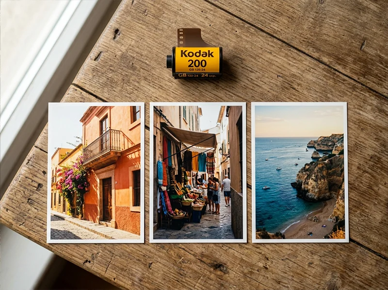
Vintage Travel Lightroom Edits: The Kodak Gold 200 Workflow
Richard ♦ updated June 15, 2026 ♦ 16 min read

Travel photography means shooting in wildly different light across the same trip, cobblestone streets at noon, a shaded market at 3pm, a terracotta rooftop at golden hour, and needing the images to feel like they belong together. Kodak Gold 200 handles this better than any other film. Its warm yellow-orange bias works in direct sun and holds up in shade. Shadows lift to a warm brown rather than cold grey, which unifies a mixed set without everything looking identical.
This guide covers the Gold 200 workflow in Lightroom applied specifically to travel, with location-specific adjustments for the environments you actually shoot in, and the one step most tutorials skip that separates “warm filter” from “looks like film.” The Kodak Gold 200 preset from Legendary Presets is built from actual film scans and gives you a calibrated starting point before any manual fine-tuning.
Key Takeaways
- Gold 200’s warm yellow-orange bias is what unifies mixed travel lighting, it’s not just warmth, it’s selective warmth in the right channels
- The black point lift (Output 15–20 on the tone curve) is the single adjustment that makes travel edits read as film rather than a filtered digital photo
- Greens need a hue shift toward yellow-olive, this is the most commonly skipped step and the most obvious giveaway of a digital origin
- Different travel environments need different HSL emphasis: architecture leans on Yellows, coastal work leans on Blues and Aquas, markets and people lean on Oranges
- Apply grain last; add it before color work and it renders incorrectly across luminance levels
- Batch editing with one hero photo per lighting condition, not one per trip, is what keeps a gallery consistent without making every frame look the same
01.
Why Gold 200 Is the Right Film for Travel Photography
Most travel photographers default to whatever preset “looks warm.” The problem with that approach is that generic warmth lifts the entire image equally, it makes blue skies orange, turns white walls yellow, and pushes everything into the same muddy cast.

Gold 200’s defining quality for travel: the same warm brown shadow tone reads consistently across direct sun, open shade, and mixed market light. Gold 200 doesn’t work that way. On film, it saturates yellows and oranges selectively while holding blues slightly back rather than eliminating them. Shadows lift to a warm brown tone rather than pure black. Greens shift toward yellow-olive. The result is an image that feels warm in the right places, sunlit walls, skin, golden surfaces, while skies and shadows stay distinct and readable.
For travel photography specifically, three Gold 200 characteristics matter most:
- Yellow channel warmth: Sunlit architecture, sandy streets, warm stone, these glow in a way that generic warmth adjustments don’t produce. The warmth is concentrated in the Yellow and Orange HSL channels, not spread uniformly across the image.
- Lifted brown shadows: Street photography always has dark doorways, shaded alleys, and faces under hats. Gold 200 renders these as rich dark brown rather than cold digital black. This is what makes a travel set feel cohesive across indoor and outdoor frames.
- Muted but present blues: Gold 200 doesn’t kill the sky. It pulls blue saturation back just enough to let warm tones lead, without turning the sky grey. The result is a blue that reads as part of the scene rather than competing with the warm foreground.
For a full technical breakdown of what Gold 200 does across its HSL channels and how it compares to Gold 100 and 400, see the Kodak Gold preset guide.
02.
Why Weekend Travel Photos Look Better With a Retro Edit
Weekend trips are usually messy lighting-wise. You get harsh midday sun, mixed indoor bulbs, cloudy skies, neon signs, and golden hour all in the same camera roll.
A retro edit helps because it:
- smooths contrast so lighting differences feel less obvious
- tones down modern colors (especially greens and blues)
- adds warmth that makes the whole set feel consistent
That’s why film-style travel photography is still everywhere on Instagram, Pinterest, and travel blogs.
03.
The Core Retro Glow Workflow
This is the foundation. Apply this to any travel RAW file before making any location-specific adjustments.
Step 1: Exposure First – Check the Histogram Before Anything Else
Travel photography is full of mixed exposure situations. You’re not controlling the light. Before you apply any preset or push any slider, press
Jin Lightroom to show the clipping overlay and check your histogram.- Highlights should sit just below the right wall, not kissing it
- If bright areas are already blown: pull Exposure down, then raise Shadows to compensate
- Slightly underexposed files handle the Gold 200 warmth better than overexposed ones, the lifted shadows and warm tones need detail to work with
One specific travel situation to watch: backlit scenes, which are common when shooting in narrow streets or doorways. If your subject is in shade against a bright background, the sky or wall behind them will clip if you expose for the shadow. Either expose to protect highlights and lift shadows in post, or shoot two exposures and mask. Don’t try to recover a blown background with the Gold 200 warmth over the top, it reads as orange, not retro.
Step 2: White Balance – Warm, But From the Right Starting Point
Gold 200 was designed for daylight (5,500K). For digital emulation, you want to work from a similar base before the preset’s warmth is applied.
- Daylight outdoor scenes: Temperature 5,400–5,600K, Tint +3 to +5
- Open shade: Temperature 5,700–5,900K, Tint +5 to +8 (shade adds blue-green; correct both before warming)
- Mixed indoor/outdoor (markets, cafes with windows): Temperature 5,600–5,800K, Tint +5 to +7
- Overcast: Temperature 6,000–6,200K, Tint +8 to +10, the preset’s yellow warmth needs more headroom to work against a grey sky
The most common white balance mistake in travel editing: applying a preset over a very cool original temperature (e.g., a shade shot at 4,200K). The preset warms the image but the underlying cool tone fights it, you get an image that looks simultaneously warm and off. Fix the white balance to a reasonable daylight base first, then apply.
Step 3: Tone Curve – The Black Point Lift Is Non-Negotiable
This is the step that separates a genuine retro edit from a digital photo with a warm filter.
Open the Point Curve panel (not the parametric sliders). Make three moves:
- Lift the black point: Drag the bottom-left anchor up to Output 15–20. This is the single most important adjustment. Kodak color negative film cannot reproduce pure black, the film base itself has density. Lifting the black point replicates this. Without it, shadows go digital-black and the whole image reads as a warm filter over a modern photo.
- Gentle highlight rolloff: Pull the top-right anchor inward slightly, Output 240 instead of 255. Film compresses highlights gradually; digital clips sharply. This softens the transition into bright areas.
- Very slight S-curve: A small midtone lift keeps the image from going flat from the lifted blacks. Keep it subtle, you want density in the shadows, not a washed-out image.
Step 4: HSL – Match the Film’s Channel Behavior
This is where the Gold 200 color signature is built. These are the baseline values; location-specific variations follow in the next section.
Channel Hue Saturation Luminance Reds 0 +8 +5 Oranges -3 +10 +8 Yellows -5 +12 +10 Greens +8 -5 -5 Aquas 0 -8 0 Blues 0 -10 -5 The three moves that matter most:
Yellows Saturation +12, Luminance +10, this is where the sunlit travel warmth lives. Sandstone walls, golden hour streets, sandy beaches, ochre plaster. Without this, you have generic warmth. With it, you have the Gold 200 glow.
Greens Hue +8, this shifts digital greens toward yellow-olive. Modern cameras render foliage as vivid, slightly cyan-leaning green. Gold 200 renders it muted and yellow-leaning. This shift is subtle at 100% view but immediately visible at normal viewing size, it’s what makes travel shots look like film rather than a digitally warmed image. Most Gold 200 tutorials skip this step. Don’t.
Blues Saturation -10, the gentle muting that lets warm tones lead without turning skies grey. Skies stay blue but recede slightly behind the warm foreground, which is exactly how the film behaved.
Step 5: Color Grading – Warm Highlights, Neutral Midtones, Cool Shadows
In Lightroom’s Color Grading panel:
- Highlights: Hue 45–50, Saturation 8–12. Adds the characteristic warm glow to bright surfaces, window light, sunlit walls, skin in direct light.
- Midtones: Hue 40–45, Saturation 3–5. Very subtle. Keeps the overall warmth present without overdoing it.
- Shadows: Hue 210–220, Saturation 4–8. A slight cool push into shadows creates the warm-cool separation that gives the image depth. Keep it very restrained, if your shadows look teal, pull the saturation back.
The warm highlight / cool shadow split is what creates the “retro glow” quality. The highlights feel golden; the shadows feel cinematic. If you push either end too hard, it looks like a two-tone Instagram edit. The right amount looks like the color chemistry of the film itself.
Step 6: Grain – Add It Last, Get the Size Right
Grain added before your tone curve gets modified by the curve when it renders, it compresses in shadows and stretches in highlights in a way that doesn’t match how film grain actually distributes. Add grain after all tone and color work is done.
For Gold 200:
- Amount: 20–25
- Size: 25–30
- Roughness: 50
For travel photography at higher ISOs (your camera was already at ISO 800 or above): pull Amount to 12–15. The camera’s native noise plus preset grain compounds into something that reads as dirty rather than filmy.
A slight vignette (–15 to –20 in Lightroom’s Vignetting panel, Feather 80) is optional but helps travel shots where the background is busy. It pushes the eye toward the center without being obvious at normal viewing sizes.
04.
Location-Specific Adjustments
The core workflow above gets you 80% of the way there. These adjustments are what takes a travel edit from “looks warm” to “looks like this specific place shot on film.”
Warm-colored architecture is Gold 200’s strongest subject. Yellow Saturation +15 and Orange Hue -5 push terracotta from orange to amber, the difference between a warm photo and one that looks like Kodak film. Warm-Colored Architecture: Lisbon, Rome, Marrakech, Oaxaca
Terracotta, sandstone, ochre, faded plaster, these are Gold 200’s strongest subject. The yellow-orange channel warmth compounds with the existing warm tones in the architecture and produces a glow that no other film stock matches.
Additional HSL moves on top of the baseline:
- Yellow Saturation: push to +15
- Yellow Luminance: push to +12
- Orange Hue: -5 (shifts warm walls from yellow-orange toward red-orange, more accurate to terracotta and brick)
- Orange Saturation: +12
The result: ochre walls in Lisbon glow amber. Sandstone in Marrakech goes golden. The image looks like it was shot on a warm afternoon even if it was midday overcast.
Watch for: Orange Saturation above +15 will push skin in the frame toward oversaturation. If there are people in shot, keep Orange Saturation at +10 and use a brush mask on the architecture to push it further locally.
Coastal and Beach: Greek Islands, Portuguese Coast, Caribbean
Coastal scenes present the opposite challenge, cool blue water and sky compete with the warm preset. The standard Gold 200 Blue Saturation –10 can make ocean shots feel grey.
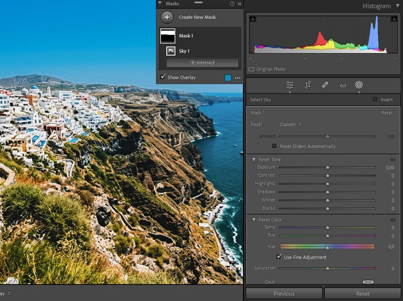
Coastal edits need the Select Sky mask to counteract Gold 200’s blue muting. The result: warm foreground tones and a proper blue sky rather than the slightly grey default. Coastal HSL adjustment:
- Blues Saturation: -5 instead of -10 (less muting, keep the ocean blue)
- Aquas Saturation: -5 (pulls back the cyan-heavy digital color in shallow water)
- Aquas Luminance: -8 (deepens the aqua without removing it)
- Blues Luminance: -8 (deepens sky slightly, prevents it washing out in bright sun)
- Yellow Saturation: +15 (sandy beaches and warm rock should still glow)
After applying: use Lightroom’s Select Sky mask and push Blue Saturation back up +8–12 within the sky only. This keeps the warm tones on sand and skin while the sky reads as a proper coastal blue rather than the slightly muted Gold 200 default.
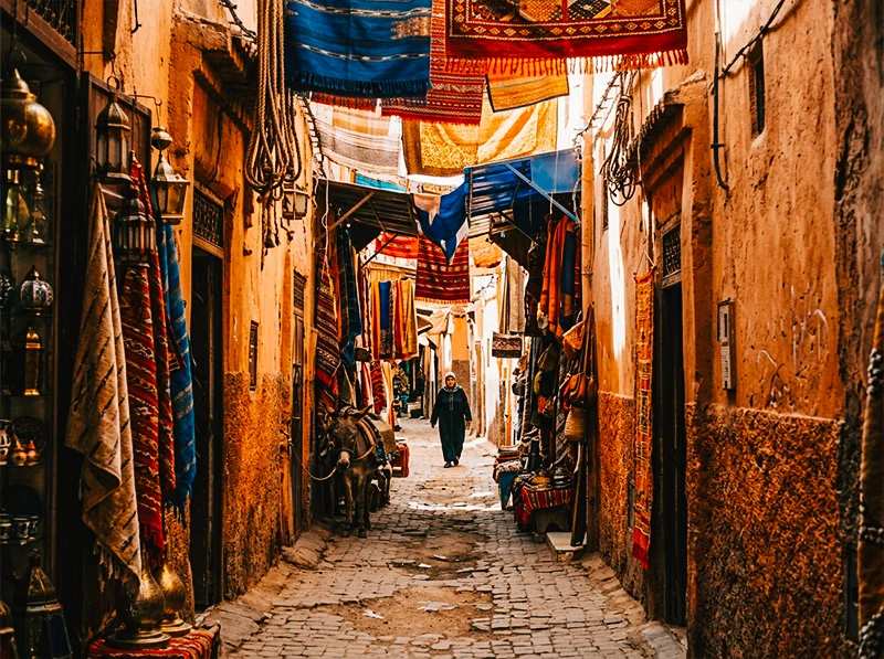
Markets, Souks, Indoor Natural Light
Markets, whether it’s a Moroccan souk, a Thai floating market, or a European Christmas market, are the scenario where mixed light is hardest to manage. You have deep interior shade, patches of direct sun through a roof opening, artificial overhead lights, and colorful surfaces all in one frame.
Market-specific approach:
- Lift Shadows: +20 to +25 (recover detail in shade stalls without blowing the sunlit patches)
- Highlights: -30 to -40 (patches of direct sun through roof openings blow easily)
- Orange Luminance: +12 (faces and skin under artificial market light go dark, this lifts them back without affecting the whole image)
- Reduce grain to Amount 15, market scenes have a lot of fine detail (spices, textiles, goods) and heavy grain obscures it
For souks and markets with very colorful goods (spices, fabrics): resist the temptation to boost Vibrance globally. The Gold 200 HSL baseline already saturates reds and yellows. Adding Vibrance on top pushes the colored goods into unrealistic territory. Instead, use a brush mask on any specific items that need more saturation.
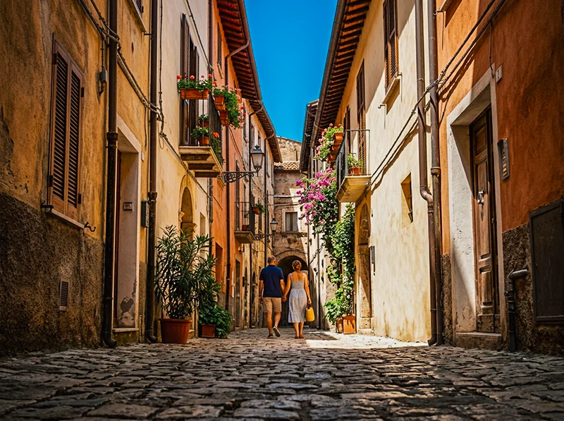
Street Photography in European Cities
Cobblestone streets, doorways, cafes, pedestrians, this is midday travel shooting at its most common. Harsh overhead sun, strong shadows, and varied surfaces.
Street scenes reward the Clarity +8 adjustment that portraits don’t — cobblestones, worn plaster, and rough walls need tactile edge definition to read as film rather than a warm digital photo. Street-specific adjustments:
- Clarity: +8 globally (street scenes benefit from the added texture and edge definition, unlike portraits, you want the cobblestones to feel tactile)
- Greens Hue: +10 (any trees, shrubs, or planted areas in the frame; push further toward olive)
- Greens Saturation: -8 (reduce the vivid digital green of European park vegetation)
- Blue Luminance: -10 (deepen shadows in blue sky patches between buildings)
For street shots with people as incidental subjects (not portraits): Gold 200’s Orange Saturation +10 works fine. For street shots where a person is the primary subject, pull Orange Saturation to +6 and compensate with Orange Luminance +10 to keep the warmth without oversaturation under hard midday light.
The stocks in our Lightroom film presets library were chosen because they represent the best of what analog photography produced, not because they are the easiest to replicate digitally.
05.
Batch Editing a Full Trip
The goal of batch editing travel photography isn’t consistency in the sense of every image looking identical, it’s consistency of feeling. The same warmth, the same film character, even though the light was different between morning and afternoon.
The right approach:
- Sort your import by lighting condition, not by time. Group: direct sun, open shade, indoor/market, overcast. These four groups each need slightly different baseline Temperature and Shadow settings.
- Edit one hero image per lighting group, your best composition in that light. Get it right. That becomes the sync source for everything else in the group.
- Sync across the group but uncheck Crop, Local Adjustments, and Spot Removal. Color and tone sync; geometry and masking stay per-image.
- Adjust Exposure only per image after syncing. Don’t go back into HSL or tone curve per image, if the sync base is right, exposure is the only variable that should differ within a lighting group.
- When you export to gallery or social media: keep the same export settings across the whole trip (JPEG, sRGB, 90 quality, long edge 3000px). Varying quality or color space between batches introduces inconsistency that shows up when images are viewed side by side.
One film-specific note on consistency: real Kodak Gold 200 rolls from different labs scan differently. A roll from Lab A and a roll from Lab B can have a noticeably different color temperature even if shot on the same trip. If you’re editing actual film scans rather than digital RAW, apply the Gold 200 preset at 60–70% opacity and use the Temperature adjustment to standardize the base before the preset, rather than applying at full strength and fighting the scan’s native color cast.
06.
The One Step Most Tutorials Skip
Almost every Gold 200 tutorial focuses on white balance and warmth. The step that actually separates a convincing film edit from a filtered digital photo is the Camera Calibration panel.
After applying all the adjustments above, go to Camera Calibration and set:
- Red Primary Hue: -5
That’s it. One move. This shift adjusts the warm-pink relationship at the color matrix level, below the HSL panel, below the tone curve. The result is that warm skin tones read like Kodak print film rather than a digitally warmed RAW file. It’s subtle but permanent, once you train your eye to see the difference, you won’t edit a Gold 200 look without it.
This is the calibration trick that comes from studying actual film scans rather than approximating the look from tutorials. At Legendary Presets, it’s built into every Kodak preset by default.
07.
What Doesn’t Work With This Look
Gold 200 is not a universal travel preset. Being honest about where it fails saves you the frustration of forcing a look onto a photo that fights it.
- Night and artificial light scenes: Gold 200’s warmth compounds with tungsten interior light and turns everything amber-orange. For urban night photography, Kodak UltraMax 400 handles mixed artificial light better.
- Very cool-toned environments: Scandinavian coastal light, blue-hour city shots, foggy mountain scenery, these scenes are built on cool tones as a deliberate mood. Applying Gold 200 warmth fights the image. Fujifilm Superia 400 or Portra 400 are better matches for environments where coolness is the point.
- Blue as the dominant subject: Ocean close-ups, blue-door architecture, photographs where a specific blue is the visual anchor. Gold 200 mutes blues structurally, you can compensate with HSL, but you’re working against the preset’s strongest tendency.
- Already-warm golden hour: If the sun is within 30 minutes of the horizon, the light is already doing everything Gold 200 does. Applying the preset at full strength over golden hour RAW files pushes into oversaturated orange territory. Pull Temperature back 100–200K after applying, or use the preset at 70% opacity.
08.
Quick Reference: Core Settings by Location
Location Type Temp above neutral Yellow Sat Orange Sat Blue Sat Shadow Lift Warm architecture (Rome, Marrakech) +250K +15 +12 -10 +15 Coastal / beach +200K +15 +10 -5 +15 Markets / indoor natural light +200K +12 +10 -8 +20–25 European street, midday +250K +12 +10 -10 +15 Overcast, any location +400K +15 +8 -8 +20 All figures are adjustments on top of the core baseline HSL settings. These are starting points, every image needs its own exposure check.

A lifted black point in the tone curve creates the classic retro fade. Use the Tone Curve for That Retro Fade
HSL adjustments help remove harsh digital greens and make travel colors look film-like. Grain and soft clarity create a natural retro glow without looking fake. 09.
Frequently Asked Questions
What makes a travel edit look “retro” rather than just warm?
Three things working together: the black point lift (shadows that go brown rather than digital black), the green hue shift toward yellow-olive (removes the vivid digital green of foliage), and the warm-cool Color Grading split (warm highlights, slightly cool shadows). Warmth alone doesn’t produce the retro quality. All three moves together do.
Can I use this workflow on iPhone RAW files?
Yes. Lightroom supports RAW from most recent iPhones. The one adjustment to make: phone RAW files often have a slightly cooler and more vivid native color profile than DSLR/mirrorless. Add an extra +100K to Temperature before applying the preset, and reduce Green Saturation by -5 to counteract the phone’s native color matrix.
Why does my travel edit look orange rather than warm?
Usually one of two causes: Orange Saturation is too high (above +12 in direct sun), or white balance is doing too much work instead of the HSL panel. The fix: pull Orange Saturation to +8, push Yellow Saturation to +12, and make sure the Greens have the +8 hue shift applied. The warmth rebalances from orange to the sunlit yellow-gold character of the actual film.
How do I keep skies from going grey with Gold 200?
The Blues Saturation -10 in the baseline is conservative, it’s designed for scenes where sky isn’t the dominant element. If sky is prominent, use Lightroom’s Select Sky mask after applying and push Blue Saturation +10–12 within the mask only. This brings the sky back to a proper blue while keeping the warm tones on skin and foreground.
Should I use Dehaze for vintage travel edits?
Usually not. Dehaze increases contrast and clarity, which fights the soft lifted-shadow character of the Gold 200 look. If your RAW has genuine haze from atmosphere or distance, use a very small amount (0 to +8 maximum), then compensate by pulling Clarity back -5 to keep the overall softness.
How do I make a mixed trip feel consistent without every photo looking identical?
Group by lighting condition, not by time. Edit one hero image per lighting group. Sync only color and tone, not local adjustments or crop. Then adjust Exposure per image only. The color signature stays consistent; the individual exposures stay honest to each scene.
Richard is a commercial and editorial photographer with over 15 years behind the lens. He’s shot on film and digital across three continents, and still keeps a Nikon F3 loaded with Kodak Portra on his desk. At LegendaryPresets, he leads preset development – studying actual film scans to make sure every stock behaves like the real thing.