


Home | Articles | Analog Film
Kodak Portra 400 Lightroom Preset – The World’s Most Beloved Portrait Film
Richard ♦ April 21, 2026 ♦ 16 min read

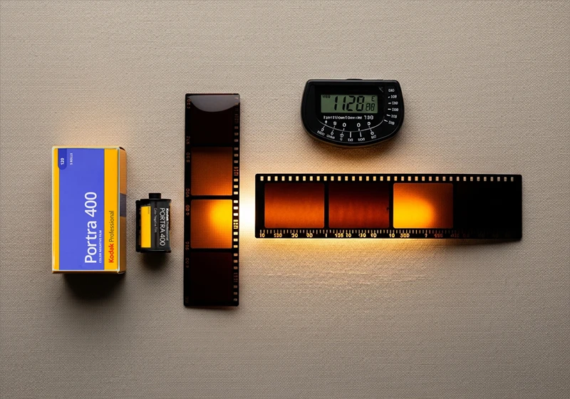
The Kodak Portra 400 Lightroom preset is the digital photographer’s answer to one of the most enduring questions in photography: how do you get that film look? Not just any film look – the warm, creamy, impossibly flattering palette of the world’s best-selling film stock. Portra 400 has been the gold standard for portrait photography since its debut in 1998, and it remains the number one selling colour film today – an extraordinary feat in the age of mirrorless cameras and instant digital feedback.
Photographers from Annie Leibovitz to wedding shooters in Tuscany have trusted Portra 400 for its singular ability to render skin. Warm. Dimensional. Never harsh. Its peach-orange highlight roll-off and lifted, brown-green shadows create a mood that no digital profile has ever fully replicated – until now.
At Legendary Presets, our Kodak preset pack was built by studying thousands of properly exposed Portra frames to translate every nuance of that emulsion into Lightroom presets that work on real digital files.
“Portra doesn’t just record light – it interprets it. The preset attempts to do the same: to give your digital files the warmth, restraint, and quiet dignity that made 35mm portraiture an art form.”
Browse the Kodak Preset Pack →
01.
Background
About Kodak Portra 400: The Film That Defined Portrait Photography
Kodak Portra 400 was introduced in 1998 as a professional portrait and wedding film, replacing the older Vericolor line. It was designed from the ground up for one purpose: to make people look extraordinary. In 2010, Kodak reformulated the emulsion – and that version is the one photographers overwhelmingly prefer. The newer Portra 400 has finer grain, smoother tonal transitions, and a slightly more neutral colour balance that gives photographers more latitude in post-processing. Most film photographers actively seek out post-2010 rolls.
At its core, Portra 400’s character comes from its T-grain emulsion technology. Unlike traditional cubic silver halide crystals, T-grain crystals are flat and tabular, meaning they pack more light-sensitive surface area into less physical space. The practical result is remarkably fine grain for an ISO 400 emulsion – finer, in many cases, than some ISO 100 consumer films. This makes Portra 400 a genuine all-rounder: clean enough for studio portraiture, sensitive enough for candlelit receptions.
Portra is available in both 35mm and 120 medium format. This distinction matters for digital emulation. Medium format Portra – shot on a Hasselblad 500CM or Mamiya RZ67 – has a subtly different quality. The larger negative captures more detail and the grain appears even finer relative to the frame. The resulting images have a depth and three-dimensionality that 35mm can’t quite match. When emulating Portra digitally, it’s worth knowing which version you’re chasing.
Despite being 25+ years old, Portra 400 remains actively manufactured and widely stocked. It is not nostalgia – it is a current, thriving product used by professional photographers every day.
02.
Film Analysis
The Portra 400 Color Profile: What to Expect
Understanding what Portra 400 actually does to colour is the foundation of building a convincing digital emulation. This isn’t a film with a bold, obvious signature – Portra’s magic is in its restraint. Its palette is warm, quiet, and deeply flattering rather than saturated or punchy.
Highlights
Creamy, warm. Orange-peach lean. Shoulder roll prevents blowout even in bright sun.
Shadows
Warm, lifted blacks with a distinctive brown-green undertone. Never cold or blue-black.
Skin Tones
Peach-orange. Flattering across all complexions from fair to deep. The star of the show.
Blues
Muted, desaturated sky blues. Portra doesn’t favour vivid cyan – skies read as moody and calm.
Greens
Warm olive-green. Never vivid or lime. Foliage looks natural and period-consistent.
Grain
Fine, organic luminance grain. Adds texture and life without digital noise artefacts.
Fine, organic luminance grain. Adds texture and life without digital noise artefacts.
The key takeaway: Portra 400 adds warmth without adding yellow. It shifts skin into peach-orange territory rather than golden-warm territory, which is why it works so beautifully across a wide range of complexions. Cooler-toned subjects get warmth added; already-warm subjects are simply enhanced. The muted blues and olive greens mean that backgrounds recede gracefully, keeping the viewer’s attention on the subject where it belongs.
The grain, while present, is genuinely fine. At standard enlargements it reads as texture rather than noise, giving images a material, analogue quality that digital sharpness alone can’t replicate.
Preset Collection
Kodak Portra 400 Preset – Buy the Collection
The Legendary Presets Kodak Portra 400 pack includes nine precision-calibrated presets covering every shooting condition: studio, overcast, golden hour, indoor ambient, and mixed light.
9 Lightroom Presets – Lightroom Classic + CCMobile – DNG Profiles Free Updates – Works on RAW + JPEG
Compatible with Lightroom Classic, Lightroom CC (desktop and mobile), one purchase, one download, lifetime access.
03.
Results
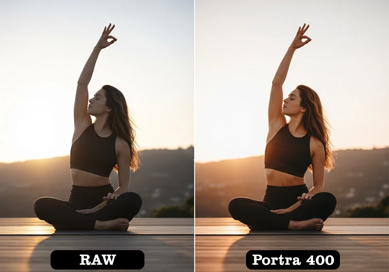
Before & After: Portra 400 Preset Across Photo Types
The Portra 400 preset doesn’t apply a uniform look – it responds to the light already present in the image, enhancing what’s there rather than overriding it. Here’s how it performs across five distinct shooting scenarios.
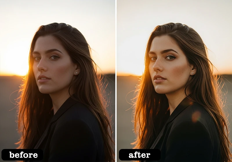
Outdoor Portrait
The preset lifts the skin tones into warm peach territory, rolls the highlights away from white, and adds a barely perceptible shadow warmth that makes the subject read as three-dimensional against a softened background.
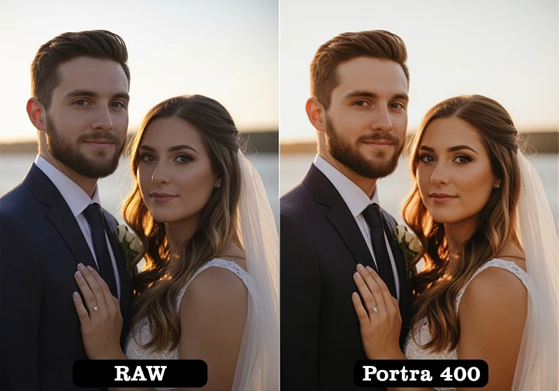
Wedding Ceremony
Applied to ceremony frames, the preset softens bright whites in veils and florals into warm ivory, giving the image the timeless, slightly faded quality of a well-kept wedding album.
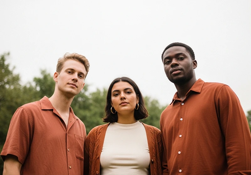
Lifestyle / Documentary
On candid, documentary-style frames, the lifted blacks reduce harsh contrast while the warm shadow tint gives even flat interior light a sense of golden-hour quality that wasn’t there before.
Before
After · Portra 400
04.
Honest Guidance
When to Use Kodak Portra 400 (And When Not To)
The strongest presets are the ones photographers trust – and trust is built on honest guidance. The Portra 400 preset is exceptional in the right contexts. In others, it’s simply the wrong tool. Here’s a frank breakdown.
✓ Portraits & headshots – Any scenario where skin tone rendering is the priority. This is what Portra was made for.
✓ Wedding photography – Ceremony, couple portraits, and reception candids. Universally flattering on all skin tones and light conditions.
✓ Engagement sessions – Outdoor, natural light, or golden hour. The preset elevates romantic, warm-toned imagery.
✓ Overcast & diffused light – Works brilliantly in flat, even light that would otherwise feel clinical. Portra’s warmth adds life to grey-sky days.
✓ Earthy, warm-toned environments – Brick, timber, sand, autumn foliage – all enhanced beautifully.
✓ Lifestyle & documentary – Candid, natural-light documentary work where a quiet, analogue warmth is desirable.
✗ Vivid blue landscapes – Portra desaturates blues. Ocean and mountain scenery with strong cyan tones will look muted and flat.
✗ Moody or dark scenes – The lifted blacks reduce shadow drama. For dark, contrasty moods, consider a Kodak Tri-X or T-Max emulation instead.
✗ Product photography – Accurate colour rendering of packaged goods and commercial products requires neutral tone curves, not Portra’s warm shift.
The guiding principle: if the image is about people, warmth, and emotional connection, Portra 400 belongs on it. If it’s about precision colour accuracy or dramatic, low-key contrast, reach for a different emulation.
05.
Workflow Tips
How to Customize the Portra 400 Preset
A one-click preset is a starting point, not a finish line. Portra 400 on film responds to exposure, light quality, and metering decisions made at the time of capture. In Lightroom, you can replicate those variables through targeted adjustments. Here are five techniques used by professionals to dial in a more authentic Portra look.
- Shoot slightly overexposed (+⅓ to +⅔ stop)
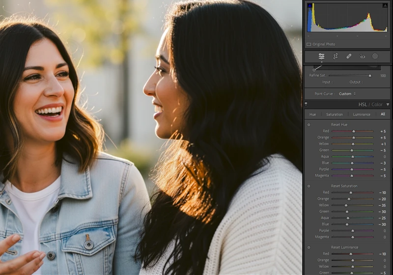
Film photographers deliberately overexposed Portra to push skin tones into the warmest part of the emulsion’s curve. In Lightroom, simulate this by pulling Exposure up +0.3 to +0.5 after applying the preset – highlights will maintain their creamy roll-off while skin gains the characteristic Portra glow. - Use the Orange Hue slider for skin tone direction
The HSL panel’s Orange Hue slider is the single most powerful control for Portra emulation. Shift it toward red (negative values) for a deeper, more saturated skin tone. Shift it toward yellow (positive values) for a lighter, summery warmth. Both are authentic to Portra’s range – the choice depends on your light source. - Pull Orange Luminance for skin contrast
Lowering the Orange Luminance value slightly darkens skin tones relative to surrounding elements, creating the subtle facial dimension that makes Portra portraits look three-dimensional. A value of −10 to −20 is usually sufficient – beyond that, skin begins to look artificially tan. - Adjust grain by shooting condition
Reduce grain (Detail panel → Amount) for clean studio or controlled-light images where fine detail matters. Increase it slightly for natural light, outdoor, or documentary work where organic texture adds to the analogue aesthetic. A good rule of thumb: the more ambient or available the light, the more grain feels natural. - Use the Calibration panel for sensor-specific accuracy
Different camera sensors render colour differently. The Calibration panel’s Primary Colour sliders let you shift the overall colour response of your camera’s raw files before the preset is applied. Sony sensors often benefit from a slight reduction in the Blue Primary Saturation; Canon sensors typically require minimal adjustment; Fujifilm sensors may need a subtle Red Primary Hue shift toward orange to match Portra’s characteristic warmth.
06.
Film Comparison
Kodak Portra 400 vs Portra 160 vs Portra 800: Which Preset?
The Portra family shares a DNA – warm highlights, flattering skin, lifted shadows – but each stock has a distinct personality suited to different shooting conditions. Understanding the differences helps you choose the right preset for a given shoot, and build cohesive galleries that feel intentional rather than arbitrary.
| Film Stock | ISO / Speed | Grain | Colour Character | Best For |
| Portra 160 | ISO 160 | Extremely fine – the finest in the Portra range | Slightly cooler, more neutral highlights. Subtle warmth. Lower saturation overall. | Bright daylight, studio strobes, medium format detail work, fashion editorial |
| Portra 400 Most Popular | ISO 400 | Very fine for ISO 400. Slightly more texture than 160. | Warm peach-orange highlights. Lifted brown-green shadows. Flattering universal warmth. | Portraits, weddings, engagements, lifestyle, overcast natural light – the all-rounder |
| Portra 800 | ISO 800 | Noticeably coarser grain. More organic texture. | Warmer still, with more visible orange-red push. Richer, deeper shadow colour. | Low light, indoor ambient, evening receptions, documentary work in dim conditions |
The practical choice: If you’re shooting in abundant natural light or with strobes, Portra 160 gives you the finest-grained, cleanest emulation. For most portrait, wedding, and lifestyle work – the Portra 400 preset is the definitive choice. If the light is low, the mood is warm, and you want visible grain as a design element, Portra 800 is the tool.
All three presets are available individually and as part of the full Kodak preset pack, which includes Portra 160, 400, and 800 alongside the Kodak Ektar and Kodak Gold emulations for complete Kodak colour coverage.
07.
FAQ
FAQ: Kodak Portra 400 Lightroom Preset
Is Kodak Portra 400 still being made?
Yes. Kodak Portra 400 is actively manufactured and widely available from major photography retailers and online film suppliers. It remains the world’s best-selling professional colour negative film, a remarkable position for a product that debuted in 1998.
The current version is the 2010 reformulation, which is the variant most photographers consider the definitive Portra 400 – finer grain, smoother colour response, and wider exposure latitude than the original formula.
Why does Portra look different on film vs digital emulation?
Film is an analogue, chemical process with inherent organic variation: subtle exposure inconsistencies, lab scanning choices, the density of the negative, and even the specific scanner profile all influence the final result. Digital emulation captures the characteristic colour palette, tonal curves, and grain structure of the film, but applies it consistently across every image.
This means the emulation can actually be more “ideally Portra” than a single scanned roll – but it lacks the frame-to-frame organic variation that gives film its handmade feel. For maximum authenticity, combine the preset with manual grain customisation and slight exposure variation between frames.
Does this preset work for dark skin tones?
Yes, and this is one of Portra 400’s genuine strengths. Unlike some warm film emulations that push skin into an artificial orange on deeper complexions, Portra’s warmth operates primarily through its highlight shoulder and shadow warmth rather than a blanket orange saturation boost.
This means the preset adds a flattering warmth to dark and deep skin tones without distorting their natural colour. For very deep complexions, we recommend reducing the Orange Saturation value by 5–10 points in the HSL panel to maintain natural-looking skin depth while retaining the Portra atmosphere.
Can I use the Portra 400 preset for landscape photography?
It depends on the landscape. Earthy, warm-toned landscapes – desert, autumn woodland, golden wheat fields, terracotta architecture – respond beautifully to the Portra 400 preset. The olive greens, warm highlights, and lifted shadows enhance these subjects in a way that feels natural and evocative.
Landscapes featuring vivid blues – ocean photography, clear mountain skies, turquoise water – will be noticeably muted by the preset’s desaturating effect on blue and cyan tones. For cooler-palette landscapes, the Kodak Ektar or Fuji Velvia emulations will be more appropriate choices.
Get Started
Ready to Shoot Film Without Buying Film?
The complete Kodak Portra 400 Lightroom preset collection is available now – nine presets, lifetime updates, compatible with Lightroom Classic and CC on desktop and mobile.
Learn more about analog film Lightroom presets:
- Editing Urban Night Shots for Punchy Cityscape Photos
- Realistic Film Grain Without Losing Detail in Lightroom
- Classic Kodak Color in Lightroom: Film-Style Editing Guide
- Slide-Film Aesthetic for Architecture: Lightroom Guide
- Vintage Travel Edits: From RAW to Retro Glow in Lightroom
- Lightroom Tips to Balance Bright Colors Without Clipping Highlights
Richard is a commercial and editorial photographer with over 15 years behind the lens. He’s shot on film and digital across three continents, and still keeps a Nikon F3 loaded with Kodak Portra on his desk. At LegendaryPresets, he leads preset development – studying actual film scans to make sure every stock behaves like the real thing.