Home | Articles | Analog Film
Top 5 Classic Fuji Film Looks to Recreate in Lightroom
Richard ♦ updated June 22, 2026 ♦ 20 min read
Fuji film stocks had specific, repeatable visual characters. Velvia was vivid and high-contrast. Provia was neutral and balanced. Pro 400H was soft and pastel. Neopan Acros was clean and fine-grained. These were not accidents of chemistry. Fujifilm engineered each stock to behave a specific way in specific shooting conditions.
That precision is why recreating these looks in Lightroom is possible. You are not chasing a vague aesthetic. You are reverse-engineering a known color profile, and the settings are consistent enough to document.
This guide gives you complete Lightroom recipes for the five most iconic Fuji film looks: panel-by-panel values, the reasoning behind each setting, and the most common mistake that kills each look before it gets going. If you want a calibrated starting point built from actual film scans rather than manual panel work, Legendary Presets has the full Fuji range as ready-to-apply presets. But if you want to understand what the settings are actually doing and why, this is the guide.
Key takeaways
- Every Fuji film look is defined by three things: where it sits on the contrast spectrum, what it does to green and yellow tones, and how it handles highlights.
- Slide film (Velvia, Provia) and negative film (Pro 400H, Superia) need different highlight treatment. Slide film clips fast. Negative film rolls off gradually.
- The Green and Yellow HSL channels are where Fuji color becomes Fuji color. Every recipe here uses them.
- Grain is the last step, always. Applied before other adjustments, it interacts with every slider move that follows.
- The most common mistake across all Fuji recreations: adding global Saturation on top of the look. Don’t. Use Vibrance.
01.
How do you get a Fuji film look in Lightroom?
Set Vibrance +15, Saturation 0. Pull Highlights -30 to -50 before touching color. Use a gentle Tone Curve S-shape rather than the Contrast slider. In HSL, shift Green Hue -5 to -10 toward yellow and reduce Green Saturation -5 to -10. Add grain last: Amount 15-25, Size 20-30, Roughness 40-50. The specific values depend on the stock. The structure of the edit is the same across all of them.
02.
What makes Fuji look like Fuji
Before getting into individual recipes, the one characteristic that runs through almost every Fuji color stock: a yellow-green bias in foliage and mid-tone greens. It is subtle but it is the detail that separates a Fuji edit from a generic warm-film look.
In Lightroom terms: Green Hue shifted toward yellow by -5 to -10 points in the HSL panel. That single move, more than any other, signals Fuji to a trained eye. The Fuji Film Greens guide covers this in full if you want the technical background.
The other structural difference between Fuji slide film and Fuji negative film matters for how you handle highlights:
- Slide film (Velvia, Provia) clips highlights hard and fast. Pull Highlights -40 to -60 before anything else.
- Negative film (Pro 400H, Superia) rolls off gradually. Highlights -20 to -40 is usually enough.
Get that distinction wrong and no amount of HSL work will fix the result.
03.
Look 1: Fujichrome Velvia 100
The character: Velvia was Fuji’s most saturated slide film by design. Fujifilm measured it at up to 20 percent higher color saturation than standard slide films. Blues go deep. Greens push vivid. Contrast is high and shadows go dense. It was the stock landscape and nature photographers loaded when they wanted maximum visual impact.
Green Saturation up, Blue Luminance down. The two HSL moves that separate Velvia from a generic saturated landscape edit. What it is not for: Skin. Velvia’s chemistry pushes skin toward oversaturation. The same moves that make a mountain range dramatic make a face look sunburnt. Use it for landscapes, seascapes, architecture, and scenes where color is the subject. Keep it away from portraits.
Complete Lightroom recipe:
White Balance
- Kelvin: 5200-5600K (daylight neutral, don’t warm it up. Velvia handles warm light without help)
- Tint: 0 to +2
Exposure and Tone
- Highlights: -45 to -60 (slide film clips hard. Pull before anything else)
- Shadows: +5 to +10 (keep shadows dense, not lifted)
- Whites: -15 to -25
- Blacks: -15 to -20 (deeper blacks add the density Velvia had)
- Contrast slider: 0 (use Tone Curve instead)
Tone Curve
- Deep shadows anchor: lift 3-5 points
- Highlights anchor: pull down 8-12 points
- Midtones: keep flat
- The curve should produce bite at both ends with clean midtones
HSL: the Velvia moves
- Green Hue: -8 to -12 (toward yellow, stronger than other stocks)
- Green Saturation: +5 to +10 (unlike other Fuji stocks, Velvia ADDS green saturation)
- Yellow Hue: -3 to -5 (toward orange-green for foliage warmth)
- Yellow Saturation: +5 to +8
- Blue Hue: -5 to -8 (toward cyan for sky depth)
- Blue Saturation: +8 to +12 (deeper sky blues)
- Blue Luminance: -12 to -18 (darkens sky without adding more saturation)
- Orange Saturation: -5 (protects any warm tones from clipping)
Vibrance and Saturation
- Vibrance: +15 to +25
- Saturation: 0
Grain
- Amount: 12-18
- Size: 18-25
- Roughness: 40-50
- Velvia 100 had fine grain for a saturated slide film. Keep it subtle.
Most common mistake: Pulling Highlights to -20 or -30 and wondering why the sky still clips. Velvia needs -45 to -60. The film was designed for metered exposure in controlled conditions. RAW files from digital cameras at outdoor scenes need aggressive highlight protection to approximate it.
For a complete step-by-step Velvia workflow including scenario-specific adjustments, the Recreate Fuji Velvia Style guide covers golden hour, coastal, and overcast conditions in detail.
04.
Look 2: Fujichrome Provia 100F
The character: Provia was Fuji’s workhorse slide film. Neutral color balance, medium contrast, accurate tones, consistent across varied lighting conditions. Photojournalists and commercial photographers trusted it precisely because it did not push color in any direction. What you shot is what you got.
Provia 100F: neutral and reliable. No color pushed. What you shot is what you get, rendered with Fuji precision. In Lightroom, this translates to a balanced look with clean midtones, honest color, and enough contrast to feel film-like without the drama of Velvia. It is the most versatile Fuji look to recreate and the most useful for general photography.
Complete Lightroom recipe:
White Balance
- Kelvin: 5200-5600K for daylight
- 5600-6000K for overcast (compensates for the blue cast without overcorrecting)
- Tint: 0 to +2
Exposure and Tone
- Highlights: -35 to -50 (still a slide film, still clips fast)
- Shadows: +8 to +15
- Whites: -10 to -20
- Blacks: -8 to -12
- Contrast slider: 0
Tone Curve
- Gentle S-shape, less steep than Velvia
- Shadow anchor: lift 4-6 points
- Highlights anchor: pull down 5-8 points
- Midtones: flat
HSL: the Provia moves
- Green Hue: -6 to -10 (toward yellow, the Fuji green character)
- Green Saturation: -3 to -5 (slight reduction, unlike Velvia)
- Yellow Hue: -2 to -4
- Blue Hue: -3 to -5 (slight cyan shift for natural sky)
- Blue Luminance: -8 to -12
- Orange Saturation: -3 to -5
Vibrance and Saturation
- Vibrance: +12 to +18
- Saturation: 0
Grain
- Amount: 14-20
- Size: 18-25
- Roughness: 40-50
Most common mistake: Adding a warm split tone to “make it feel more like film.” Provia was not warm. It was neutral. A warm split tone turns it into a generic warm-film look rather than a Provia look. If the image feels too clinical, the issue is usually the Tone Curve being too flat, not the split toning being absent.
For street photography specifically, the Provia approach in context is covered in the Street Photography Workflow guide.
05.
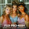
Look 3: Fujifilm Pro 400H
The character: Pro 400H was a color negative film designed for professional portrait and wedding work. Its defining feature was its overexposure workflow: most professional photographers rated it at ISO 200-250 rather than box speed of 400, intentionally overexposing by one stop. T
The Tone Curve midtone lift is the defining move in a Pro 400H recreation. This is the overexposure behavior built into a Lightroom panel. he result was lifted highlights, open shadows, soft pastel tones, and skin that looked natural across a wide range of lighting conditions.
Recreating this in Lightroom means understanding that the softness is not a post-processing filter. It is exposure behavior. The recipe below builds the same result through Tone Curve and HSL work.
Complete Lightroom recipe:
White Balance
- Kelvin: 5200-5800K
- For outdoor natural light, lean slightly warm (5600-5800K) to replicate the intentional overexposure warmth
- Tint: +2 to +4
Exposure and Tone
- Exposure: +0.3 to +0.5 EV lift (the overexposure behavior is partly about starting slightly brighter)
- Highlights: -25 to -40 (negative film rolls off more gently than slide)
- Shadows: +15 to +25 (more lifted than Velvia or Provia)
- Whites: -10 to -15
- Blacks: -5 to -10 (less dense than slide stocks, keep shadow lift open)
- Contrast slider: 0
Tone Curve
- The key move: lift the midtone anchor 3-5 points above the diagonal. This replicates the slightly lifted, open feeling of the overexposure workflow.
- Shadow anchor: lift 5-8 points
- Highlights anchor: pull down 4-6 points only (gentle, not steep)
- Result: an S-curve with the midpoint lifted, not a steep S
HSL: the Pro 400H moves
- Orange Hue: +3 to +5 (toward yellow, corrects Fuji’s green-cyan shadow bias on skin)
- Orange Saturation: -8 to -12 (skin stays natural, not pushed warm)
- Green Hue: -5 to -8
- Green Saturation: -5 to -8
- Yellow Saturation: -3 to -5 (pastel character, pull yellow back slightly)
- Pink/Magenta: slight desaturation in Magentas -3 to -5 if visible in highlights
Vibrance and Saturation
- Vibrance: +10 to +15 (more restrained than Velvia or Provia)
- Saturation: 0
Color Grading (optional but authentic)
- Highlights: Hue 45, Saturation 5-8 (very subtle warm push in highlights)
- Shadows: Hue 210, Saturation 3-5 (faint cool-neutral in shadows)
- This replicates the faint color separation that negative film has in the tonal extremes
Grain
- Amount: 16-22
- Size: 20-28
- Roughness: 42-52
Most common mistake: Pushing Contrast back in because the preset looks too soft. Pro 400H is supposed to look soft. If you add contrast, you are correcting out the film’s defining characteristic. The right response to “too flat” with Pro 400H is to check the Tone Curve midtone lift and the Shadow lift, not to add contrast.
For the full portrait application of Pro 400H, including how Fuji’s skin color science differs from Kodak, the Fuji Lightroom Presets for Portrait Photographers guide covers it in detail.
06.
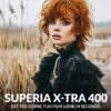
Look 4: Fujifilm Superia X-Tra 400
The character: Superia was Fuji’s consumer negative film. The film in the yellow box, sold at every camera shop. Designed to work well in varied conditions with minimal technique required. Slightly warm, good latitude, forgiving of exposure errors, with a color character that is recognizably Fuji without the precision of the Pro range.
Superia 400: slightly warm, forgiving, recognizably Fuji. The film in the yellow box, now in a Lightroom panel. In Lightroom, the Superia look is the most accessible to recreate because it is the most tolerant. The recipe works across a wide range of source material without requiring perfect exposure.
Complete Lightroom recipe:
White Balance
- Kelvin: 5400-5800K (slightly warmer than Provia or Velvia)
- Tint: +2 to +5
Exposure and Tone
- Highlights: -20 to -35 (consumer negative film, wide latitude)
- Shadows: +12 to +20
- Whites: -8 to -15
- Blacks: -5 to -10
- Contrast slider: 0
Tone Curve
- More relaxed S-shape than Velvia or Provia
- Shadow anchor: lift 5-7 points
- Highlights anchor: pull down 4-6 points
- Midtones: slight lift of 2-3 points (slightly warmer, more open feel)
HSL: the Superia moves
- Green Hue: -5 to -8 (toward yellow, lighter touch than Velvia)
- Green Saturation: -5 to -8
- Yellow Hue: -2 to -4
- Yellow Saturation: +3 to +5 (Superia has slightly warm foliage)
- Orange Hue: +2 to +4
- Orange Saturation: -5 to -8
- Red Saturation: -3 to -5 (keeps warm tones from going too punchy)
Vibrance and Saturation
- Vibrance: +12 to +18
- Saturation: 0
Grain
- Amount: 18-26
- Size: 22-30
- Roughness: 42-52
- Superia 400 had slightly more grain than the Pro range at the same speed
Most common mistake: Leaving the white balance too cool. Superia was slightly warm compared to Provia. If the recreation looks grey or neutral, the fix is usually adding 200-400K of warmth to the white balance rather than adjusting the color channels.
07.
Look 5: Fujifilm Neopan Acros 100
The character: Neopan Acros 100 has a reputation as one of the finest-grained black and white films ever made. The grain is exceptionally tight, the tonal transitions are smooth, and the shadow detail is clean rather than blocked. It was the choice of photographers who wanted the film look without visible grain: large-scale prints, close-up portraiture, architectural photography.
Acros 100: fine grain, smooth tonal transitions, clean shadow detail. The Color Mix panel is where this look lives. Recreating it in Lightroom is a different process from the color stocks because the key work happens in the Color Mix panel rather than HSL. The black and white conversion is where Acros’s tonal character comes from.
Complete Lightroom recipe:
Convert to black and white
- In the Develop panel: HSL/Color/B&W, select B&W
- Or: Basic panel, Saturation -100 (less controllable, use B&W panel instead)
Exposure and Tone
- Exposure: slight lift +0.1 to +0.2 EV (Acros had a slight exposure latitude toward the highlights)
- Highlights: -20 to -35
- Shadows: +8 to +15 (keep shadow detail open, Acros had good shadow rendering)
- Whites: -5 to -15
- Blacks: -8 to -15 (some density but not collapsed)
- Contrast slider: 0. Critical. The B&W conversion already increases apparent contrast. Don’t add more.
Tone Curve
- Gentle S, less steep than the color stocks
- Shadow anchor: lift 3-5 points
- Highlights anchor: pull down 4-6 points
- Midtones: flat
Color Mix (B&W panel): this is where the tonal character lives
- Red: -10 to -15 (slightly darkens warm skin and brick tones)
- Orange: -8 to -12 (controls skin and warm tones without blocking)
- Yellow: +5 to +10 (lifts foliage and clothing with yellow)
- Green: +8 to +12 (opens foliage tones, keeps them from blocking)
- Aqua: 0
- Blue: -5 to -10 (slightly darker sky without going dramatic)
- Purple: 0
- Magenta: -3 to -5
These Color Mix values replicate the orthochromatic and panchromatic response Acros had to different wavelengths of light. Blue goes slightly darker, greens stay open, reds darken slightly on skin.
Grain
- Amount: 12-18 (fine grain was Acros’s defining characteristic. Keep it subtle)
- Size: 16-22
- Roughness: 38-48
Most common mistake: Using the Contrast slider to add punch after converting to black and white. The Contrast slider at +40 or +50 crushes the shadow detail that makes Acros look clean. Use the Tone Curve instead, and keep the shadow end open. If the image needs more bite, steepen the Tone Curve at the highlight end only.
08.
Side-by-side recipe reference
Setting Velvia 100 Provia 100F Pro 400H Superia 400 Neopan Acros White Balance 5200-5600K 5200-5600K 5200-5800K 5400-5800K Any Highlights -45 to -60 -35 to -50 -25 to -40 -20 to -35 -20 to -35 Shadows +5 to +10 +8 to +15 +15 to +25 +12 to +20 +8 to +15 Green Hue (HSL) -8 to -12 -6 to -10 -5 to -8 -5 to -8 n/a (B&W) Green Sat (HSL) +5 to +10 -3 to -5 -5 to -8 -5 to -8 n/a (B&W) Blue Luminance -12 to -18 -8 to -12 n/a n/a -5 to -10 Vibrance +15 to +25 +12 to +18 +10 to +15 +12 to +18 n/a (B&W) Grain Amount 12-18 14-20 16-22 18-26 12-18 Grain Size 18-25 18-25 20-28 22-30 16-22 09.
The Lightroom sequence that applies to all five looks
The order of operations matters. Follow this sequence regardless of which stock you are recreating:
- Apply any Fuji-based preset as a starting point if you have one
- Adjust Exposure until mid-tones read correctly
- Pull Highlights before touching color (see the values per stock above)
- Set Shadows and Blacks
- Build the Tone Curve
- Set HSL: start with Green Hue, then work through the other channels
- Set Vibrance to the target value, Saturation stays at 0
- Color Grading only if the stock warrants it (Pro 400H: yes, small values; Velvia: no)
- Grain last, after all other decisions are made
Apply grain before step 8 and every subsequent slider change will interact with the grain structure. Apply Saturation at any step and you will push the color calibration past where the film sat. These are the two sequence mistakes that derail most Fuji recreations.
10.
When I Stopped Using the Wrong Green Hue Value
I spent about six months working with a Velvia recreation that always looked slightly off on foliage. The colors were vivid, the contrast was right, the blues were deep. But the greens looked too pure, too digital. Not the yellow-green warmth that Velvia actually had on film.
The problem was using the same Green Hue value (-5) across all Fuji stocks. Velvia needs -8 to -12. The stronger shift is what produces the warmth in the greens that the film actually had. At -5, you get the Fuji direction. At -10, you get the Velvia character specifically.
It took shooting a roll of expired Velvia through a film camera and comparing the scans to my Lightroom recreation to identify exactly where the gap was. The difference between -5 and -10 on Green Hue is not dramatic on a histogram. On a print of mountain foliage, it is the difference between looking like Velvia and looking like a desaturated version of Velvia.
11.
FAQ
Can I recreate a Fuji film look without a preset?
Yes. The recipes above are the manual approach. A preset applies the same values automatically. The advantage of doing it manually is that you understand what each setting is doing, which makes it easier to fine-tune for a specific image. The advantage of a calibrated preset is that it is built from actual film scans rather than visual approximation, so the color accuracy is higher. Both approaches are valid. They solve different problems.
Why does my Velvia recreation look too saturated?
Usually one of two things: global Saturation is above 0 on top of the HSL work, or the Blue Saturation is too high without the corresponding Blue Luminance reduction. Increase Blue Luminance reduction to -15 or more, and pull Blue Saturation back to +8 rather than +15. Velvia’s blues are deep because of Luminance reduction, not raw Saturation.
What is the difference between recreating Velvia and Provia in Lightroom?
Three things. First, Velvia adds Green and Yellow Saturation in HSL where Provia reduces it. Second, Velvia needs more aggressive highlight protection (-45 to -60 vs -35 to -50) because its tonal range was narrower. Third, Velvia’s Tone Curve is steeper at both ends where Provia’s is more gentle. The Green Hue shift is similar in direction but stronger on Velvia.
Why does the Pro 400H recreation look flat?
Because it is supposed to. Pro 400H’s defining character is a soft, lifted midtone that most photographers now associate with “film look” without knowing the specific stock. If it looks flat to you, the fix is not adding Contrast. Check that the Tone Curve midtone lift is in place (anchor above the diagonal by 3-5 points), the Shadow lift is at +15 to +25, and the Vibrance is at +10 to +15. Those three moves produce the lift without the harshness.
Can these recipes work on images from any camera?
Yes with minor white balance adjustments. Different camera sensors have different native color profiles, so the starting white balance may need shifting 100-300K between systems. The HSL values, Tone Curve shape, and grain settings are independent of the camera and apply the same way to any RAW file.
How do I know which Fuji look to use on a given image?
Match the stock to the light and the subject. Velvia for high-contrast bright light with strong colors. Provia for all-round work in varied light. Pro 400H for people in natural or soft light. Superia for everyday and casual shooting. Acros when color is competing with the composition. The Best Fuji Lightroom Presets for Photographers guide organizes all five stocks by shooting scenario in detail.
12.
Final thoughts
Every Fuji film look comes down to the same underlying logic: protect the highlights early, move the Green channel toward yellow, use Vibrance not Saturation, and add grain last. The specific values change between stocks. The structure of the edit stays the same.
The recipes above give you the values. The reasoning behind them gives you the ability to adapt when a specific image needs something different. A dark interior shot needs different highlight protection than a bright outdoor scene. A portrait needs different Orange channel handling than a landscape. Understanding the recipe means you can adjust it rather than just apply it.
The full Fuji preset range is at Legendary Presets for photographers who want a calibrated starting point built from actual film scans.
Related reading:
Richard is a commercial and editorial photographer with over 15 years behind the lens. He’s shot on film and digital across three continents, and still keeps a Nikon F3 loaded with Kodak Portra on his desk. At LegendaryPresets, he leads preset development – studying actual film scans to make sure every stock behaves like the real thing.