Home | Articles | Analog Film
Best Black and White Lightroom Presets: The Complete Guide to Film-Based B&W
Richard ♦ updated July 4, 2026 ♦ 12 min read

Clicking the B&W switch in Lightroom gives you a technically correct conversion. It doesn’t give you a look.
Every great B&W image you’ve seen was shot on a specific film stock with a tonal bias built into its chemistry. TRI-X looks like TRI-X because of its emulsion, not because of how someone moved a slider. Lightroom’s B&W conversion has no emulsion. It applies the same neutral math to every photo.
That’s what black and white film presets fix. At Legendary Presets, each preset encodes the tonal curve, grain structure, and channel response of a real film stock. This guide covers which stock is right for your work and how to stop guessing.
Key Takeaways
- Lightroom’s B&W conversion is neutral by design. It doesn’t replicate the optical character of any specific film
- Kodak TRI-X 400 is the street photographer’s stock: high contrast, pronounced grain, wide exposure latitude
- Kodak T-MAX is the fine-detail stock family: finer grain and smoother tones, better for portraits and controlled light
- Agfa Scala 200X is the only B&W reversal film ever made commercially. Its tonal response is unlike any negative film.
- Fujifilm Neopan Acros 100 delivers micro-contrast and sharpness rather than grain. It’s the choice when Fuji’s tonal character fits your work
- Film-based presets encode the B&W Mix channel response of the original stock. Lightroom’s slider applies the same channel weights to every image
01.
Why Lightroom’s B&W Slider Isn’t Enough
When you switch a photo to black and white in Lightroom, here’s what actually happens: the software desaturates each colour channel and applies a set of default conversion weights. Red gets a certain brightness value. Blue gets another. Every photo starts from the same mathematically neutral point.

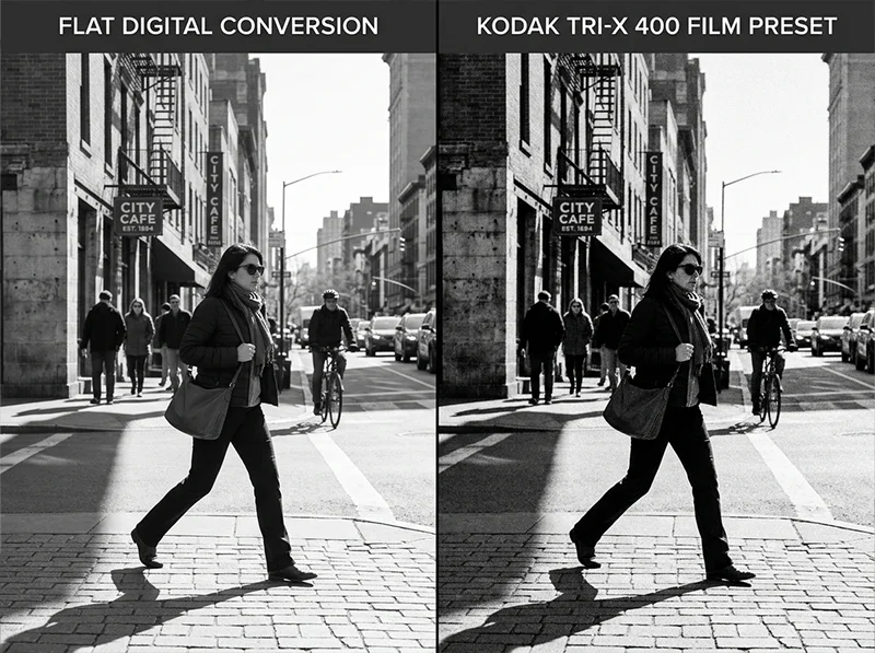
Left: Lightroom’s default B&W conversion. Right: Kodak TRI-X 400 preset. Same image, same exposure. Different tonal character entirely. That’s the problem.
Film was never neutral. Kodak TRI-X 400 is a panchromatic film with a specific spectral sensitivity curve. Its silver halide crystals responded more strongly to blue and UV light than to red, giving blues a lighter rendering and reds a slightly darker one than a neutral conversion produces.
That optical bias is why TRI-X skin has a specific tonal weight, reds held back slightly, while blue skies render brighter and need less manipulation to feel correct. That optical bias is why TRI-X street photos have that characteristic sky-to-skin contrast. It wasn’t a stylistic choice. It was chemistry built into the emulsion.
When you apply a TRI-X film preset in Lightroom, you get three things the B&W slider doesn’t give you:
- The channel response: how the film’s emulsion weighted each colour in the scene
- The characteristic curve: the contrast shape specific to that stock
- The grain structure: matched to how TRI-X actually looked at ISO
None of that exists in the default B&W conversion.
Lightroom B&W slider Film-stock preset Tonal response Neutral, uniform Stock-specific optical bias per film Grain Manual addition only Matched to the stock’s grain structure Contrast curve Default S-curve Film’s actual characteristic curve B&W Mix Default channel weights Pre-set to the film’s spectral response The slider is a starting point. A film-stock preset is a finished tonal language.
02.
The B&W Film Stock Guide: Which One Is Right for You
Every film stock on this list has a different character. Here’s what each one actually does, who uses it, and what it’s best for.

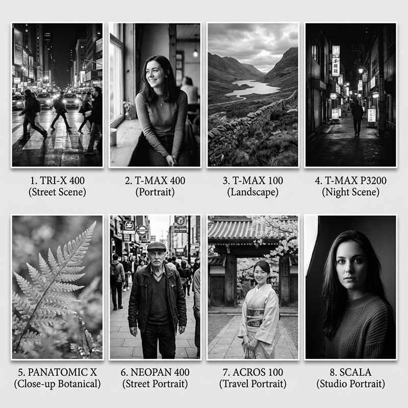
Each film stock has a distinct tonal fingerprint. Top row (left to right): TRI-X 400, T-MAX 400, T-MAX 100, T-MAX 3200. Bottom row: Panatomic X, Neopan 400, Neopan Acros 100, Agfa Scala 200X. Kodak TRI-X 400
Kodak TRI-X 400 is the most widely used B&W film stock in the history of photography. Introduced in 1954, it was the film of photojournalists, street photographers, and documentary photographers for fifty years. Henri Cartier-Bresson shot it. Garry Winogrand shot it. The visual language of 20th-century documentary photography is largely the visual language of TRI-X.
✅ Character:
- High contrast with a steep, pronounced S-curve
- Large, visible grain with a clumped character that reads as texture rather than noise
- Strong shadow depth, blacks go deep without losing all detail
- Highlights roll off with good retention before clipping
- Renders skin tones with a characteristic weight, not flattering, but real
📷 Best for:
- Street photography and documentary work
- Photojournalism-style images
- Urban environments where strong contrast adds energy
- Any subject where grain and contrast are part of the aesthetic
Use with care on: Studio portraits and images where smooth, flattering skin tone is the priority, the contrast and grain work against those qualities.
Kodak T-MAX 400
Kodak T-MAX 400 was launched in 1987 as a technical improvement over TRI-X, using a new T-Grain tabular emulsion with flat silver crystals instead of TRI-X’s conventional round crystals. Same ISO speed, finer grain, more controlled contrast.
It was the professional’s choice when they needed TRI-X speed with better technical quality. Fashion photographers, portrait studios, and commercial photographers who needed B&W for deliverables often chose T-MAX over TRI-X.
✅ Character:
- Finer grain than TRI-X with a more uniform structure
- More linear tone curve, less steep S-curve, more controlled contrast
- Better shadow detail retention than TRI-X
- Smoother, more refined skin rendering
- Less “documentary” in character, cleaner and more controlled
📷 Best for:
- Portraits where skin tone quality matters
- Studio work and editorial photography
- Wedding B&W where technical quality is expected
- Any B&W work where TRI-X feels too heavy
The TRI-X vs T-MAX decision: TRI-X for work where you want the image to feel like documentary photography. T-MAX for work where you want the image to feel like photography that happens to be in B&W.
Kodak T-MAX 100
Kodak T-MAX 100 is the finest grain film in the Kodak T-MAX range. Lower ISO means a different use case, it was the choice for architecture, landscape, large-format work, and any subject where you had control of the light and wanted the cleanest possible tonal rendering.
✅ Character:
- Extremely fine grain, almost invisible at normal viewing distances
- Very smooth tonal gradations across the range
- Clean, controlled contrast without the steep S-curve of TRI-X
- Excellent shadow detail and highlight retention simultaneously
- The most technically precise B&W stock in the range
📷 Best for:
- Architecture and interior photography
- Landscape and nature
- Product photography in B&W
- Fine art and large-print work
- Any subject where tonal smoothness matters more than character
Not suited for: Handheld available light work, the lower ISO means more noise or motion blur in difficult light conditions.
Kodak T-MAX 3200
Kodak T-MAX 3200 is the extreme end of the T-MAX range, a film designed specifically for very low light conditions. Available light events, concerts, dark venues, night photography. The high ISO means significant grain by design.
✅ Character:
- Very large grain with a distinctive chunky structure
- High contrast that suits low-light subjects
- Strong shadow lifting that recovers detail in very dark conditions
- The grain is the aesthetic, it should be visible, not minimized
📷 Best for:
- Concert and event photography
- Night street photography
- Any very dark indoor environment
- Work where you want maximum grain as a creative choice
Fujifilm Neopan 400
Fujifilm Neopan 400 was Fuji’s answer to TRI-X, same ISO, different tonal character. Where TRI-X has a steep, punchy S-curve, Neopan 400 has a softer shoulder on the highlights and a more gradual shadow response. The result is a B&W that feels cooler, quieter, and more refined than TRI-X.
✅ Character:
- Softer contrast than TRI-X, less pronounced S-curve
- Cool tonal rendering, whites feel slightly colder than Kodak stocks
- Fine-to-medium grain, slightly finer than TRI-X
- Better highlight retention than TRI-X in bright conditions
- More suited to available light and natural light work
📷 Best for:
- Natural light portrait work in B&W
- Travel and street photography where you want depth without heavy contrast
- Situations where TRI-X feels too aggressive
- Documentary work in better light conditions
Fujifilm Neopan Acros 100
Fujifilm Neopan Acros 100 was one of the last truly great B&W films produced before the analog decline, and one of the sharpest and finest-grain 400-equivalent films ever made. It was Fuji’s premium B&W stock, favored by landscape photographers, fine art photographers, and anyone who needed maximum quality in B&W.
✅ Character:
- Extremely fine grain, comparable to T-MAX 100 but with Fuji’s tonal signature
- Very smooth gradations with excellent tonal separation
- Slightly cooler rendering than Kodak stocks
- Exceptional sharpness and micro-contrast
- Long tonal scale that holds detail in both highlights and shadows
📷 Best for:
- Fine art and landscape B&W
- Architecture with detailed tonal requirements
- Any work where Acros 100’s reputation for quality is the goal
- Photographers who want Fuji’s tonal character at maximum quality
Kodak Panatomic-X
Kodak Panatomic-X is the most unusual stock in the B&W range, an ultra-fine-grain orthochromatic-influenced film that was designed for technical and scientific photography. Its extremely slow ISO and distinctive tonal rendering make it a specialty choice.
✅ Character:
- The finest grain of any stock in the range
- Unique tonal rendering with a cooler, more neutral response
- Very smooth tonal gradations
- High acutance, the apparent sharpness of detail is exceptional
- A distinct, different look from any of the panchromatic stocks
📷 Best for:
- Specialized fine art work where maximum tonal precision is needed
- Photographers who want a B&W look that is clearly distinct from TRI-X or T-MAX
- Large-print output where grain must be invisible at any viewing distance
Agfa Scala 200X
Agfa Scala 200X introduced in 1992, is fundamentally different from every other B&W stock in the range. It was the only commercially produced B&W slide film ever made, processed to produce a positive transparency rather than a negative. Agfa discontinued it in 2005 when the company withdrew from consumer photographic materials.
The result is a B&W with higher inherent contrast, denser blacks, and a different tonal structure from negative film.
✅ Character:
- Higher contrast than any negative B&W stock
- Very deep, dense blacks
- Bright, clean highlights with little rolloff
- Medium grain with a distinctive silvery quality
- The “slide film look” in B&W, graphic, high-impact, less gradual
📷 Best for:
- High-contrast subject matter, architecture, industrial, still life
- Work where you want maximum graphic impact
- B&W photography where a distinctive, unusual tonal structure is the goal
- Not for portraits or subjects where flattering tonal gradation matters
03.
B&W Preset Quick Reference by Subject
Subject First Choice Second Choice Avoid Street photography Kodak TRI-X 400 Fujifilm Neopan 400 T-MAX 100 Documentary / reportage Kodak TRI-X 400 Kodak T-MAX 400 Agfa Scala 200X Portraits, studio Kodak T-MAX 400 Fujifilm Neopan 400 TRI-X 400 Wedding B&W Kodak T-MAX 400 Kodak TRI-X 400 T-MAX 3200 Architecture Kodak T-MAX 100 Fujifilm Neopan Acros 100 T-MAX 3200 Landscape Fujifilm Neopan Acros 100 Kodak T-MAX 100 TRI-X 400 Concert, dark venues Kodak T-MAX 3200 Kodak TRI-X 400 T-MAX 100 Fine art, large print Kodak Panatomic-X Fujifilm Neopan Acros 100 T-MAX 3200 High-contrast graphic Agfa Scala 200X Kodak TRI-X 400 T-MAX 100 04.
Using the B&W Mix Panel After Applying
The B&W Mix panel is the most important adjustment after applying a B&W preset. It controls how each color in the original image converts to a tone.
The sliders and what they affect:
- Red and Orange, skin tones. Increase to brighten skin, decrease to darken
- Yellow, skin highlights and warm light areas. Affects the midtone of many portrait subjects
- Green, foliage, grass, any green in the scene. Increase to lighten, decrease to darken
- Blue and Aqua, sky. Decrease to darken a sky and increase cloud separation
- Purple and Magenta, flowers, some fabrics, certain artificial light sources
The most useful adjustments:
- For portraits: pull Red and Orange slightly up to brighten skin, pull Blue slightly down to separate skin from a grey sky or neutral background.
- For landscapes: pull Blue and Aqua down to darken the sky, pull Green up slightly to open up foliage detail, pull Yellow slightly up to brighten grasses.
- For street photography: leave the preset values as they are, TRI-X’s tonal relationships are calibrated for general urban environments.
05.
How to Pick the Right B&W Film Preset
If the film stock guide above felt like a lot, here’s the short version.
Genre drives stock choice. Street and documentary work almost always benefits from TRI-X 400’s high contrast and wide exposure latitude. You’re shooting street or documentary work. Start with TRI-X 400. The grain and contrast are what built the visual language of street photography. If TRI-X feels too rough for a specific subject, try Neopan 400. It has similar energy with slightly less bite.
You’re shooting portraits.
T-MAX 400 is the safe choice: ISO 400 versatility with smooth tones. Neopan Acros 100 is the choice when you’re in good light and want that Fuji micro-contrast character on skin. The B&W Portraits preset is built specifically for skin tone protection above everything else.You’re shooting landscapes or architecture. T-MAX 100 for maximum tonal gradation. Panatomic X for maximum sharpness and zero visible grain. Both need decent light.
You’re shooting in low light. T-MAX 3200. It’s built for darkness. The grain and shadow depth are part of the look, not a limitation to work around.
You want something Fuji-flavoured. Neopan 400 for grain and street character, Acros 100 for fine-grain sharpness and cooler highlights.
You want something unlike anything else. Agfa Scala 200X.

My pro tip: Before committing to a preset for a full shoot, apply three stocks to the same test image: a portrait with skin tones, a window with bright sky behind it, and a shadow-heavy interior. The stock that handles all three without needing heavy correction afterward is the right one for your work.
TRI-X will push the interior into something dramatic. T-MAX will keep everything controlled. Neopan Acros will split the midtones in a way neither Kodak stock does. That test takes two minutes and saves you from re-editing an entire set.
The Black and White Lightroom Preset collection includes every stock covered in this guide, from TRI-X and T-MAX through Neopan Acros, Panatomic-X, and Agfa Scala.
06.
Quick Answer: Which Black and White Lightroom Preset Should You Start With?
For street and documentary photography, start with Kodak TRI-X 400. Its high contrast and visible grain match the visual language of the genre. For portraits or editorial work, use Kodak T-MAX 400. For landscapes and fine art, Fujifilm Neopan Acros 100 delivers the finest grain and cleanest tonal gradations of any stock in the range.
07.
How Film B&W Presets Work Differently From Simple Desaturation
When you apply a B&W film preset, it does two things that Lightroom’s basic desaturation does not:
1. Tonal mapping from the B&W Mix panel
Every B&W film stock had a specific sensitivity to different colors. Orthochromatic films (pre-1950s) were insensitive to red, making skies very bright and lips almost white. Panchromatic films like TRI-X became the standard because they responded to the full color spectrum, but each stock still had its own response curve. TRI-X rendered reds slightly darker than neutral and blues slightly lighter, which is part of why skin tones have a specific quality under TRI-X that is different from T-MAX.
A B&W film preset replicates this by setting specific values in the B&W Mix panel, the sliders that control how each color (Red, Orange, Yellow, Green, Aqua, Blue, Purple, Magenta) converts to a tone. Skin in TRI-X looks like TRI-X skin because the Orange and Red sliders are set to the values that match how TRI-X responded to those wavelengths.
2. Tone curve and grain structure
Each film stock had a different contrast response and grain structure. TRI-X has a steeper S-curve and larger, more visible grain. T-MAX 100 has a more linear response and extremely fine grain. Neopan 400 has a softer shoulder on the highlights, which is why it handles available light so well.
The preset’s tone curve and Detail panel settings replicate these characteristics. The result is not just a desaturated image, it is an image that has the tonal weight, contrast shape, and grain texture of the actual film stock.
The first time I saw this clearly was on a portrait shot through a window. Soft morning light, a face half in shadow. Lightroom’s default B&W gave me a clean, flat greyscale. When I applied the TRI-X preset, the shadow side of the face darkened differently. The blue channel had shifted. The skin midtones developed a weight I had not put there myself. That was the moment the B&W Mix panel stopped being a style option and became a replication of how a specific emulsion actually saw color.
08.
A Note on Grain
Grain in a film-stock preset is not digital noise. It’s a designed tonal texture matched to how the original film actually looked. It behaves differently in different tonal zones, just like real grain does.
TRI-X grain (left) is coarse and irregular. T-MAX grain (right) is finer and more uniform. Both are designed textures, not noise. Lightroom controls grain with three sliders. Understanding them helps you fine-tune any preset:
- Amount: overall grain intensity. Higher values make grain more visible across the whole image.
- Size: how coarse the grain particles appear. Larger values read as older or faster film. Smaller values feel more modern.
- Roughness: how irregular the grain pattern is. High roughness looks organic and analog. Low roughness looks uniform and clean.
Here’s how the main B&W stocks approach these differently:
- TRI-X 400: high Amount, larger Size, high Roughness. The grain is coarse, irregular, and visible in the shadows. That roughness is the visual signature of the film.
- T-MAX 400: similar Amount but lower Roughness and smaller Size. Grain is finer and more uniform: cleaner and more modern-feeling.
- Neopan Acros 100: low Amount, very small Size. Less about visible grain and more about a fine textural quality that contributes to micro-contrast.
- Agfa Scala 200X: grain interacts with Scala’s higher base contrast to create a textural depth in the shadows that negative film stocks don’t produce the same way.
My pro tip: The grain settings in any film preset are calibrated for standard screen and A4 output. If you’re exporting for large print, the same Amount value that reads correctly at A4 starts to look overdone at A2 or bigger. I pull Amount down by 10 to 15 points on anything going to large print, then bring Roughness up slightly to keep the texture feeling organic. Lower Amount with higher Roughness gives you visible grain that still reads as film rather than a filter applied in post.
When you adjust a preset after applying it, the grain settings are worth revisiting for your specific image. For a deeper look at how to work with grain in Lightroom without losing image detail, see the guide to realistic film grain settings.
09.
FAQ
What is the difference between monochrome and black and white in Lightroom?
In Lightroom, there’s no meaningful technical difference. Both refer to a greyscale image with no colour data. In photography more broadly, “monochrome” can include toned images (sepia, cyanotype) that use a single colour, while “black and white” typically means a pure greyscale. For practical purposes in Lightroom, treat them as the same thing.
Do B&W film presets work on color photos?
Yes. Film-stock B&W presets convert colour RAW files to greyscale using the film stock’s channel response. A TRI-X preset will apply TRI-X’s specific tonal conversion to whatever colour image you apply it to. You do want to shoot in RAW to get the most from the B&W Mix adjustments baked into the preset.
Which black and white film preset is best for portraits?
For most portrait work, Kodak T-MAX 400 or Fujifilm Neopan Acros 100. T-MAX 400 gives you ISO versatility and smooth tonal transitions. Acros 100 delivers the micro-contrast that gives skin a fine textural quality. If skin tone protection is the priority above all else, the B&W Portraits preset is built specifically for that.
What makes Kodak TRI-X 400 different from T-MAX?
TRI-X was designed in an era when grain character was considered part of the film’s personality. It has a coarser, more irregular grain structure and a higher native contrast that makes it feel raw and energetic. T-MAX was developed later with a more modern emulsion that produces finer, more uniform grain and smoother tonal gradations. TRI-X feels like the street. T-MAX feels like a studio.
Can I adjust a B&W preset after applying it?
Yes, and you should. Film-stock presets are starting points. Once applied, every Lightroom slider is available. You can adjust exposure, contrast, grain, and the B&W Mix panel to suit your specific image. The preset sets the tonal character; you finish the edit.
Related Articles
- Kodak TRI-X 400 Lightroom Preset: Street Photography’s Black & White
- Agfa Scala 200X: The World’s Only Black & White Slide Film Preset
- Kodak TRI-X vs T-MAX: Which B&W Film Preset Is Right for You?
Richard is a commercial and editorial photographer with over 15 years behind the lens. He’s shot on film and digital across three continents, and still keeps a Nikon F3 loaded with Kodak Portra on his desk. At LegendaryPresets, he leads preset development – studying actual film scans to make sure every stock behaves like the real thing.