Home | Articles | Analog Film
Agfa Scala 200X: The World’s Only Black & White Slide Film Preset
Richard ♦ June 19, 2026 ♦ 12 min read

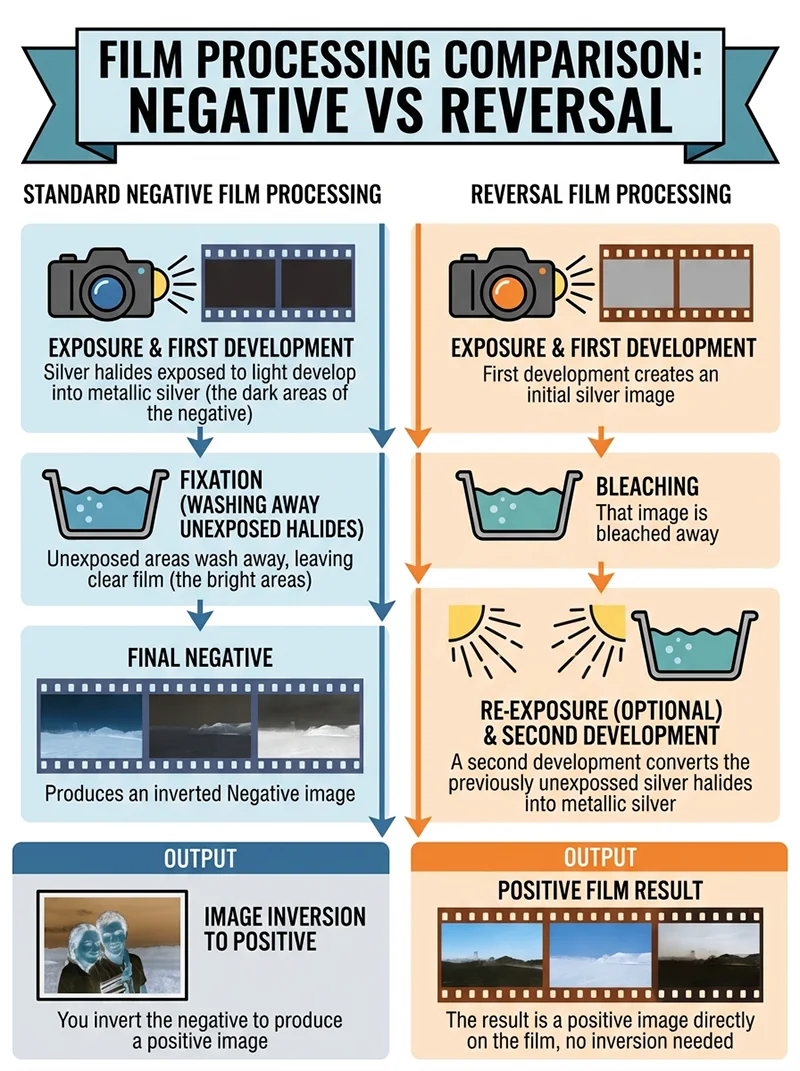
Every B&W film ever made was a negative film. TRI-X, T-MAX, Neopan, Acros: all negatives. You shoot, you develop, you invert the negative to get a positive image.
Agfa Scala 200X was the one exception.
Scala was a reversal film. It came out of processing as a positive B&W transparency: a slide. That single difference in chemistry produced a tonal response that no negative film replicates:
- Higher base contrast
- Deeper, more structural shadows
- Midtone separation that feels built-in rather than dialled in
- Highlight retention designed for projection
Agfa discontinued Scala in 2010. The film and its processing chemistry are gone. But the tonal character it produced is preserved in the Agfa Scala 200X Lightroom preset, and it remains one of the most distinctive looks in the black and white preset collection.
This article explains what made Scala unique, how the preset replicates it, and which subjects it suits best.
Key Takeaways
- Agfa Scala 200X was the world’s only commercially produced B&W reversal film. It created a positive B&W slide, not a negative.
- Reversal processing produces higher base contrast and different shadow depth than negative film. This is why Scala looks unlike TRI-X or T-MAX.
- The Scala preset suits subjects with strong tonal structure: architecture, still life, high-contrast portraits, and any scene where deep shadows are part of the composition
- Scala’s contrast is not the same as adding contrast in Lightroom. It comes from the characteristic curve of the reversal process and behaves differently across the tonal range
- ISO 200 makes Scala a good-light film. In low light, the contrast compounds the underexposure problem quickl
01.
What Made Scala Different
Most photographers have never used a reversal film, so the difference is worth understanding briefly.
Standard negative film:
- Silver halides exposed to light develop into metallic silver (the dark areas of the negative)
- Unexposed areas wash away, leaving clear film (the bright areas)
- You invert the negative to produce a positive image
Reversal film (Scala):
- First development creates an initial silver image
- That image is bleached away
- A second development converts the previously unexposed silver halides into metallic silver
- The result is a positive image directly on the film, no inversion needed

Negative film inverts to produce the final image. Reversal film creates a positive directly on the film through a second development stage. The tonal result of each process is fundamentally different. That second development step is what changes the tonal character. Shadows in a reversal process go darker faster. The midtone region has more separation. The highlights roll off differently because the curve was designed for projection, not printing.
The practical result in Lightroom: Scala’s preset behaves unlike any negative-film preset. The contrast isn’t coming from a slider. It’s built into the curve structure of the reversal process itself.
02.
What the Scala Preset Looks Like
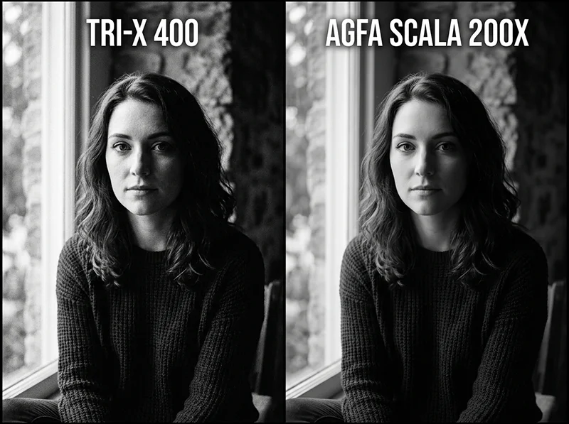
If you haven’t used Scala before, the preset will feel noticeably different from TRI-X or T-MAX on first application.

Left: TRI-X 400. Right: Agfa Scala 200X. Both have high contrast but the shadow depth and midtone separation behave differently. Scala’s reversal curve creates a structural quality TRI-X doesn’t produce. The shadows go deep. Not in the way that pulling the Blacks slider creates deep shadows, but in a way that feels structural. The shadow density in a Scala image has a quality that reads as intentional rather than adjusted.
The midtones have separation. Scala’s characteristic curve produces a tonal separation in the midrange that doesn’t compress or flatten. Two surfaces that are tonally similar in a colour image will have more visible separation in a Scala B&W conversion than in a TRI-X or T-MAX conversion of the same file.
The highlights hold. Reversal films were used extensively for projection, which meant highlight burnout was a serious problem. Scala’s characteristic curve was designed to hold highlight detail at the top end, which translates to a preset that doesn’t blow out bright surfaces easily.
The grain is moderate and fine. ISO 200 meant Scala had a finer grain structure than TRI-X at 400. The grain is visible and organic but not dominant. It contributes texture without competing with the image.
03.
Where Scala Preset Works Best
Scala is not an all-purpose film. Its high base contrast and strong shadow depth make it ideal for specific subjects and counterproductive for others.
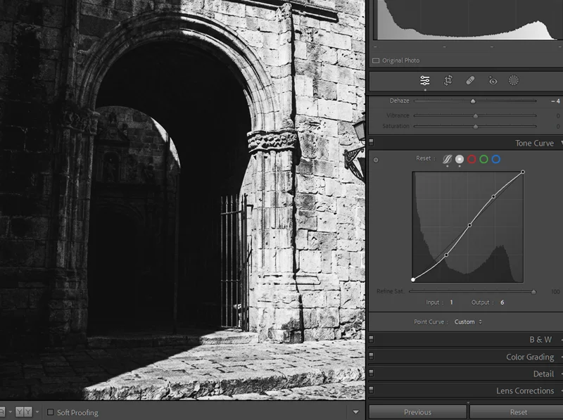
Controlled studio light and a subject with clear tonal structure brings out Scala’s best quality. The midtone separation between objects is the result of the reversal curve, not a slider adjustment. Architecture and urban environments
The combination of deep shadows, strong midtone separation, and highlight retention makes Scala exceptionally well suited to architectural work. Stone facades, steel structures, interiors with pools of light, and urban geometry all benefit from Scala’s tonal rendering. The reversal curve gives architectural surfaces a three-dimensional quality that flatter B&W conversions don’t produce.
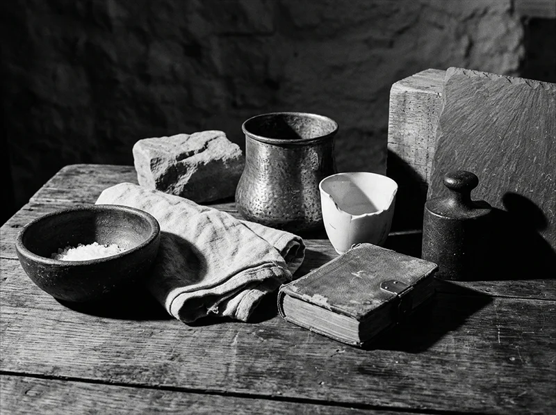
Still life and controlled studio work
Scala’s tonal precision suits studio setups where you control the light and want every tonal relationship in the scene to be visible and distinct. Product photography, tabletop work, and any setup with deliberate lighting benefits from Scala’s midtone separation.
High-contrast portraits
Scala works well for portraits with strong, directional lighting where shadow and highlight contrast is the subject. Think Rembrandt lighting, split lighting, or any portrait setup where deep shadows on the face are intentional. Scala’s shadow depth reinforces that kind of lighting rather than opening it up.
Landscape photography
Scenes with strong tonal structure benefit from Scala’s separation. Rocky terrain, coastal scenes with dark water and bright sky, and woodland scenes where dappled light creates pools of shadow and highlight all suit Scala’s reversal character.
What to avoid:
- Flat-lit portraits where the goal is smooth, even skin tones. Scala’s contrast will fight the subject.
- Low-light situations. At ISO 200, Scala’s contrast compounds underexposure problems quickly.
- Documentary and street work where a raw, energetic feel is the goal. Scala feels precise where TRI-X feels spontane
04.
Applying the Scala Preset in Lightroom
Scala’s contrast comes from the tone curve, not the Contrast slider. Adjusting the curve directly gives you more control over the shadow region than any panel slider does. Starting exposure
Scala was ISO 200, which means it was a good-light film. In Lightroom, apply the preset to a well-exposed image first. Unlike TRI-X, which handles overexposure forgivingly, Scala’s reversal character means that underexposed areas go very dark very quickly once the preset is applied.
- Well-exposed image: apply preset, assess shadows first
- Slightly underexposed image: bring Exposure up 0.3 before applying, then assess
- Overexposed image: bring Highlights down 10–15 points after applying to recover the top end
Working with the shadows
The shadow depth is Scala’s defining characteristic. In most cases, you want to preserve it rather than lift it. Resist the urge to raise the Shadows slider when you first apply the preset.
- If shadows are blocking in important areas, bring Blacks up 5 points rather than Shadows. This lifts the absolute floor without flattening the shadow-to-midtone transition Scala creates.
- If the image feels too dark overall, raise Exposure by 0.2 rather than lifting shadows. This preserves the tonal relationships while brightening the whole image.
- For architecture and still life, consider pulling Blacks down a further 5 points. The deeper shadow floor suits structural subjects.
Adjusting contrast
Scala’s contrast comes from the preset’s tone curve, not from the Contrast slider. If you want to reduce the intensity:
- Reduce Clarity first. This softens the midtone separation without flattening the shadows completely.
- If that’s not enough, go to the Tone Curve panel and gently raise the shadow anchor point by 5–8 points. This opens the shadow region while leaving the midtone and highlight curve intact.
- Avoid using the Contrast slider to increase contrast on top of the preset. Scala’s curve is already steep. Adding more Contrast tends to block the shadows completely.
Grain
Scala’s grain is finer and more moderate than TRI-X. The preset applies a moderate Amount with smaller Size and medium Roughness.
- For architecture and still life, consider reducing grain Amount by 10 points. Cleaner grain suits structural subjects.
- For portraits, keep the grain as-is. It adds organic texture to skin without becoming dominant.
- Don’t push grain Amount up significantly on Scala. The fine grain is part of the film’s identity. Heavy grain on Scala looks like a different film.
05.
Scala vs TRI-X vs T-MAX: Where It Fits
Agfa Scala 200X Kodak TRI-X 400 Kodak T-MAX 100 Film type Reversal (positive) Negative Negative ISO 200 400 100 Native contrast Very high High Moderate Shadow depth Very deep Deep Gradual Grain Fine, moderate Coarse, irregular Ultra-fine Best for Architecture, still life, portraits with strong light Street, documentary Landscape, fine art Avoid Low light, flat-lit subjects Fine art portraits Anything needing speed Scala occupies a distinct position. It’s not a faster alternative to T-MAX 100 or a cleaner alternative to TRI-X. It’s a different tonal mechanism producing a result neither negative stock can replicate. If you’ve worked through TRI-X and T-MAX and want something that looks genuinely different, Scala is the logical next step.
For a detailed comparison of TRI-X and T-MAX, see the Kodak TRI-X vs T-MAX Lightroom preset guide.
06.
A Note on Reversal Film and Digital Photography
One question that comes up with Scala is whether a reversal film preset makes sense for digital photography, given that digital cameras capture images as a positive from the start.
It does, for the same reason TRI-X and T-MAX presets make sense for digital. The value isn’t in replicating the film process itself. It’s in applying the tonal character that the film process produced to a digital RAW file. Scala’s characteristic curve, shadow depth, and midtone separation are real optical properties that were refined over years of film production. The Lightroom preset encodes those properties and applies them to any image you have.
The result is a B&W look that digital B&W conversion can’t replicate because digital conversion has no optical bias. It applies the same tonal math to every image. Scala’s reversal curve doesn’t.
07.
FAQ
Why was Agfa Scala discontinued?
Scala required a specialist reversal processing chemistry, E-6 adapted for black and white, that was not compatible with standard C-41 or standard black and white negative processing. As the number of professional labs declined through the 2000s, fewer labs offered the specialised Scala processing. Agfa discontinued the film in 2010 partly because the processing infrastructure to support it had largely disappeared.
Can the Scala preset be used on colour images?
Yes. Like all B&W film presets, the Scala preset converts colour RAW files to black and white using the film’s channel response. The reversal curve and tonal character are applied to the colour data in the file. RAW files give better results than JPEGs because they contain more colour information for the B&W conversion to work with.
Is Scala good for street photography?
It can work for specific street situations, particularly urban geometry and architectural street scenes. But for documentary street photography with people and movement, TRI-X’s raw energy suits the genre better. Scala’s precision and high contrast can make candid images feel overly formal.
How does Scala compare to Agfa’s colour films?
Scala shares Agfa’s overall approach to contrast and saturation, which tends toward precision and depth rather than warmth. Agfa’s colour films like Vista 400 have a distinctly Agfa character in their colour rendering. Scala carries a similar precision into B&W, which is one reason photographers who liked Agfa’s colour films were often drawn to Scala for B&W work.
Are there any modern films similar to Scala?
Scala is genuinely unique in that no other commercially produced B&W reversal film exists or has existed. Ilford and Kodak never made a B&W reversal film for commercial sale. Some photographers process regular B&W negative film as a reversal using DIY chemistry, but the results vary and no commercial product replicates Scala’s specific emulsion characteristics.
Related Articles
- Black and White Lightroom Presets: The Complete Guide to Film-Based B&W
- Kodak TRI-X 400 Lightroom Preset: Street Photography’s Black & White
- Kodak TRI-X vs T-MAX: Which B&W Film Preset Is Right for You?
Richard is a commercial and editorial photographer with over 15 years behind the lens. He’s shot on film and digital across three continents, and still keeps a Nikon F3 loaded with Kodak Portra on his desk. At LegendaryPresets, he leads preset development – studying actual film scans to make sure every stock behaves like the real thing.