Home | Articles | Analog Film
Kodak Gold Lightroom Presets: Gold 100 vs 200 vs 400, Which One Do You Actually Need?
Richard ♦ updated June 13, 2026 ♦ 17 min read

The Kodak Gold look is one of the most searched film aesthetics in digital photography, and one of the most misunderstood. Most photographers type “kodak gold lightroom preset” into Google and assume there’s one thing to find. There are three distinct films in the Gold family, each with a different ISO, different grain structure, and a meaningfully different color character. Picking the wrong one for your subject or lighting gives you results that feel off, even if you can’t say exactly why.
This guide breaks down all three, Gold 100, Gold 200, and Gold 400, explains exactly what each preset does in Lightroom, and tells you which one to reach for in which situation. You’ll also find the fine-tuning tricks that take any Kodak Gold preset from “nice filter” to something that genuinely looks like film.
At Legendary Presets, the full Kodak Gold range is available as individual packs, Gold 100, Gold 200, and Gold 400, each built from actual film scan analysis rather than approximation.
Key Takeaways
- Kodak Gold 100, 200, and 400 look similar at a glance but behave differently on real images, ISO, grain, and color palette all shift between them
- Gold 200 is the most versatile and the one that defined the “Kodak Gold look” most people are chasing
- Gold 100 is cleaner, tighter, better for harsh light and fashion, not just a “low ISO version” of 200
- Gold 400 runs grainier and slightly cooler, making it better for indoor natural light, candids, and any shot where texture fits the mood
- The Red Primary Hue –5 calibration trick after applying any Gold preset is the single most impactful fine-tune you can make
- Blue-dominant scenes need manual HSL correction after applying, this is a feature of the film, not a bug in the preset
01.
What Made Kodak Gold a Cultural Color Reference
Kodak Gold wasn’t a photographer’s film. It was everyone’s film.
From the mid-1980s onward, it sat in drugstore displays, airport kiosks, and supermarket checkout lines. It powered birthday parties, beach trips, family holidays, and high school graduations. Most people who shot it had no idea what ISO meant, they just knew the photos looked a certain way. Warm. Golden. Like something worth keeping.

Kodak Gold 200 – a consumer film that became a cultural color reference. That specific look, lifted shadows, warm midtones, colors that feel honest rather than saturated, is what photographers are chasing when they search for a Kodak Gold Lightroom preset today. It’s not nostalgia for a technical achievement. It’s nostalgia for a feeling.
What’s worth knowing is that “Kodak Gold” covered three different emulsions across its life, and they weren’t identical. The differences matter when you’re emulating them in Lightroom.
For the full picture, the Kodak Lightroom presets range includes every major stock from warm consumer films to professional portrait emulsions.
02.
What Made Kodak Gold a Cultural Color Reference
Kodak Gold wasn’t a photographer’s film. It was everyone’s film.
From the mid-1980s onward, it sat in drugstore displays, airport kiosks, and supermarket checkout lines. It powered birthday parties, beach trips, family holidays, and high school graduations. Most people who shot it had no idea what ISO meant, they just knew the photos looked a certain way. Warm. Golden. Like something worth keeping.
That specific look, lifted shadows, warm midtones, colors that feel honest rather than saturated, is what photographers are chasing when they search for a Kodak Gold Lightroom preset today. It’s not nostalgia for a technical achievement. It’s nostalgia for a feeling.
What’s worth knowing is that “Kodak Gold” covered three different emulsions across its life, and they weren’t identical. The differences matter when you’re emulating them in Lightroom.
Kodak Gold 200 Film Look, Instantly
Get Kodak Gold 200 Lightroom Presets with – warm tones, lifted shadows, fine grain. Works in Lightroom Classic, Lightroom CC, and mobile. Fully adjustable.
03.
Kodak Gold 100 vs 200 vs 400: What Actually Changes
This is the section most articles skip. Here’s the honest breakdown.

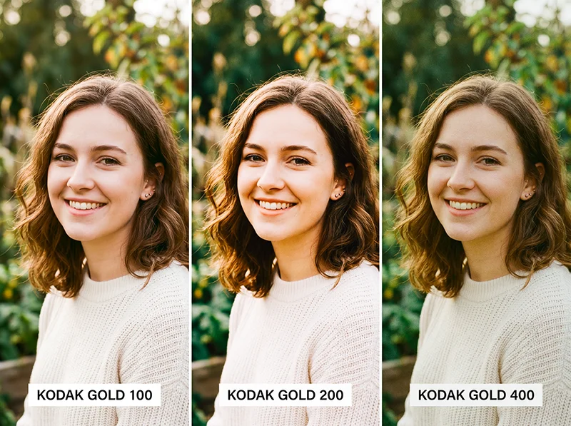
Gold 100 (left), Gold 200 (center), Gold 400 (right), same frame, different emulsion character. Gold 100 Gold 200 Gold 400 ISO 100 200 400 Grain Very fine Fine, slightly tactile Visible, textured Color temperature Warm, composed Warm, golden push Warm, slightly cooler than 200 Shadow lift Moderate Moderate-high Low-moderate Saturation Lower, cleaner Punchy but not aggressive Slightly muted Best for Harsh light, fashion, midday sun Portraits, travel, lifestyle Candids, indoor natural light, texture shots Gold 100 is the quietest of the three. Lower saturation, very fine grain, warm but controlled. Most photographers skip it because Gold 200 gets all the attention, but it’s actually the better choice for harsh midday light or fashion work where you want warmth without colors pushing too hard.
Gold 200 is the one almost everyone means when they say “Kodak Gold.” Golden highlights, creamy lifted shadows, just enough grain to feel tactile. It’s the most versatile preset in the family and the correct default for outdoor portraits, travel, and lifestyle work.
Gold 400 is grainier and slightly cooler than Gold 200. Less of a “golden warmth” look, more of a “lived-in candid film” look. Use it when grain adds something to the story, indoor natural light, documentary coverage, environmental portraits. Don’t reach for it when you want the clean, flattering Gold 200 glow.
I’ve run all three on the same outdoor portrait set. The difference is clear once you see them side by side: Gold 100 gives you control, Gold 200 gives you magic, Gold 400 gives you texture.
04.
What a Kodak Gold Preset Actually Does in Lightroom
A well-built Kodak Gold preset isn’t just a warmth slider cranked up. It’s a set of coordinated adjustments that work together to replicate how the film’s emulsion responded to light. Here’s what’s happening across the key panels when you apply a Gold 200 preset:
- White balance: Shifts warmer, typically 150–300K above a neutral daylight reading. This is the foundation. Without it, nothing else looks right.
- Tone curve: A soft S-curve with a raised black point. Real color-negative film can’t produce pure black, the film base itself has density. That lifted shadow is one of the most recognizable film characteristics and what separates a real emulation from a generic warm filter.
- HSL panel: Reds and oranges get a saturation and luminance boost (+5–10). Blues and cyans pull back (–10–15 saturation). Greens shift slightly toward yellow-green. This is why the preset warms skin tones and mutes skies, it’s mirroring the actual dye response of the emulsion.
- Color calibration: The red primary hue shifts slightly to push skin tones warmer and more orange. Blue primary is de-emphasized.
- Grain: Fine, luminance-based grain. For Gold 200, around 20–25 in Amount, Size at 20–30, Roughness at 50. For Gold 100, pull Amount down to 15–18. For Gold 400, push Amount to 30–35 and Size to 35–40.
One click in Lightroom – the preset shifts white balance, lifts shadows, and adds fine grain simultaneously. These aren’t arbitrary settings, they map to measurable characteristics of each physical film stock when scanned and analyzed. The Legendary Presets Kodak Gold range is built exactly this way, stock by stock.
05.
When the Kodak Gold Preset Works – and When It Fights You
Most articles just list “great for portraits.” That’s true but incomplete. After running a batch test across 300+ images in varied shooting conditions, the patterns are clear.
It excels:
- Outdoor portraits in golden hour or soft afternoon light, the warm preset and warm light compound each other perfectly
- Travel photography where you want images to feel like memories rather than records
- Wedding candids and reception shots with mixed ambient light
- Lifestyle, editorial, and social media content where an inviting, warm tone matters
- Family sessions and documentary-style personal photography
- Skin tones across a wide range of complexions, the warm red-orange bias flatters broadly
It fights you:
- Scenes where blue sky is the dominant element, the HSL shift will mute it toward grey-green. Fix: use Lightroom’s Select Sky mask and push Blue Saturation back up +10–15 within the mask only
- Shots already very warm from golden hour light or tungsten interiors, the preset can push things into orange. Drop Temperature by 100–200K after applying
- Blue or teal clothing, same issue as sky. Go to HSL > Saturation > Blue and push +10–15 after applying
- Color-critical work, product photography, food, real estate. These need accurate color, not a film push
- Blue-hour or overcast street photography where cool tones are the mood
The blue issue trips up a lot of photographers. It’s not a problem with the preset, it’s an accurate replication of how the film actually behaved. Real Kodak Gold 200 muted blues. The fix is a local mask, not a different preset.
Analog film stocks were never interchangeable, each one was engineered for a specific purpose, browse our complete film presets collection and find the emulsion that was built for what you shoot.
06.
The Fine-Tuning Workflow
Applying the preset is step one. Getting it to look right on your specific image is step two.
- Expose correctly before applying. The preset assumes a properly exposed RAW file. Underexposed images will block up even with the lifted black point. Expose to the right when you can.
- Check your white balance first. If the original shot is very cool (overcast, open shade), add 200–400K warmth before applying. If it’s already warm (golden hour, tungsten), pull Temperature back by 100–200K after applying.
- Use the calibration trick. After applying, go to Camera Calibration and set Red Primary Hue to –5. This small shift dials the warm-pink relationship to something that reads like genuine Gold film rather than a filtered Instagram edit. It’s subtle but once you train your eye to see it, you won’t skip it.
- 4. Dial back grain on high-ISO shots. If you shot at ISO 1600 or above, your camera’s natural grain plus the preset grain can look excessive. Pull grain Amount in the Effects panel from 25 down to 10–15.
- Use opacity for film scans. Applying a Gold 200 preset at 40–60% opacity is a fast way to standardize a mixed roll of 35mm scans from different batches. Different scanning sessions can shift the base color significantly, the preset acts as a consistent color anchor without overriding the scan’s natural character.
- Mask the sky separately. Lightroom’s Select Sky masking tool is fast and accurate. Apply it after the preset, then push Blue Saturation +10–15 within the mask. Warm tones stay on skin and foreground; the sky stays blue.
07.
Gold vs. Portra vs. Ektar: Picking the Right Kodak Preset
The Gold vs. Portra question comes up constantly from photographers new to film emulation. Here’s the honest answer.
- Gold 200 is the emotional choice. Warm, punchy, nostalgic. It’s what your parents’ vacation photos looked like. Best when you want warmth and feeling built into the edit.
- Portra 400 is the professional choice. More neutral, extraordinarily fine grain, accurate skin without a golden push. Wedding photographers who shoot in varied lighting default to Portra because it doesn’t fight the existing light, it refines it. If a client needs clean, consistent, flattering portraits across all lighting conditions, Portra is more reliable than Gold.
- Ektar 100 goes the other direction entirely, maximum saturation, high contrast, punchy commercial color. Built for landscapes and editorial work, not portraiture.
- Kodak UltraMax 400 sits between Gold and Ektar, grainier than Gold 200, more versatile, a wider color palette. Better for urban and documentary work than Gold.
The short version: Gold for warmth and emotion, Portra for accuracy and flexibility, Ektar for commercial color impact. A complete Kodak preset library has all three. You’ll reach for different ones on different shoots.
For a deeper dive on the Portra range, the guide to Kodak Portra Lightroom presets covers 160 vs 400 vs 800 in the same level of detail.
08.
Which Photography Genres Suit Each Gold Preset
Portrait photography, Gold 200 first, Gold 100 as a second option in harsh light. The warm orange-red bias in the HSL makes skin glow. Tested across fair to deep complexions, it flatters broadly. The lifted shadows prevent harsh faces under midday sun.
Travel photograph:, Gold 200 is the default. Markets, cobblestone streets, coastal towns, golden fields, it adds a “postcard from the past” quality that turns a competent travel shot into something that feels lived-in. For grittier, more urban travel work, try Gold 400 instead.
Wedding photography: Gold 200 for ceremonies and outdoor portraits, Gold 400 for reception candids where more grain and texture fits the loose, emotional energy. The warmth suits string lights, candles, and golden hour windows equally well.
Lifestyle and content: Gold 200 is the preset behind a significant chunk of what you see on social media that looks “warm and filmy.” It makes everyday subjects feel elevated without the edit feeling obvious.
Street photography: Gold 400 over Gold 200 here. The extra grain texture and slightly cooler palette gives street shots more grit and authenticity. Gold 200 can feel too pretty for environments that aren’t pretty.
Film scanning: Any of the three at 40–60% opacity, matched to the film stock you were shooting. If you were shooting Gold 200, use the Gold 200 preset as a standardizer. It reduces variation between scanning sessions significantly.
Make Your Photos Look Expensive
One-click Kodak Gold 200 presets with authentic warm tones, lifted shadows, and fine film grain.
09.
FAQ: Kodak Gold Lightroom Presets
What’s the difference between Kodak Gold 100, 200, and 400 presets?
Gold 100 is cleaner, lower-grain, better for bright light situations where you want warmth without saturation pushing too hard. Gold 200 is the most versatile, the classic warm, golden, slightly nostalgic look. Gold 400 is grainier, slightly cooler, better for texture and candid work. ISO controls grain; each stock also has its own distinct color palette.
Does a Kodak Gold preset work on JPEG files?
Yes, but RAW gives significantly better results. JPEGs are already processed by the camera, shadow recovery and HSL shifts won’t be as clean, and the lifted blacks can look muddy on compressed files.
Can I use Kodak Gold presets on Lightroom Mobile?
Yes. DNG-compatible versions sync through Lightroom CC and work on RAW files from iPhone and Android cameras.
Why does the Kodak Gold preset make skies look grey?
That’s accurate film behavior, Gold 200 muted blues. The fix is to use Lightroom’s Select Sky mask after applying and push Blue Saturation back up +10–15 within the sky only.
Is Kodak Gold good for skin tones?
Gold 200 and Gold 100 are excellent on skin, the warm red-orange HSL shift adds a natural glow that flatters a broad range of complexions. Gold 400 is warmer than neutral but more suited to environmental and candid work than close portrait work.
What Lightroom preset is closest to Kodak Gold 200?
The most accurate emulations analyze real film scans rather than approximating the look. The Kodak Gold 200 preset at Legendary Presets is built from actual scan data, with the tone curve, HSL, and grain calibrated to match the physical film’s measured response.
How is Kodak Gold different from Kodak UltraMax?
Gold 200 is warmer, cleaner, more portrait-friendly. UltraMax 400 is grainier, has richer greens and blues, and suits urban and documentary work better. Think of Gold as the warm film and UltraMax as the vivid film.
10.
The Bottom Line
The Kodak Gold look isn’t one thing, it’s three distinct films, each with a different use case. Gold 100 for controlled light and clean warmth. Gold 200 for the classic golden, nostalgic look across portraits, travel, and lifestyle. Gold 400 when texture and a slightly rawer feel fits the subject.
The preset gets you the look in one click. The fine-tuning, especially the Red Primary Hue –5 calibration trick and the sky masking workflow, gets you the look that actually reads as film rather than a filter.
Explore the individual packs: Kodak Gold 100 · Kodak Gold 200 · Kodak Gold 400
Or see the full range of Kodak Lightroom presets if you want to compare Gold against Portra, Ektar, and the rest of the catalog.
Related reading
- Guide to Kodak Portra Lightroom Presets: 160 vs 400 vs 800
- Kodak Film Lightroom Presets: The Full Collection Guide
- Realistic Film Grain Without Losing Detail in Lightroom
- Edit Photos with Sunny Kodak Gold 200 Film Colors
Richard is a commercial and editorial photographer with over 15 years behind the lens. He’s shot on film and digital across three continents, and still keeps a Nikon F3 loaded with Kodak Portra on his desk. At LegendaryPresets, he leads preset development – studying actual film scans to make sure every stock behaves like the real thing.