


Home | Articles | Analog Film
Fujifilm Instax Film: What It Is and How to Get the Look in Lightroom
Richard ♦ June 15, 2026 ♦ 7 min read
Instax prints have a look that’s immediately recognisable, high contrast, slightly lifted whites, warm shadows, and a softness that digital cameras don’t produce naturally. If you’ve shot on Instax or want to edit your digital photos to match that aesthetic, this guide covers what makes the Instax look distinct and how to recreate it in Lightroom without touching a film cartridge.
If you’d rather start with a preset built directly from Instax characteristics, the Fujifilm Instax Presets for Lightroom at Legendary Presets give you that look in one click.
Key Takeaways
- Instax prints are characterised by lifted blacks, warm whites, moderate contrast, and slightly soft colour, not the same as other Fuji film stocks
- The look works best on casual, social, and lifestyle scenes, it doesn’t suit moody or low-key editing
- In Lightroom, three controls matter most: the black point, the highlight warmth, and a subtle grain setting
- The Instax look is distinct from Provia or Velvia, it’s a consumer instant film, not a professional slide film
- Instax comes in three formats, Mini (46×62mm), Square (62×62mm), and Wide (99×62mm), each giving slightly different framing but the same core aesthetic
01.
What the Instax Look Actually Is
Instax isn’t trying to be accurate. It’s built for instant gratification, a print in your hand within seconds, no lab, no scanning, no editing. The chemical process that makes that possible produces a distinctive aesthetic that has nothing to do with professional slide film or colour negative latitude.

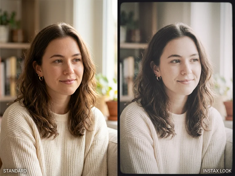
Same RAW file. Left: standard digital edit. Right: Instax aesthetic, lifted blacks, warm highlights, muted saturation. The Instax look has four defining characteristics:
- Lifted blacks. Instax prints never go truly dark. The shadow areas sit noticeably above absolute black, giving images an airy, faded quality.
- Warm highlights. Whites on Instax prints have a slight warmth, not yellow, but not clean white either. This is part of why Instax images feel nostalgic rather than clinical.
- Moderate contrast. The print is contrasty enough to feel punchy, but the lifted blacks mean the contrast sits in the midtones rather than the shadows.
- Soft colour. Colours are present and readable but not saturated. Instax isn’t Velvia. The saturation is muted enough that the image feels like a memory rather than a photograph.
This combination, lifted blacks, warm whites, midtone contrast, muted colour, is what separates the Instax look from every other Fuji film aesthetic. Provia is neutral and accurate. Velvia is hyper-saturated. Pro 400H is soft and pastel. Instax is its own thing: warm, casual, slightly imprecise, and immediately charming.
Not sure which Fuji stock suits your style? The complete Fujifilm film presets range lets you try them all and find your go-to look.
02.
How to Recreate the Instax Look in Lightroom
You don’t need an Instax camera to use this aesthetic. These are the specific Lightroom moves that recreate it from a RAW file.
Tone curve – the foundation
The most important control is the black point. In the tone curve, lift the bottom-left anchor point up by 20–25 units. This is what creates the faded, lifted-black quality that defines Instax prints. Don’t use the Blacks slider for this, the tone curve gives you a smoother lift.
White balance and highlight warmth
Instax whites are warm, not clean. Set white balance around 5,600–5,800K and add +8 to +12 on the Tint slider toward magenta. Then reduce Whites slightly (-10 to -15) so the highlights compress rather than clip hard.
HSL – mute without flattening
Reduce overall Saturation by -10 to -15 globally, then bring individual colours back selectively. The key move: reduce Yellow Saturation (-15) and Orange Saturation (-10) slightly more than the others. This removes the warmth from colours without making them go grey, which is the Instax colour character.
Grain – keep it light
Instax prints have a fine, even texture from the chemical process. In Lightroom’s Detail panel: Amount 20–25, Size 20, Roughness 30. This should be barely visible, just enough to stop the image looking completely digital.
Vignette – optional but effective
A very subtle vignette (-8 to -12 in Post-Crop Vignetting, Feather 90) mimics the slight edge darkening that Instax cameras produce from the fixed lens aperture. Not necessary but adds authenticity.
If you want to go beyond this stock, our analog film presets library covers dozens of emulsions across every major film brand.
03.
When the Instax Look Works
This aesthetic is built for specific subjects. It suits:
- Casual social and lifestyle photography, groups, parties, outdoor gatherings
- Portrait work where you want warmth and nostalgia over accuracy
- Travel photography with a personal, diary-like quality
- Any scene where imperfection is part of the appeal
It doesn’t suit low-key portraits, moody architectural work, or any image where you want accurate colour or deep blacks. The lifted shadows and warm whites fight those intentions.
The Instax look is built for social, casual scenes. Warm, approachable, slightly imprecise, exactly what it was designed for.

04.
What are the Competitors of Fujifilm Instax Film?
Here are some notable alternatives:
| Brand | Film Type | Key Features | Compatibility |
| Polaroid | I-Type, 600, SX-70 | Larger prints, Bluetooth connectivity, artistic control | Polaroid Now+, I-2 cameras |
| Lomography | Lomo’Instant films | Creative filters, multiple exposure options | Lomo’Instant cameras |
| Dubblefilm | Instant films | Double exposure capabilities, vibrant colors | Compatible with Fujifilm Instax |
| Mint | InstantFlex TL70 | Twin-lens reflex design, vintage aesthetics | Instax Mini film packs |
Polaroid remains a significant competitor with its larger format and artistic features, while Lomography appeals to creative users seeking unique effects. Dubblefilm offers a budget-friendly alternative compatible with Instax cameras, and Mint’s InstantFlex provides a vintage shooting experience.
05.
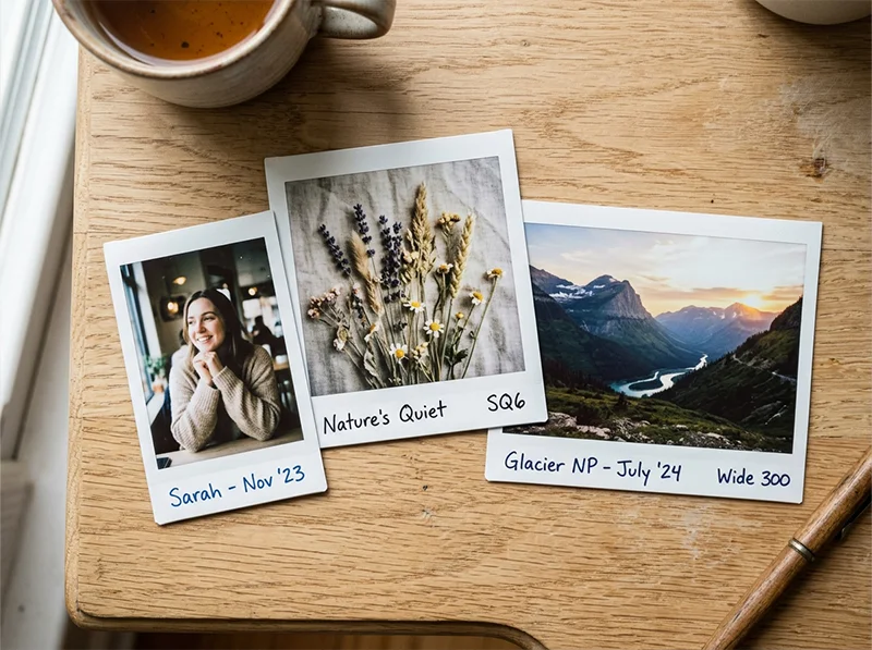
The Three Instax Formats
If you’re shooting actual Instax film, the format affects framing but not the look:
| Format | Print size | Best for |
| Instax Mini | 46 × 62 mm | Casual portraits, wallet-size keepsakes |
| Instax Square | 62 × 62 mm | Artistic compositions, social media framing |
| Instax Wide | 99 × 62 mm | Group shots, landscapes, wider scenes |
All three share the same core Instax aesthetic, the format choice is purely about composition.
06.
Start With a Preset
If you want the Instax aesthetic without building it from scratch, the Fujifilm Instax Presets for Lightroom are built from the same visual analysis above, lifted blacks, warm highlights, muted colour, fine grain, calibrated for RAW files from modern digital cameras.
For other Fuji film looks in Lightroom, the full range is covered in the guide to iconic Fuji film stocks, from Velvia’s saturated landscapes to Pro 400H’s soft portrait work.
Related Fuji preset products:
- Fujifilm Pro 800Z Presets
- Fujifilm Pro 160NS Presets
- Fujichrome Provia 100F Presets
- Fujichrome Sensia 200 Presets
- Fujifilm Pro 160S Presets
Related reading:
- Guide to Iconic Fuji Film Looks: Stock by Stock
- Realistic Film Grain Without Losing Detail in Lightroom
- Fuji Lightroom Presets for Portrait Photographers
Richard is a commercial and editorial photographer with over 15 years behind the lens. He’s shot on film and digital across three continents, and still keeps a Nikon F3 loaded with Kodak Portra on his desk. At LegendaryPresets, he leads preset development – studying actual film scans to make sure every stock behaves like the real thing.