Home | Articles | Analog Film
What Is the Ektachrome Look – and How Do You Get It in Lightroom?
Richard ♦ June 14, 2026 ♦ 16 min read
What is the Kodak Ektachrome Look – and How Do You Get It in Lightroom?
The Ektachrome look is defined by three things: cool, punchy blues; clean, slightly cool whites; and contrast that’s tight without being harsh. It’s the look of E-6 slide film, the kind that rewards careful exposure and makes skies and ocean shots feel almost three-dimensional.
Getting it in Lightroom isn’t complicated, but most guides skip the part that actually matters: understanding why Ektachrome looks the way it does, so your edits make sense rather than just copying numbers.
I’ve shot on actual Ektachrome E100 stock, the relaunched version Kodak brought back in 2018, and I’ve spent a lot of time reverse-engineering those scans to build the Kodak Ektachrome E100 presets at Legendary Presets. Here’s what I know.
Key Takeaways
- Ektachrome E100 is E-6 slide film, it behaves completely differently from C-41 negative film like Portra or Gold
- The Ektachrome look is built on cool whites, deep blues, and controlled saturation, not high vibrance
- Skin tones need active protection because E100 pushes toward magenta in warm tones
- The Tone Curve does more work than the Contrast slider in this edit
- Highlight protection is non-negotiable, slide film has almost no latitude above the exposure point
- Ektachrome is sharper-feeling than Portra or Fuji Pro 400H, which makes it better for architecture, travel, and product work than for soft portraiture
01.
What Makes the Ektachrome Look Different and Why It Matters
Most photographers know Ektachrome by its blues. But the reason those blues look the way they do isn’t just about the HSL panel, it’s about how E-6 slide film records colour differently from negative film.
Slide film vs. negative film, the key difference
Negative film (Kodak Portra, Gold, Fujifilm Pro 400H) is designed to be forgiving. It has wide exposure latitude, and lab scanning adds another layer of correction. The colour you see has been interpreted twice: once by the film, once by the scanner.
E-6 slide film like Ektachrome works differently. The processed transparency is the final image, no negative, no colour correction stage. What you shoot is what you get. This means:
- Exposure latitude is narrow, roughly ±1 stop vs. 3–4 stops for negative film
- Colour rendering is more literal, blues are blues, not blue-green
- Contrast is baked in from the chemistry, not added in post
- Highlights clip fast and cleanly, rather than rolling off gradually
When you’re recreating this in Lightroom, you’re not just adding a look, you’re simulating a fundamentally different recording process. That’s why the Ektachrome edit feels different to build than a Portra or Gold edit.
How Ektachrome E100 compares to Velvia and Provia
These are the three slide films photographers reference most often, and they’re genuinely different:
Film Character Saturation Contrast Best for Kodak Ektachrome E100 Cool, precise, clean Moderate Medium-high Travel, architecture, street Fujichrome Velvia 100 Warm, vivid, saturated Very high High Landscapes, nature Fujichrome Provia 100F Neutral, balanced Moderate Medium General, portraits, studio Ektachrome sits between Provia and Velvia in terms of saturation, but it’s cooler-toned than both. Where Velvia pushes yellows and greens toward neon, Ektachrome keeps colours more accurate and adds depth through contrast rather than saturation. That’s what makes it work so well for urban and architectural photography.
The Kodak film presets range covers everything from the warm nostalgia of Gold 200 to the fine grain of Portra 160, one collection for every Kodak look.
02.
What does the Kodak Ektachrome look mean?
The Ektachrome look refers to the colour rendering of Kodak Ektachrome E100, a daylight-balanced ISO 100 slide film. Its defining traits are: cool, deep blues (especially in sky and shadow); clean, slightly cool whites; moderate-to-high contrast; and controlled saturation that stays accurate rather than vivid.
In Lightroom, you recreate it by cooling the white balance, pulling highlights, deepening blue luminance, adding an S-curve on the Tone Curve, and protecting skin tones from the resulting magenta push.
03.
The Core Lightroom Workflow
This is the full E100 edit in order. Work through these steps rather than jumping to colour before you’ve fixed your base.

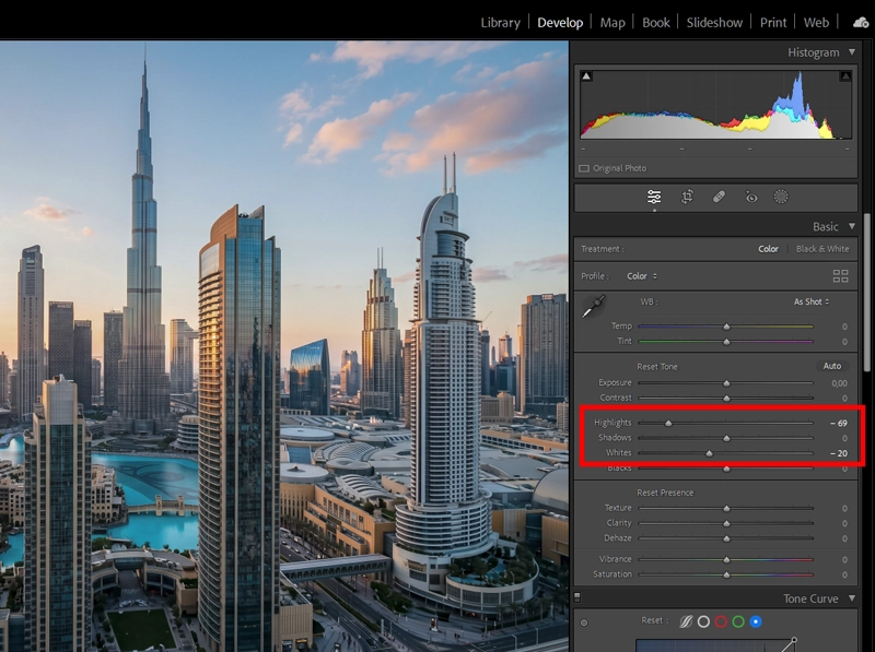
Highlight protection is the first move in any E100 edit — pull Highlights down before touching colour. Slide film clips hard with no gradual roll-off, so what you protect here you can’t recover later. Step 1: Protect your highlights first
Ektachrome punishes clipped highlights more visibly than negative film because there’s no gradual roll-off, it clips hard. Before anything else:
- Pull Highlights down: -40 to -70 depending on scene brightness
- Hold Alt/Option while dragging Whites until clipping just disappears
- If you’re shooting a sky-heavy scene, check the histogram before moving on
This is also where Ektachrome differs most from a Portra edit. With Portra you can sometimes recover from a slightly hot exposure. With E100 you can’t, and your Lightroom edit shouldn’t pretend otherwise.
Step 2: Cool the white balance (but not cold)
Ektachrome E100 is daylight-balanced at around 5500K. In practice, it reads slightly cooler than you’d expect, particularly in the whites and the upper midtones.
- Temp: 4800K–5400K for daylight shots
- Tint: 0 to -5 (neutral to very slightly green, pulling away from magenta)
Don’t go below 4600K unless you’re going for a stylised cold look. The E100 character is cool, not cold. If your whites feel grey rather than clean, you’ve gone too far.
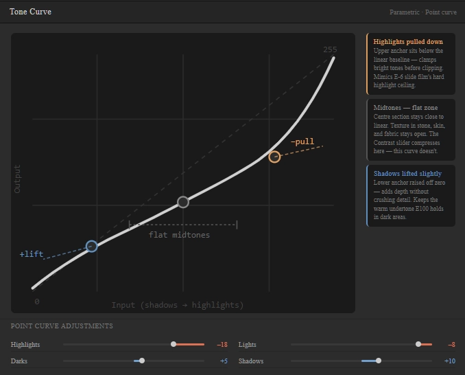
Step 3: Shape contrast with the Tone Curve
The Contrast slider flattens the midtones in a way that doesn’t match how slide film actually behaves. Use the Tone Curve instead:
- Lift the deep shadows point very slightly (lifts blacks without graying them out)
- Pull the highlights point down a touch
- Add a gentle S-shape through the midtones
The result is contrast that feels punchy in the right places, bright areas and deep shadows, without crushing the midtones where texture lives. On stone walls, concrete, and fabric, this makes a visible difference.

Balancing blues and reds in HSL for a calm slide-film aesthetic Step 4: Build the blue character in HSL
This is where the Ektachrome look gets its signature. Two moves, in order:
- Blue Hue: shift toward cyan, -5 to -10. This is what gives E100 skies that slightly teal quality rather than a flat royal blue.
- Blue Luminance: pull down, -10 to -20. Deepens the sky and water without adding more saturation.
Then check your Aqua channel, if you’ve gone too far on the Blue Hue shift, aqua tones (pool water, certain sky gradients) can go over-teal. A small Aqua Hue correction (+3 to +5 toward blue) fixes this.
Step 5: Handle reds and oranges for skin
This is the step most guides skip, and it’s the one that makes or breaks Ektachrome on portraits.
E100 pushes slightly toward magenta in warm tones, you’ll see it in skin and brick. Two corrections:
- Red Hue: shift slightly toward orange (+3 to +8). Warms the red channel away from magenta.
- Orange Saturation: reduce slightly (-5 to -10). Keeps skin from going oversaturated in the HSL adjustment.
Don’t skip this even if your shot has no people in it. Brick, terracotta, and autumn foliage all carry the same orange-red values and will pick up the same push.
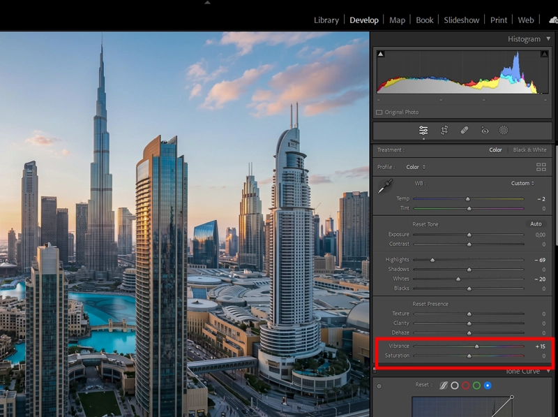
Vibrance, not Saturation, is how E100 adds colour depth. It lifts muted tones while leaving already-saturated colours alone, much closer to how slide film actually behaves than a flat Saturation boost. Step 6: Vibrance over saturation
Ektachrome is bold but not oversaturated. Use Vibrance +10 to +20 and keep Saturation at 0 or +5 at most. Vibrance boosts colours that are already muted while protecting skin tones, it’s closer to how slide film actually adds depth than a flat saturation boost.
Step 7: Add film grain last
Grain goes on last, after all colour and tone decisions are made. Add it before grain and it interacts with every subsequent adjustment.
- Amount: 15–25
- Size: 20–30
- Roughness: 40–55
E100 grain is fine and regular, not the chunky, random grain of pushed T-MAX 3200. Keep Size low and Roughness moderate.
04.
Lightroom Settings at a Glance
Adjustment Suggested Range What it does Highlights -40 to -70 Protects sky and bright surfaces Whites Clip-point only Prevents hard clipping Tone Curve Gentle S-shape Adds contrast without crushing midtones Blue Hue -5 to -10 Shifts sky toward teal Blue Luminance -10 to -20 Deepens sky and water Red Hue +3 to +8 Pulls skin away from magenta Orange Saturation -5 to -10 Keeps skin clean in HSL Vibrance +10 to +20 Adds colour depth without oversaturation Grain Amount 15–25 Fine, regular film texture 05.
Where Ektachrome Works and Where It Doesn’t
Understanding this saves you from forcing the look onto the wrong subjects.
Where E100 works well
- Travel and street photography – the cool whites and deep blues make urban scenes feel sharp and cinematic. Red signs, café chairs, and painted doors pop without looking fake. See the full Ektachrome E100 travel editing guide for a scenario-by-scenario breakdown.
- Architecture – the microcontrast and controlled saturation make stone, glass, and concrete look precise rather than heavy. The slide-film aesthetic for architecture guide covers highlight handling for glass-heavy facades.
- Coastal and landscape – blue luminance control makes water and sky look dimensional in a way that Velvia’s saturation can’t always match.
- Product photography – the accurate colour rendering and clean whites work well for objects where colour accuracy matters.
Where E100 is harder to use
- Soft portrait work – the magenta push and higher contrast work against the warm, forgiving look that Portra 400 or Fuji Pro 400H give naturally. You can make it work, but you’re fighting the film’s character rather than using it.
- Indoor tungsten lighting – E100 is daylight-balanced. Mixed indoor lighting pulls the whole edit in directions that need a lot of correction to rescue.
- Low-light scenes – at ISO 100, E100 was always a daylight film. Shooting at higher ISOs and then trying to apply E100’s character feels forced, the grain character doesn’t match and the shadows go noisy before they go filmic.
06.
One Thing Most Guides Get Wrong
Most Ektachrome tutorials in Lightroom focus entirely on the blue channel. That’s the easy part.

This is the curve that separates E100 from a generic contrast boost — flat through the midtones, bite at the ends. The Contrast slider can’t replicate this. The edit that actually makes E100 look like E100 is the Tone Curve work. Here’s why: slide film’s contrast is built into the chemistry, not added afterward. When you add Contrast with the slider in Lightroom, you’re compressing the midtones symmetrically, the curve goes up and down equally. That’s not what slide film does.
Real E100 contrast holds the midtones relatively steady and adds bite at the edges, in the upper highlights and the deep shadows. You get a sense of depth and three-dimensionality that the Contrast slider can’t replicate because the slider applies the same adjustment everywhere.
When I was matching my Ektachrome scans against digital edits, I found I needed a very flat centre on the Tone Curve with steeper anchors at each end, almost like a flattened S. The contrast feels high because of the endpoint separation, but the midtones stay open and clean. That’s the detail most people miss.
07.
One Thing Most Guides Get Wrong
Most Ektachrome tutorials in Lightroom focus entirely on the blue channel. That’s the easy part.
The edit that actually makes E100 look like E100 is the Tone Curve work. Here’s why: slide film’s contrast is built into the chemistry, not added afterward. When you add Contrast with the slider in Lightroom, you’re compressing the midtones symmetrically, the curve goes up and down equally. That’s not what slide film does.
Real E100 contrast holds the midtones relatively steady and adds bite at the edges, in the upper highlights and the deep shadows. You get a sense of depth and three-dimensionality that the Contrast slider can’t replicate because the slider applies the same adjustment everywhere.
When I was matching my Ektachrome scans against digital edits, I found I needed a very flat centre on the Tone Curve with steeper anchors at each end, almost like a flattened S. The contrast feels high because of the endpoint separation, but the midtones stay open and clean. That’s the detail most people miss.
08.
What I Noticed From Actual E100 Scans
After scanning multiple rolls of relaunched Ektachrome E100 alongside Provia 100F and Velvia 100 for the Legendary Presets development process, one thing stood out that I haven’t seen written about elsewhere:
E100’s blue channel behaves differently in shadow vs. highlight areas. In bright areas, sky, water, white walls, the blue is clean and slightly teal-shifted, just as the spec suggests. But in shadow areas, Ektachrome goes slightly warmer than you’d expect from a cool film. The shadows don’t go blue-grey the way Provia does; they have a faint warm undertone that keeps portraits from looking cold even when the overall edit is cool.
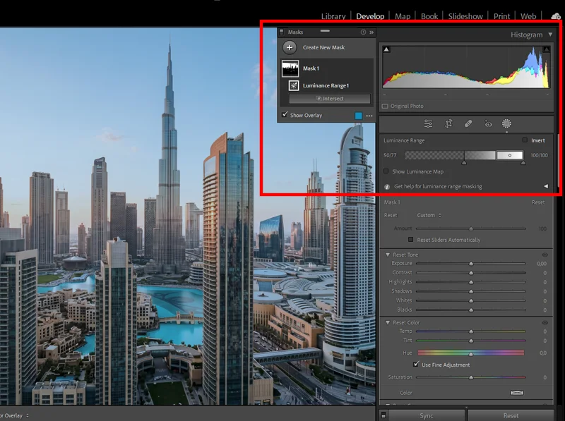
Applying Blue Luminance reduction only to the upper tonal range keeps the sky deep without pushing shadows cold — the detail that makes E100 feel warm in the darks. The practical implication: if you use a flat -10 Blue Luminance adjustment across the board, you’ll lose that warmth in the shadows. A better approach is to use a luminosity mask on the adjustment, apply the Blue Luminance reduction only to your upper midtones and highlights, and let the shadows breathe. You’ll get the deep sky character without the cold, clinical feel in darker areas.
In Lightroom, do this with a Masking adjustment: add a Luminance Range mask set to the upper 60–70% of the tonal range, then apply your Blue Luminance reduction inside that mask. It’s two extra clicks and it’s the difference between Ektachrome and “generic cool film.”
09.
FAQ
What is the Ektachrome look in photography?
The Ektachrome look comes from Kodak Ektachrome E100, an ISO 100 slide film. Its main traits are cool, deep blues, clean whites with a slight cool bias, and medium-high contrast with accurate colour, not oversaturated. It’s a precise, almost clinical look compared to warmer film stocks like Portra or Velvia.
Is Ektachrome warmer or cooler than Portra?
Cooler. Kodak Portra 400 renders skin with a warm, flattering bias and has wide exposure latitude. Ektachrome E100 renders colour more literally with a cool daylight bias. In practical terms: Portra forgives overexposure; Ektachrome doesn’t, but rewards careful exposure with sharper, more precise colour.
Why does my Ektachrome Lightroom edit look too blue?
Usually two causes: Blue Luminance pulled too far, or the White Balance taken below 4800K. Back off Blue Luminance to -10 and bring Temp up to 5000–5200K. Also check that your Aqua Hue hasn’t drifted, Aqua can go green-blue quickly when Blue Hue is shifted toward cyan.
Does Ektachrome work for portraits?
It can, but it’s not the natural choice. E100’s magenta push in warm tones means you need to actively correct Red Hue and Orange Saturation to keep skin clean. If soft, warm, flattering portraits are the goal, Fuji Pro 400H or Kodak Portra 400 are easier to work with. Ektachrome portraits work best in good outdoor light where the cool whites and clean contrast add definition rather than fighting the subject.
What’s the difference between Ektachrome and Ektachrome-style presets?
Shooting actual Ektachrome E100 film requires using E-6 chemistry processing (or sending it to a lab), and the results depend heavily on your scanner. A Lightroom preset applies the colour and contrast characteristics of E100 to a digital RAW file, skipping the film entirely. The preset approach lets you control the result precisely; actual film scanning adds analogue variability that can’t be fully replicated digitally, but also has its own character.
10.
Final Thoughts
The Ektachrome look isn’t just a blue-boost and a contrast slider. It’s a specific set of relationships between tones, cool whites, deep but accurate blues, controlled midtone contrast, and protected highlights, that come from a film designed to work as a direct-view transparency, not a negative.
Once you understand that, the Lightroom edit makes intuitive sense. You’re not adding a filter; you’re simulating a recording process that handled colour differently from the ground up.
For a fast starting point, the Kodak Ektachrome E100 presets are built directly from E100 film scans and cover portraits, travel, and architecture. From there, use the workflow above to push or dial back the character depending on your subject.
For architecture-specific E100 editing, see the slide-film aesthetic for architecture guide. For travel and scenario-specific breakdowns (beach, city, mountains, markets), the Ektachrome E100 travel editing guide covers the adjustments in detail.
If you want to see how E100’s cool-precise character compares to the warmer, more saturated slide films, Fuji vs. Kodak colour science in Lightroom breaks down the differences directly.
Shooting digitally does not mean giving up on analog character, our complete film photography presets collection gives you every major emulsion without ever picking up a film camera.
Richard is a commercial and editorial photographer with over 15 years behind the lens. He’s shot on film and digital across three continents, and still keeps a Nikon F3 loaded with Kodak Portra on his desk. At LegendaryPresets, he leads preset development – studying actual film scans to make sure every stock behaves like the real thing.