Home | Articles | Analog Film
How to Apply the Kodak Gold 200 Look in Lightroom: Scenario-by-Scenario Guide
Richard ♦ updated June 13, 2026 ♦ 17 min read

Kodak Gold 200 has one of the most recognizable color signatures in photography. Warm without being orange. Sunny without being overexposed. Greens that lean slightly yellow-olive rather than vivid digital green. It’s the palette of holiday photos, birthday parties, and every disposable camera roll from the 1990s.
Getting that look on a digital RAW file is more specific than most tutorials admit. It isn’t just “warm it up and add grain.” Gold 200 has a precise color character, lifted shadows that go brown rather than cold, yellows that glow in sunlight, skin that takes on a radiant peach tone, and replicating it means knowing which sliders do what, in what order, and on what type of shot.
This guide covers the Gold 200 look applied across five real shooting scenarios, with exact Lightroom values for each. Whether you’re using a Kodak Gold 200 preset as your starting point or building the look from scratch, every section gives you something specific to work with.
Key Takeaways
- Gold 200 is a daylight film, its warmth is strongest in sunlight and needs to be dialled back in overcast or artificial light
- The yellow-orange channel is the heart of the look, most of the warmth lives in the Yellows and Oranges, not in the white balance alone
- Greens should lean toward yellow-olive, not vivid digital green, this is one of the most commonly missed elements
- Blues stay rich but slightly muted, don’t boost blue saturation in scenes with sky; let it sit slightly desaturated
- Shadow lift is moderate but warm, blacks should read brown, not grey, not cold
- Gold 200 is forgiving on overexposure, the look actually improves with a slight exposure push (+0.3 to +0.5 stops)
01.
What the Gold 200 Color Profile Actually Is
Before touching a slider, it helps to understand what you’re trying to reproduce. Gold 200 has five defining characteristics that separate it from generic warm filters:
1. Yellow-orange warmth, not golden warmth The warmth isn’t broad-spectrum. It concentrates in the yellow and orange channels, sunlit surfaces glow intensely, skin takes on a healthy peach-orange, but the overall image doesn’t look like a golden hour photo. It looks like a sunny day.
2. Yellow-green shift in the greens Digital cameras render grass and foliage as a vivid, saturated green. Gold 200 renders them as a slightly muted, yellow-leaning olive green. This shift is subtle but immediately recognizable once you see it, it’s what makes Gold 200 look like it was shot on a warm day rather than just edited warm.
3. Blues that stay present but recede Gold 200 doesn’t kill the blues the way some warm films do. Skies hold their color. But they’re slightly desaturated relative to a neutral film, pulling back enough to let the warm tones dominate without a harsh warm-cold fight in the frame.
4. Lifted shadows with a warm brown tone The shadow toe sits above zero, blacks are dark brown rather than pure black. Combined with the warm color cast, this gives shadows a rich, dense character rather than a flat digital crush.
5. Moderate contrast, not low contrast Gold 200 is sometimes described as “low contrast.” That’s not quite right. It has medium contrast, enough to make images feel punchy and alive, but the contrast doesn’t clip highlights or crush blacks. It sits in the middle zone, which is what gives it that “just right” quality on everyday subjects.
For photographers who shoot across different genres, the Kodak presets for Lightroom collection offers a film stock for every situation.
02.
The Core Lightroom Settings for Gold 200
These are the baseline settings to apply before scenario-specific adjustments. Think of this as the foundation, everything in the scenario sections below is built on top of these.

Fine-tune colors to create natural warmth and sunlight glow. White Balance
- Temperature: +200 to +300K above your camera’s neutral reading. If your camera reads 5500K in daylight, set it to 5700–5800K.
- Tint: +3 to +5. A small positive tint counteracts any green cast and pushes toward the warm magenta end of Gold’s character.
Tone Curve
- Black point: Output 15–20. Pull the bottom-left anchor up off zero, this creates the lifted shadow toe that reads as film rather than digital.
- Highlights: Pull the top-right anchor slightly left, Output 245 instead of 255. Gentle highlight rolloff, nothing dramatic.
- Midtones: Very slight upward lift (+5–8 on the midtone anchor). Gold 200 has a slightly bright midtone character.
HSL Panel – the core of the look
Channel Hue Saturation Luminance Reds 0 +8 +5 Oranges –3 +10 +8 Yellows –5 +12 +10 Greens +8 toward yellow –5 –5 Aquas 0 –8 0 Blues 0 –10 –5 Purples 0 0 0 The most important moves:
- Yellows Saturation +12, Luminance +10, this is where sunlight lives on Gold 200. Sunlit surfaces, warm walls, golden grass, all of this glows because of this adjustment.
- Oranges Hue –3, shifts oranges slightly toward red-orange, which is what makes Gold 200 skin tones look warm and healthy rather than bright yellow.
- Greens Hue +8, pushes digital greens toward yellow-green. This is the adjustment most Gold 200 tutorials skip, and it’s the one that makes the difference between “looks warm” and “looks like film.”
- Blues Saturation –10, the gentle muting that lets warm tones lead without a blue-sky fight.
Color Calibration
- Red Primary Hue: –5, shifts the red-orange relationship to mirror Gold’s emulsion character. This affects skin tones most directly.
- Green Primary Hue: +5, pushes greens toward yellow before the HSL adjustment takes effect.
- Blue Primary Saturation: –10, de-emphasizes the blue channel at the base level.
Grain
- Amount: 22
- Size: 25
- Roughness: 50
Gold 200 grain is fine but tactile, visible at 100% but not distracting at print size. The settings above are calibrated for a base ISO file. If your RAW was shot at ISO 800 or above, drop Amount to 12–15 to avoid compounding camera noise with preset grain.

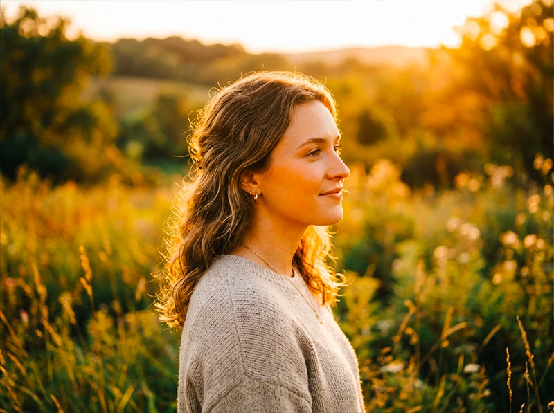
Golden hour + Gold 200 needs the preset warmth pulled back slightly. The light is already doing the work, the preset refines rather than adds. Scenario 1: Golden Hour Outdoor Portraits
This is Gold 200’s natural territory, the scenario the film was essentially designed for.
The challenge: Golden hour light is already warm. Apply Gold 200 settings at full strength and you risk pushing skin into oversaturated orange territory.
The approach:
- Pull Temperature back by 100–150K from the base setting, golden hour adds warmth the preset doesn’t need to supply
- Reduce Orange Saturation from +10 to +5, the warm light is doing that work already
- Keep Yellow Luminance at +10, sunlit surfaces should still glow
- Lower Highlights to –20 to –30 to hold the warm sky detail without blowing the golden edges
What to watch:
- Check the histogram on skin tones, if the orange channel is clipping, pull Orange Saturation down further
- Backlit subjects: lift Shadows to +20 to recover warm fill detail in the shadow side of faces
The result: Skin looks warm and dimensional rather than oversaturated. The scene feels like genuine golden hour on film, not a digital photo with a warm filter applied.
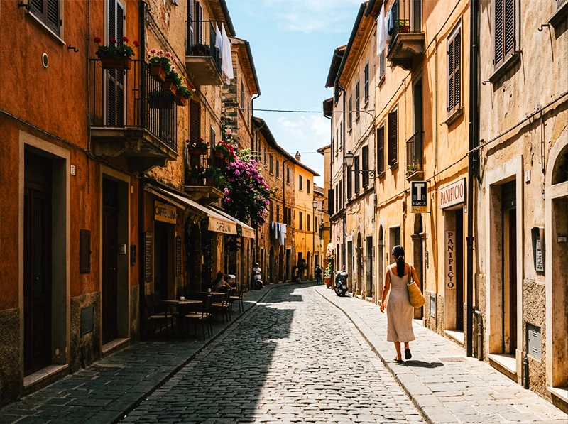
Warm-colored architecture and midday sun are Gold 200’s strongest combination. Yellow Saturation +15 on sandstone and terracotta produces that glowing, cinematic travel look. Scenario 2: Bright Midday Daylight – Travel and Street
Midday sun is where Gold 200 earns its reputation as a travel film. The warm yellow bias turns harsh midday light into something vivid and full of energy rather than flat and clinical.
The challenge: Strong overhead light creates hard shadows and can blow highlights on reflective surfaces, buildings, water, metal.
The approach:
- Use the baseline settings at full strength, this is the scenario they’re calibrated for
- Pull Highlights to –25 to –35, protect building facades and wet surfaces
- Clarity +8 globally, midday urban scenes benefit from the extra texture punch
- Boost Yellow Saturation to +15 for really sunny scenes, sunlit cobblestones and sandy surfaces should glow
Scenario-specific HSL tweaks for street scenes:
- If there’s strong blue sky in the frame: Blues Luminance –10 (deepens the sky without removing its blue)
- If there are leafy trees or grass: Greens Hue +10, Greens Saturation –8 (pushes toward olive, reduces vivid digital green)
- For people in the frame: check Orange Luminance, if skin is reading too dark under harsh overhead light, push Orange Luminance up to +12
A specific technique for travel photography: Gold 200 renders the warm tones of terracotta, sandstone, and wooden architecture exceptionally well. If you’re shooting in cities with warm-colored buildings, Marrakech, Lisbon, Rome, Santa Fe, push Yellow Saturation to +15 and Yellow Luminance to +12. The buildings practically glow. This is the adjustment that makes the Gold 200 look feel distinctly different from a generic warm preset.
Scenario 3: Family Lifestyle and Candid Portraits
This is the emotional core of the Gold 200 aesthetic, the look that makes everyday moments feel like they’re worth keeping.
The challenge: Indoor-outdoor mixed light, fast-moving subjects, varied skin tones in the same frame.
The approach:
- White balance at +150K above neutral (less than the base +300K), indoor-outdoor transitions mean the preset’s warmth needs to be more conservative
- Orange Hue –3, Orange Saturation +8, the key skin tone adjustments, applied more conservatively than for travel
- Reduce grain to Amount 18, candid family images work better with slightly less texture than landscape or travel work
- Lift Shadows to +15, outdoor family scenes often have strong backlight with shadowed faces; lifted shadows recover detail without flattening the image
For mixed-complexion groups:
- Apply the base settings, then check each person’s skin in the HSL Orange channel
- If deeper skin tones are reading too dark: Orange Luminance +15
- If fair skin tones are reading too warm: Orange Saturation –5, Orange Luminance –5
- Gold 200’s warm-peach push is broadly flattering across complexions, but mixed groups may need a local adjustment mask on individual subjects
The Gold 200 advantage on family photography: The lifted black point and warm shadow tone means hard shadow areas under chins and in hair read as warm brown rather than cold grey. This alone, more than the warmth boost, is what makes Gold 200 family photos look like film. The shadows are never harsh.
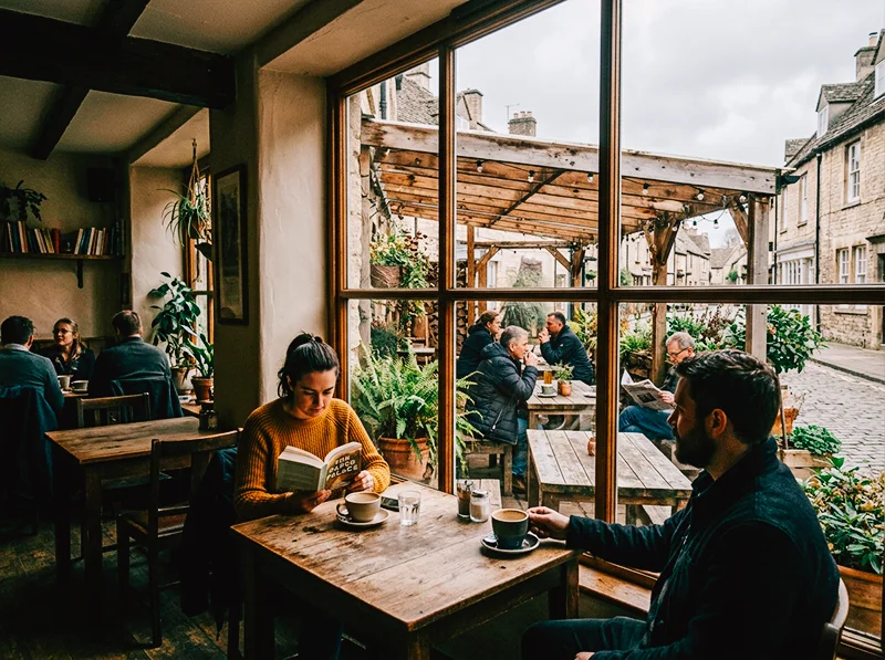
Overcast Gold 200 edits need the warmth supplied entirely rather than supplemented. The result is intimate and cozy, not a bright sunny day, but something better: a warm grey one. Scenario 4: Overcast and Flat Light
This is where most Gold 200 tutorials give up and say “it works best in sun.” It does, but with the right adjustments, it works in flat light too, and the result is something no other stock quite achieves: a warm, inviting image that doesn’t look like the sun was out when it clearly wasn’t.
The challenge: Flat, grey light has no directional warmth to build on. The preset’s warmth needs to be supplied entirely rather than supplemented.
The approach:
- Push Temperature to +400K above neutral, overcast scenes need more warmth from the slider to compensate for the flat, cool light
- Tint +8, counteract the green-grey cast of overcast sky
- Lift Shadows more aggressively: +25 to +30, flat light creates very even, detail-rich shadows; lift them to match the Gold 200 character
- Pull Highlights slightly: –15, overcast scenes rarely have clipping issues, but a gentle pull keeps the upper tones from going cool-bright
- Yellow Saturation +15, without sunlight activating the yellow channel, you need to push it manually
What not to do:
- Don’t push Orange Saturation above +12, in flat light without natural warm tones to anchor it, high orange saturation makes skin look artificial
- Don’t push Clarity above +5, overcast portraits benefit from the soft, diffused quality of flat light; heavy clarity kills that
The unexpected strength: Overcast Gold 200 edits are excellent for food photography, market scenes, and anything with earth tones and texture. The warm push without direct sunlight creates a cozy, intimate quality, the inside of a bakery, a farmers’ market in autumn, a quiet street café. It’s the Gold 200 look that doesn’t announce itself.
Scenario 5: Film Scanning and Scan Standardization
Gold 200 is still widely shot as physical film, and digital scans from different labs, or different scanning sessions from the same lab, can vary significantly in color and exposure. Using the Gold 200 preset at reduced opacity is one of the most practical applications.
The challenge: Scans from different labs have different base color temperatures, different exposure interpretations, and different handling of the orange mask. A roll from Lab A and a roll from Lab B can look like two different films even if both were Gold 200.
The approach:
- Apply the Gold 200 preset at 60–70% opacity (reduce the preset effect using Lightroom’s Amount slider in the Presets panel when hovering)
- This standardizes the warm-yellow color relationship across scans without overriding each scan’s natural character
- Adjust Temperature per scan rather than per image, find the average temperature shift needed for a given lab’s output and apply it as a batch correction before the preset
Specific scan corrections:
- If scans are consistently too green: Tint +8 before applying preset
- If scans are consistently too cool: Temperature +300K before applying
- If scans are too flat (low contrast from the scanner): Tone curve midtone lift +8 before applying
This approach turns a mixed set of scans into a coherent gallery with the Gold 200 character running consistently through it, without making each scan look identical.
Film stocks reward photographers who understand light, browse the full Lightroom film presets collection and see how each emulsion responds to the conditions you shoot in most.
03.
The Most Common Gold 200 Editing Mistakes
After working through hundreds of Gold 200 edits, these are the three adjustments that consistently produce results that look like a warm digital filter rather than actual Gold 200 film:
1. Pushing white balance instead of the yellow channel Raising
Temperature makes everything warm. Gold 200’s warmth is specific, it lives in the yellows and oranges. A photo edited with +500K Temperature and no HSL work looks like a warm filter. A photo edited with +200K Temperature and proper Yellow/Orange HSL work looks like Gold 200.
2. Skipping the green hue shift
Digital greens are vivid and slightly cyan-leaning. Gold 200 greens are muted and yellow-leaning. The Greens Hue +8 shift in the HSL panel is the single adjustment that most changes how the image reads from “warm digital” to “film.” Skip it and the foliage, grass, and plant life immediately give away the digital origin.
3. Not lifting the black point
A lifted black point (Output 15–20 on the tone curve) is what separates film emulation from warm digital editing. Without it, shadows go pure black, a clean, sharp, very digital look. With it, shadows hold a warm brown density that reads as film negative base. This is the adjustment that makes the overall image feel like it was printed from a negative rather than edited on a computer.
04.
Gold 200 Lightroom Values by Scenario
Setting Golden Hour Midday Travel Family Candid Overcast Film Scanning Temp above neutral +100–150K +200–300K +150K +400K +200K at 65% opacity Tint +3 +3 +3 +8 +5 Highlights –20 to –30 –25 to –35 –15 –15 –15 Shadows +20 +15 +15 +25 to +30 +15 Yellow Sat +12 +15 +10 +15 +12 Orange Sat +5 +10 +8 +10 +8 Greens Hue +8 +10 +8 +8 +8 Blues Sat –10 –10 –8 –5 –8 Grain Amount 22 22 18 20 12–15 05.
FAQ: Editing with Kodak Gold 200 in Lightroom
What’s the difference between editing with Gold 200 vs Gold 100 or Gold 400?
Gold 200 is the sweet spot, more warmth and saturation than Gold 100, less grain and slightly warmer than Gold 400. Gold 100 suits harsh bright light where you want warmth without saturation pushing hard. Gold 400 suits indoor and documentary work where grain texture is an asset. For the sunny, everyday, slightly nostalgic look most people associate with “Kodak Gold,” 200 is the right stock. The full comparison is in the Kodak Gold preset guide.
Why does my Gold 200 edit look orange rather than warm?
Usually one of two causes: Orange Saturation pushed too high (above +15 in bright light), or the white balance is doing too much work instead of the HSL panel. Pull Orange Saturation down to +8, push Yellow Saturation to +12, and make sure the Greens have the yellow-olive shift applied. That rebalances the warmth from orange to the sunlit yellow-gold character of the actual film.
Does Gold 200 work for portraits with darker skin tones?
Yes, but with care. The warm-orange push is broadly flattering, but in strong sunlight on deep complexions, Orange Saturation above +10 can push too hard. Keep Orange Saturation at +5 to +8 and lift Orange Luminance to +12 to add warmth and openness without oversaturation.
What’s the best time of day to shoot for the Gold 200 look?
Mid-morning to late afternoon in bright sun is ideal, roughly 9am to 4pm. The warm yellow bias of the film (and the preset) compounds best with light that already has some warmth and directionality. Golden hour works but needs the preset’s warmth dialled back slightly. Overcast works with extra HSL pushing. Night and artificial light are not Gold 200’s territory, reach for Kodak UltraMax 400 or Ektar 100 for urban night work.
Can I use Gold 200 settings for RAW files from a phone camera?
Yes. The HSL and tone curve adjustments work on any RAW file regardless of capture device. Phone RAW files often have a slightly cooler and more vivid color profile than DSLR/mirrorless RAW, you may need to push Temperature an extra +100K and pull Green Saturation down –5 to counteract the phone’s native color matrix.
How do I stop the sky going too muted with Gold 200 settings?
The Blues Saturation –10 adjustment is conservative by design. If the sky looks dull, use Lightroom’s Select Sky mask and push Blue Saturation +15 within the mask only. This brings the sky back to life without affecting the warm tones in the foreground. This is standard practice on any Gold 200 edit where sky is a dominant element.
Related reading
- Kodak Gold Lightroom Presets: Gold 100 vs 200 vs 400, Which One Do You Need?
- Kodak Color Science in Lightroom: Why It Looks the Way It Does
- Realistic Film Grain Without Losing Detail in Lightroom
- Guide to Kodak Portra Lightroom Presets
Richard is a commercial and editorial photographer with over 15 years behind the lens. He’s shot on film and digital across three continents, and still keeps a Nikon F3 loaded with Kodak Portra on his desk. At LegendaryPresets, he leads preset development – studying actual film scans to make sure every stock behaves like the real thing.