Home | Articles | Analog Film
Black and White Lightroom Presets: The Complete Guide to Film-Based B&W
Richard ♦ updated June 18, 2026 ♦ 12 min read

Clicking the B&W switch in Lightroom gives you a technically correct conversion. It doesn’t give you a look.
Every great B&W image you’ve seen was shot on a specific film stock with a tonal bias built into its chemistry. TRI-X looks like TRI-X because of its emulsion, not because of how someone moved a slider. Lightroom’s B&W conversion has no emulsion. It applies the same neutral math to every photo.
That’s what black and white film presets fix. At Legendary Presets, each preset encodes the tonal curve, grain structure, and channel response of a real film stock. This guide covers which stock is right for your work and how to stop guessing.
Key Takeaways
- Lightroom’s B&W conversion is neutral by design. It doesn’t replicate the optical character of any specific film
- Kodak TRI-X 400 is the street photographer’s stock: high contrast, pronounced grain, wide exposure latitude
- Kodak T-MAX is the fine-detail stock family: finer grain and smoother tones, better for portraits and controlled light
- Agfa Scala 200X is the only B&W reversal film ever made commercially. Its tonal response is unlike any negative film.
- Fujifilm Neopan Acros 100 delivers micro-contrast and sharpness rather than grain. It’s the choice when Fuji’s tonal character fits your work
- Film-based presets encode the B&W Mix channel response of the original stock. Lightroom’s slider applies the same channel weights to every image
01.
Why Lightroom’s B&W Slider Isn’t Enough
When you switch a photo to black and white in Lightroom, here’s what actually happens: the software desaturates each colour channel and applies a set of default conversion weights. Red gets a certain brightness value. Blue gets another. Every photo starts from the same mathematically neutral point.

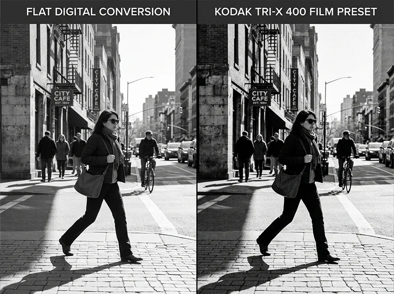
Left: Lightroom’s default B&W conversion. Right: Kodak TRI-X 400 preset. Same image, same exposure. Different tonal character entirely. That’s the problem.
Film was never neutral. Kodak TRI-X 400 is a panchromatic film with a specific spectral sensitivity curve. Its silver halide crystals made blues render slightly darker and reds render slightly brighter than a neutral conversion produces. That optical bias is why TRI-X street photos have that characteristic sky-to-skin contrast. It wasn’t a stylistic choice. It was chemistry built into the emulsion.
When you apply a TRI-X film preset in Lightroom, you get three things the B&W slider doesn’t give you:
- The channel response: how the film’s emulsion weighted each colour in the scene
- The characteristic curve: the contrast shape specific to that stock
- The grain structure: matched to how TRI-X actually looked at ISO
None of that exists in the default B&W conversion.
Lightroom B&W slider Film-stock preset Tonal response Neutral, uniform Stock-specific optical bias per film Grain Manual addition only Matched to the stock’s grain structure Contrast curve Default S-curve Film’s actual characteristic curve B&W Mix Default channel weights Pre-set to the film’s spectral response The slider is a starting point. A film-stock preset is a finished tonal language.
02.
The B&W Film Stock Guide: Which One Is Right for You
Every film stock on this list has a different character. Here’s what each one actually does, who uses it, and what it’s best for.

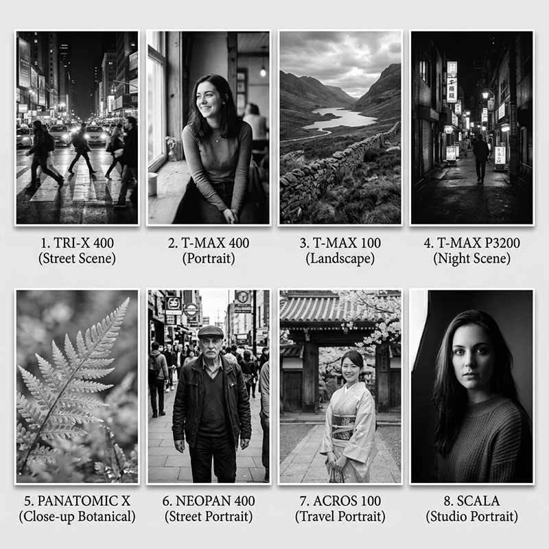
Each film stock has a distinct tonal fingerprint. Top row (left to right): TRI-X 400, T-MAX 400, T-MAX 100, T-MAX 3200. Bottom row: Panatomic X, Neopan 400, Neopan Acros 100, Agfa Scala 200X. Kodak TRI-X 400
TRI-X is the defining B&W film. ISO 400, wide exposure latitude, pronounced grain, high native contrast. Garry Winogrand, Daido Moriyama, and Henri Cartier-Bresson all built their street photography on TRI-X. It responds well to push processing. Shoot it at 1600 and the grain gets coarser and the shadows go deep, which is exactly the look a lot of street photographers are chasing.
Best for: street, documentary, reportage, any shooting where energy and grain are part of the story.
For a full breakdown of how to get this look in Lightroom, see the Kodak TRI-X 400 Lightroom preset guide.
Kodak T-MAX 100
T-MAX 100 is the fine art stock. Ultra-fine grain, wide tonal range, exceptional sharpness. Because it’s ISO 100, it needs decent light, but in the right conditions it produces a level of tonal gradation that TRI-X can’t match. Landscape photographers and architecture shooters reach for this when they want every brick, every leaf edge, every tonal transition to be visible.
Best for: landscapes, architecture, controlled studio work, any subject where detail matters more than atmosphere.
Kodak T-MAX 400
T-MAX 400 is TRI-X’s modern counterpart. Same ISO, but finer grain and smoother tonal transitions. It doesn’t have TRI-X’s gritty character. It’s cleaner, more controlled, more forgiving. Portrait photographers who want a true B&W film look without TRI-X’s rawness tend to land here.
Best for: portraits, events, weddings, anywhere you need ISO 400 versatility without committing to TRI-X’s grain.
Kodak T-MAX 3200
T-MAX 3200 was built for situations where light is almost gone. Concerts, indoor events, night street work. The grain at its native ISO is prominent and intentional. It’s not a flaw, it’s the texture that makes low-light B&W images feel atmospheric. Push it further and the drama increases.
Best for: low-light work, night photography, any subject that benefits from heavy grain and deep shadow detail.
Kodak Panatomic X
ISO 32, discontinued in 1987, and still one of the most technically precise B&W films ever made. Panatomic X had virtually no visible grain at normal enlargement sizes, which made it the choice for fine art photographers who needed maximum sharpness and tonal resolution. You won’t find it in any camera shop today, but as a Lightroom preset it delivers that ultra-clean, near-grainless look that T-MAX 100 approaches but doesn’t quite match.
Best for: fine art landscapes, close-up work, any situation where absolute sharpness and grain-free tones are the priority.
Fujifilm Neopan 400
Neopan 400 is Fuji’s answer to TRI-X. Slightly finer grain, a cooler tonal response, and a bit less contrast, which makes it more forgiving for portraits while still holding up on street work. If you shoot Fuji cameras and want B&W presets that align with the color science you already work with, Neopan 400 is the natural starting point.
Best for: street photography, travel, crossover use: shooters who move between street and portrait work.
Fujifilm Neopan Acros 100
Acros 100 has a cult following for a reason. It’s not just a fine-grain film. It has a specific micro-contrast character that gives images an edge sharpness that feels different from T-MAX’s resolution-based sharpness. Fuji’s tonal response in Acros tends to be slightly cooler in the highlights and more restrained in the shadows, which suits portrait and travel work particularly well.
Best for: portraits, travel photography, any work where Fuji’s tonal character fits the subject better than Kodak’s.
Agfa Scala 200X
Scala is the unusual one on this list, and it’s worth understanding why. Scala 200X was the world’s only commercially produced black and white reversal film. It produced a positive B&W transparency (a slide), not a negative. The processing was unique, the tonal response was different from any negative film, and the shadow depth had a quality that photographers who worked with it still talk about. Agfa discontinued it in 2010.
As a Lightroom preset, Scala delivers a contrast character and tonal curve you can’t get from TRI-X or T-MAX: higher base contrast, distinctive shadow rendering, a slightly different midtone distribution. If you’ve worked through everything else and want something genuinely different, this is it. See the full Agfa Scala 200X Lightroom preset guide for the detail.
Best for: photographers who want a B&W look that doesn’t come from the standard Kodak or Fuji catalogue.
03.
How to Pick the Right B&W Film Preset
If the film stock guide above felt like a lot, here’s the short version.
Genre drives stock choice. Street and documentary work almost always benefits from TRI-X 400’s high contrast and wide exposure latitude. You’re shooting street or documentary work. Start with TRI-X 400. The grain and contrast are what built the visual language of street photography. If TRI-X feels too rough for a specific subject, try Neopan 400. It has similar energy with slightly less bite.
You’re shooting portraits.
T-MAX 400 is the safe choice: ISO 400 versatility with smooth tones. Neopan Acros 100 is the choice when you’re in good light and want that Fuji micro-contrast character on skin. The B&W Portraits preset is built specifically for skin tone protection above everything else.You’re shooting landscapes or architecture. T-MAX 100 for maximum tonal gradation. Panatomic X for maximum sharpness and zero visible grain. Both need decent light.
You’re shooting in low light. T-MAX 3200. It’s built for darkness. The grain and shadow depth are part of the look, not a limitation to work around.
You want something Fuji-flavoured. Neopan 400 for grain and street character, Acros 100 for fine-grain sharpness and cooler highlights.
You want something unlike anything else. Agfa Scala 200X.
If you’re comparing TRI-X and T-MAX in detail, covering grain structure, contrast, and use cases side by side, the Kodak TRI-X vs T-MAX guide covers exactly that.
04.
A Note on Grain
Grain in a film-stock preset is not digital noise. It’s a designed tonal texture matched to how the original film actually looked. It behaves differently in different tonal zones, just like real grain does.
TRI-X grain (left) is coarse and irregular. T-MAX grain (right) is finer and more uniform. Both are designed textures, not noise. Lightroom controls grain with three sliders. Understanding them helps you fine-tune any preset:
- Amount: overall grain intensity. Higher values make grain more visible across the whole image.
- Size: how coarse the grain particles appear. Larger values read as older or faster film. Smaller values feel more modern.
- Roughness: how irregular the grain pattern is. High roughness looks organic and analog. Low roughness looks uniform and clean.
Here’s how the main B&W stocks approach these differently:
- TRI-X 400: high Amount, larger Size, high Roughness. The grain is coarse, irregular, and visible in the shadows. That roughness is the visual signature of the film.
- T-MAX 400: similar Amount but lower Roughness and smaller Size. Grain is finer and more uniform: cleaner and more modern-feeling.
- Neopan Acros 100: low Amount, very small Size. Less about visible grain and more about a fine textural quality that contributes to micro-contrast.
- Agfa Scala 200X: grain interacts with Scala’s higher base contrast to create a textural depth in the shadows that negative film stocks don’t produce the same way.
When you adjust a preset after applying it, the grain settings are worth revisiting for your specific image. For a deeper look at how to work with grain in Lightroom without losing image detail, see the guide to realistic film grain settings.
05.
FAQ
What is the difference between monochrome and black and white in Lightroom?
In Lightroom, there’s no meaningful technical difference. Both refer to a greyscale image with no colour data. In photography more broadly, “monochrome” can include toned images (sepia, cyanotype) that use a single colour, while “black and white” typically means a pure greyscale. For practical purposes in Lightroom, treat them as the same thing.
Do B&W film presets work on color photos?
Yes. Film-stock B&W presets convert colour RAW files to greyscale using the film stock’s channel response. A TRI-X preset will apply TRI-X’s specific tonal conversion to whatever colour image you apply it to. You do want to shoot in RAW to get the most from the B&W Mix adjustments baked into the preset.
Which black and white film preset is best for portraits?
For most portrait work, Kodak T-MAX 400 or Fujifilm Neopan Acros 100. T-MAX 400 gives you ISO versatility and smooth tonal transitions. Acros 100 delivers the micro-contrast that gives skin a fine textural quality. If skin tone protection is the priority above all else, the B&W Portraits preset is built specifically for that.
What makes Kodak TRI-X 400 different from T-MAX?
TRI-X was designed in an era when grain character was considered part of the film’s personality. It has a coarser, more irregular grain structure and a higher native contrast that makes it feel raw and energetic. T-MAX was developed later with a more modern emulsion that produces finer, more uniform grain and smoother tonal gradations. TRI-X feels like the street. T-MAX feels like a studio.
Can I adjust a B&W preset after applying it?
Yes, and you should. Film-stock presets are starting points. Once applied, every Lightroom slider is available. You can adjust exposure, contrast, grain, and the B&W Mix panel to suit your specific image. The preset sets the tonal character; you finish the edit.
Related Articles
- Kodak TRI-X 400 Lightroom Preset: Street Photography’s Black & White
- Agfa Scala 200X: The World’s Only Black & White Slide Film Preset
- Kodak TRI-X vs T-MAX: Which B&W Film Preset Is Right for You?
Richard is a commercial and editorial photographer with over 15 years behind the lens. He’s shot on film and digital across three continents, and still keeps a Nikon F3 loaded with Kodak Portra on his desk. At LegendaryPresets, he leads preset development – studying actual film scans to make sure every stock behaves like the real thing.