


Home | Articles | Analog Film
Fujifilm Pro 400H Review: Color Science, Shooting Tips and Lightroom Workflow
Richard ♦ updated June 16, 2026 ♦ 17 min read

Did you know that the discontinuation of Fujifilm Pro 400H led to a frenzy among photographers, pushing prices up to $40 per roll? Known for its soft tones and versatility, this film had been a favorite for capturing everything from weddings to moody landscapes. Let’s explore why Pro 400H left such a lasting impact and how photographers are adapting in its absence.
The world of analog film is deeper than most photographers expect, browse our complete Lightroom film presets collection and find the stock that speaks to you.
Key Takeaways:
- Versatile with Balanced Tones: Ideal for weddings, portraits, and nature shots.
- Cool Color Palette: Subtle magenta and green hues for a cinematic look.
- Wide Dynamic Range: Great exposure flexibility in highlights and shadows.
- Impact of Discontinuation: Rush for remaining stock and higher prices.
- Best Techniques: Overexpose slightly and use Noritsu scanners for better color control.
- Alternative Films: Kodak Portra 400 and Portra 800 offer similar qualities.
01.
What Made Fujifilm Pro 400H a Film Favorite?
Fujifilm Pro 400H was a professional-grade color negative film rated at ISO 400. It ran for over two decades as a go-to choice for wedding and portrait photographers, not because it was flashy, but because it was precise.
What set it apart technically:
- A four-layer emulsion with an added fourth color layer that improved accuracy under fluorescent and mixed lighting, where standard three-layer films drift orange or green
- Fine grain structure with smooth color gradients, polished without looking digital
- Wide exposure latitude: push or pull by a stop without losing shadow detail or blowing highlights
Its color personality:
- Warm highlights, teal-leaning shadows, soft contrast curve
- Saturation that was balanced, not boosted, colors looked the way things actually look in soft northern light
- Neutral skin tones that sat slightly cooler than Kodak Portra 400
For medium format shooters, the 120 version in natural light was particularly hard to match. The emotional register it produced, rich without being artificial, muted without going flat, is what photographers still try to replicate today.
The discontinuation:
On January 14, 2021, Fujifilm officially announced Pro 400H was being discontinued. Difficulty sourcing specific emulsion materials and rising production costs were cited. The reaction was immediate:
- Remaining stock sold out rapidly across retailers
- Secondary market prices hit $40 per roll within months
- Retailers hinted at one final shipment arriving before end of summer 2021, giving shooters a last window to stock up
No direct replacement has matched the full combination of its color character and shooting flexibility since.
Do you want Soft, Pastel Tones?
Stop chasing the Pro 400H look in post. These presets already have it.
02.
What Are the Key Features of Fujifilm Pro 400H?
- Dynamic Range: Pro 400H offers impressive exposure latitude, allowing you to underexpose or overexpose while still preserving details in shadows and highlights. This makes it flexible in various lighting conditions. Kodak Portra 400 is similar in this aspect, but some photographers may prefer Portra’s slightly broader range depending on their needs [2].
- Color and Saturation: Pro 400H is well-known for producing natural skin tones, which is why it’s popular for portraits. Both Pro 400H and Portra 400 offer rich colors, but Portra often gets the edge for its finer grain and wider dynamic range, making it easier to edit while maintaining smooth skin tones [2].
- Grain Quality: While Pro 400H has a fine grain structure, it’s slightly more noticeable than Portra 400. However, it still performs well in various scenarios, delivering pleasing results. Photographers looking for the finest grain may lean towards Portra 400, but both films offer good quality [2].
- Film Simulations: If you’re using Fujifilm digital cameras, you can achieve a Pro 400H-like effect with custom settings. For instance, using the DR400 dynamic range setting, combined with tailored highlight, shadow, and color adjustments, can give a close film-like feel. An exposure compensation of +1 to +1 2/3 is often recommended for creative flexibility [11].
- Aesthetic Considerations: Replicating the distinct look of Pro 400H often requires balancing color casts between highlights and shadows. Adjusting white balance can help produce cool shadows and warm highlights, which mimic the film’s signature aesthetic, even when using digital sensors [12].
How Can You Recreate Pro 400H with Digital Presets?
To achieve the nostalgic look use our Fujifilm Pro 400H Presets for Lightroom. Replicate its soft tones, gentle contrast, and cool hues. These presets help recreate the film’s natural skin tones and subtle color shifts, making them ideal for portraits and landscapes.
Quick Comparison Table
| Feature | Pro 400H | Kodak Portra 400 |
| Dynamic Range | Wide exposure latitude | Slightly broader range |
| Color Reproduction | Neutral skin tones, great for portraits | Slightly richer and more editable |
| Grain | Fine, but slightly noticeable | Finer grain quality |
| Simulation | DR400 and custom adjustments | Not applicable |
03.
Why Photographers Loved Pro 400H Across Different Styles
Pro 400H wasn’t built for one type of shooting. Its exposure latitude, neutral color rendering, and fine grain made it adaptable across genres, but it performed differently in each, and knowing those differences is what separated good results from great ones.
Portrait photography
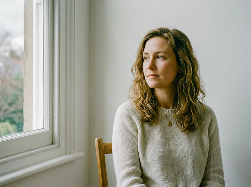
Pro 400H’s reputation in portraiture came from one thing: it didn’t make skin look like a decision. The four-layer emulsion kept skin tones neutral across a wide range of complexions, not orange-warm like Portra 400, not pink-cool like some slide films. Just accurate, with a slight softness that flattered without airbrushing.
Where it worked best:
- Overcast natural light, the film’s cool shadow character aligned perfectly with diffused outdoor light, producing clean whites and soft gradients without heavy post-processing
- Open shade, arguably the ideal condition; the fourth color layer kept the green cast from foliage out of the shadows, which is a common problem with other ISO 400 films in shade
- Window light indoors, at ISO 400, it was fast enough for natural window-lit portraits without flash, and it handled the mixed daylight/interior color balance better than most films at this speed
One practical note: Pro 400H needed more light than Portra 400 in backlit situations. An exposure compensation of +1 to +1⅔ stops in backlit setups was standard practice. Skip that step and skin tones went dull.

Wedding photography
This was where Pro 400H had its strongest following, and for a specific reason: it handled the unpredictable mixed lighting of wedding days, ceremony interiors with tungsten chandeliers, outdoor garden receptions, fluorescent hotel ballrooms, more consistently than almost any other film at the time. The fourth color layer was doing real work here.
It also responded well to being rated at ISO 200 in bright outdoor conditions and pushed to ISO 800 in dimly lit receptions. Wedding photographers who knew the film well would often shoot one roll at box speed and one pushed a stop across the same event, the pushed frames had more grain and contrast, which worked for reception dancing shots, while the box-speed frames held the soft, romantic character for ceremonies and portraits.
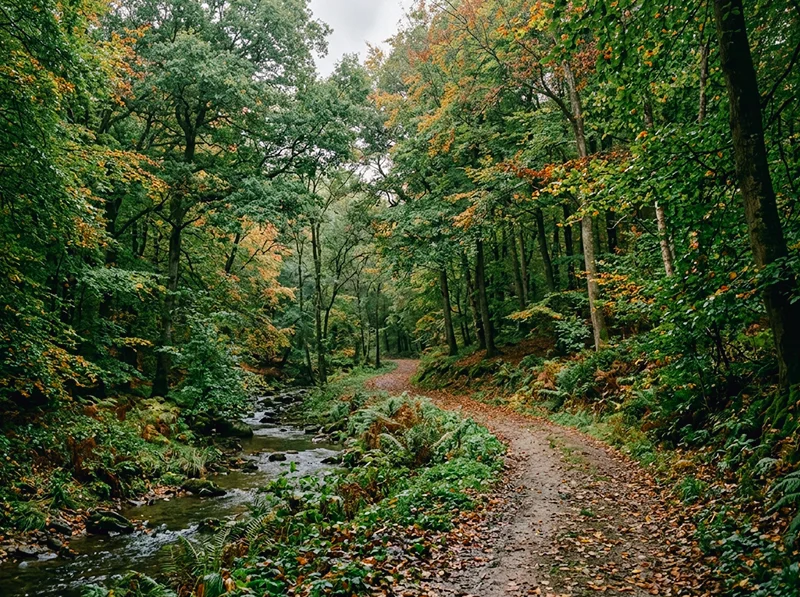
Landscape photography
Pro 400H is less talked about for landscapes, but it had a specific quality that worked well in the right conditions: it rendered greens without oversaturation. Fujifilm’s Velvia 100 gives you the punchy, oversaturated landscape look. Pro 400H gave you something quieter, muted greens, natural blues, warm earthy tones that worked well for woodland, overcast coastal scenes, and autumn color.
Where it didn’t work as well:
- Bright midday sun pushed the reds into warm-ruddy territory that needed correction in scanning
- High-contrast scenes (harsh shadows, bright sky) exposed the limits of its dynamic range faster than Portra 400
For landscapes, the sweet spot was the same as portraits: soft light, overcast sky, or golden hour. In those conditions, the color rendering was genuinely distinctive, muted without being flat, with a tonal depth that’s hard to recreate digitally without a preset built specifically around the film’s emulsion character.
04.
Fujifilm Pro 400H vs. Kodak Portra 400
These two films shared a market for years and got compared constantly. They’re both ISO 400 color negative films with wide exposure latitude and professional-grade grain. But they render the world differently, and knowing exactly how is useful whether you’re trying to choose between remaining stock on secondary markets or deciding which digital preset matches your editing style.
Color character
| Pro 400H | Kodak Portra 400 | |
| Skin tones | Neutral, slightly cool | Warm, flattering |
| Shadows | Teal-leaning | Neutral to warm |
| Highlights | Soft, controlled rolloff | Slightly broader latitude |
| Saturation | Restrained, balanced | Richer, more editable |
| Grain | Fine, slightly more visible | Finer |
| Overall mood | Cool, precise, cinematic | Warm, versatile, forgiving |
Where each wins:
Pro 400H was the stronger choice when:
- Shooting in mixed or fluorescent light, the fourth color layer kept color casts in check where Portra 400 could drift
- You wanted a cooler, more cinematic palette without heavy post-processing
- Medium format work in soft natural light, this is where the film’s tonal depth showed most clearly
- The subject had darker or olive skin tones that Portra 400’s warmth could push too ruddy
Portra 400 was the stronger choice when:
- Shooting in backlit or high-contrast situations, its dynamic range handled extremes more reliably
- You needed predictable, warm, universally flattering results across different photographers and labs
- Editing heavily in post, Portra’s color structure responds more consistently to Lightroom adjustments
- Speed mattered: Pro 400H needed +1 to +1⅔ stops of exposure compensation in backlit scenes; Portra 400 didn’t
Shooting exposure differences
This is a practical point most comparisons gloss over. Pro 400H was light-hungry. In backlit or overcast-but-bright conditions, underexposing it even slightly produced dull skin tones and muddy shadows. Portra 400 was more forgiving in both directions. If you were shooting events where you couldn’t control the light, Portra 400 was the safer film. If you could control your exposure, or were shooting with a light meter in predictable conditions, Pro 400H rewarded the precision.
On price
Pre-discontinuation, Pro 400H cost roughly $2–3 more per roll than Portra 400 in 35mm. On secondary markets in 2026, the gap is irrelevant, both are expensive, and Portra 400 is the only one still in production.
05.
What Are the Competitors of Fujifilm Pro 400H?
With the discontinuation of Fujifilm Pro 400H, photographers have sought alternatives that can offer similar qualities in terms of color reproduction, dynamic range, and versatility. Here are some notable competitors and alternatives:
- Kodak Portra 400: This film is widely considered the closest match to Pro 400H. Portra 400 offers a similar dynamic range and grain quality but has a warmer tone compared to Pro 400H’s cooler, more neutral color palette. This makes it a strong choice for portrait and general-purpose photography, especially for those transitioning from Pro 400H.
- Kodak Portra 800: For situations with lower light or when you need higher speed, Kodak Portra 800 is a viable alternative. It offers a neutral color base, slightly less warm than Portra 400, making it a good match for capturing cool tones during evening or blue hour shots.
- Fujifilm C200: As a more budget-friendly alternative, Fujifilm C200 is a consumer-grade film that provides a fine grain structure and decent contrast. It’s a practical option for 35mm shooters but may not be suitable for replacing Pro 400H in 120 format due to differences in quality and characteristics.
- Lomography 400: Another option that stands out in medium format film is Lomography 400, which offers vibrant colors and more saturation compared to the subtle tones of Pro 400H. It’s often chosen by photographers looking to experiment with brighter and punchier color palettes.
06.
What Are the Best Shooting Techniques for Fujifilm Pro 400H?
To get the best results from Fujifilm Pro 400H, consider the following shooting techniques:
- Metering and Exposure: Pro 400H is known for its light-hungry nature, so it’s best to meter for the shadows to retain detail in low-light areas. Photographers often recommend overexposing by 1/3 to 1 stop, which helps produce softer tones and reduce visible grain.
- Lighting Conditions: While Pro 400H performs well in various lighting scenarios, it particularly shines in soft and even lighting. Shooting during the golden hour or on overcast days can enhance its natural color rendition and flattering skin tones, which is ideal for portraits.
- Handling Backlit Scenes: When shooting backlit scenes, it’s crucial to provide additional exposure compensation (around +1 to +1 2/3 stops). This adjustment helps maintain balanced skin tones and avoids dull or underexposed images.
- Film Pushing and Pulling: If you’re looking to achieve a specific look, Pro 400H can handle pushing by up to two stops. Pushing the film increases contrast and saturation, which might be desirable for low-light conditions or to achieve a more intense color palette.
- Choosing Lenses: Pro 400H works well with lenses that have good contrast and sharpness. Many photographers prefer using prime lenses with wide apertures to leverage the film’s dynamic range and fine grain in different lighting environments.
07.
What Are the Post-Processing and Scanning Recommendations for Fujifilm Pro 400H?
- Which Scanner Should You Use? Many photographers suggest using a Noritsu scanner rather than a Frontier scanner for Pro 400H. The Noritsu scanner offers more flexibility in adjusting colors and contrast, which helps replicate Pro 400H’s unique cool and neutral tones more accurately.
- How Should You Adjust Colors Digitally? When scanning Pro 400H, you might notice that the film can exhibit slight magenta tones in the shadows. Adjusting the white balance to neutralize these tones can help achieve a balanced, film-like look. For warmer highlights and cooler shadows, fine-tuning color curves in post-processing software can replicate the signature look of Pro 400H.
- What About Handling Overexposure? Since Pro 400H can be overexposed for softer results, make sure to fine-tune brightness and contrast during the scanning and editing process to maintain those gentle tones. Overexposing the film by one or two stops can yield a light and airy look, but scanning software settings should match this exposure style to avoid losing detail.
- File Formats and Resolution: To maintain the highest quality and flexibility in edits, scan Pro 400H negatives in TIFF format at a high resolution. This approach helps preserve the film’s fine grain structure and subtle details, giving you more control over the final output in post-processing.
08.
How to Get the Fujifilm Pro 400H Look in Lightroom
Most Pro 400H emulations miss because they focus on grain and call it done. The film’s actual character lives in its color relationships, warm highlights pulling against cool, teal-leaning shadows, with skin tones sitting neutrally in between. Get those three things right and the grain almost doesn’t matter.
Here’s the workflow I use, panel by panel in Lightroom Classic.
White balance
Pro 400H in daylight sits around 5,200–5,400K with a slight green push. In Lightroom:
- Pull Temp toward cool, around -150 to -250 from your camera’s auto reading
- Add +5 to +8 on Tint toward green to pull away from magenta
- Under tungsten or warm indoor light, leave Temp closer to neutral, the film was designed to handle mixed light without heavy correction
Tone curve
The film’s signature is in its highlight rolloff and lifted blacks, not a harsh fade, just a gentle compression at both ends:
- Lift the black point slightly (bottom-left anchor up to around output 15–18)
- Pull the top-right highlight anchor left to compress the highlights without clipping
- Add a very slight S-shape in the midtones, Pro 400H had soft contrast, not flat contrast
HSL – the critical panel
| Channel | Adjustment | Why |
| Red Hue | +5 to +8 | Shifts reds slightly orange-warm; matches the film’s skin tone rendering |
| Red Saturation | +8 to +12 | Pro 400H reds were rich without being aggressive |
| Green Hue | -8 to -12 | Pulls greens toward a deeper, more natural tone, away from the yellow-green shift common on digital |
| Green Saturation | -5 to -8 | Keeps greens from going lurid in outdoor shots |
| Blue Hue | -10 to -15 | Pushes blues toward cyan, this is what creates the teal shadow character |
| Blue Saturation | -8 to -12 | Desaturates the blues slightly, consistent with the film’s restrained palette |
| Blue Luminance | +5 to +8 | Lifts the blues so skies stay open rather than going dark |
Split toning (Color Grading panel)
This is where the warm highlights / cool shadows split gets locked in:
- Highlights: Hue 35–45 (orange-amber), Saturation 8–12
- Shadows: Hue 200–215 (teal-blue), Saturation 10–15
- Balance: pull slightly toward highlights (+10 to +15) so the effect reads in the midtones too
Camera Calibration panel
An underused step that makes a bigger difference than most photographers expect:
- Red Primary Hue: shift -5 (moves reds slightly toward orange at the sensor level, before all other adjustments)
- Red Primary Saturation: +5 to +8
- Blue Primary Hue: shift +10 to +15 (pushes the blue primary toward cyan, reinforces the teal shadow character from the ground up)
Grain
Pro 400H had fine but present grain, not the coarse clumping of pushed film, and not invisible either:
- Amount: 14–18
- Size: 20–25
- Roughness: 40–50
Add grain last, after all color and tone adjustments are set. Changing the tone curve after setting grain changes how the grain reads visually.
09.
How Can You Ensure the Longevity and Proper Storage of Fujifilm Pro 400H?
- How Should You Store Unused Film Rolls? To preserve the quality of unused Pro 400H film rolls, store them in a cool, dry place away from direct sunlight. Ideally, you should refrigerate the film at temperatures around 5°C (41°F). Always keep the film in a sealed plastic bag to prevent condensation and moisture from damaging the emulsion.
- What About Opened Film Rolls? For film rolls that have been partially used, it’s crucial to seal them tightly in their canisters and refrigerate them until you’re ready to shoot again. Allow the film to reach room temperature before loading it into your camera to avoid any condensation issues, which can affect the film’s integrity.
- How Long Can You Store Film in Freezers? If you plan to store Pro 400H for extended periods, freezing is a viable option. Films can be stored for several years in a freezer without a significant loss in quality. However, remember to let the film thaw gradually before use to avoid condensation buildup.
- How to Preserve Developed Negatives? Store developed negatives in archival-quality sleeves made of materials like polyethylene or polypropylene. Keep these sleeves in a dark, dry place with stable temperatures. Avoid exposure to humidity or direct sunlight, as these can lead to fading and damage over time.
Explore related Fujifilm presets:
- Fujifilm Pro 400H Presets for Lightroom – the direct product destination for this article
- Fujifilm Pro 160NS Presets – the closest professional Fujifilm sibling still in the catalog; similar neutral rendering, lower ISO
- Fujifilm Natura 1600 Presets – for photographers who pushed Pro 400H to 800 and want to go further into low-light Fuji territory
- Fuji Film Lightroom Presets – full Fujifilm catalog
Related reviews:
- Fujifilm Pro 160NS Review – the professional sibling
- Fujifilm Pro 800Z Review – the high-speed alternative
- Fuji vs. Kodak Color Science – if the Portra 400 comparison in this article sent you down that road
Richard is a commercial and editorial photographer with over 15 years behind the lens. He’s shot on film and digital across three continents, and still keeps a Nikon F3 loaded with Kodak Portra on his desk. At LegendaryPresets, he leads preset development – studying actual film scans to make sure every stock behaves like the real thing.